
Saturday, February 18, 2012
Renee's poster idea...help!
 Ok, I had the idea to use road signs as the theme using different road signs on each of the documents - poster, brochure, etc.... so I tried a background to look like a road. All suggestions are welcomed!
Renee
Kendra's Web Activity 6
 I chose to represent hierarchy by showing the different regions of Virginia. Most of the hierarchy I am familiar with is representative of a vertical sequence an/or listed in order of importance. Therefore, for this activity I wanted to show a same level horizontal hierarchy. As you can see in the image I used a different color to represent each region, as well as labeled each respectively. For this reason, I did not include a key. Would it be repetitive to also include a key?
Thanks for the comments and feedback in advance!

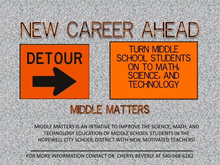
Eric - poster draft "Middle Matters"

Here's my draft of the poster. The bottom gradient and placement of the text may be a problem, but this is what I've got so far.
Image from: https://blogger.googleusercontent.com/img/b/R29vZ2xl/AVvXsEjZ8UdJ_1iLhY7fd_PbTltF01Jm82bzfcD8Z8T8gMxcV3nmCfKoQTzk07X0Z8d053bIRaiGsUB4oYZ7pdY1knvCOpcmSrIai_CmuhXqlntM53vBn2yqyWrvc9a07T2nLzcSR6Y4FIAJFas/s1600/Students+Raising+Hands+in+Classroom+-+microsoft.JPG
***Side note on the picture programs*** - After trying so many programs (Sumopaint, Aviary, Pixlr, Inkscape), I've come to realize that GIMP (it's free) is probably the best to use. It's updated and has a very similar feel to Photoshop. Inkscape is something I really didn't like much. Less tools and the UI was not as slick. GIMP is the one I ended up with but warning - there is a learning curve!!!! If you want to spend hours of looking through tutorials and learning the program it is worth it but also time consuming.
Renee's Activity 5 - Plot Structure
 In the plot structure of a story, the five elements are always present... and in this order. So, I thought that the use of arrows and numbers would clearly show the order of the literary plot structure elements.
Middle Matters First Attempt

Kendra's Middle Matters Poster Draft
 Hi all! Here is my first draft for the Middle Matters poster. I wanted to keep it simple. I used the same colors throughout. I noticed in the pdf format (before saving it as a JPEG that the white text looked blurred...), so if this is how the image appears, does anyone know why? Or how to fix it?
Also, I can't decide if the "white space" below the two text boxes should have something in its place. I also know that the text on the second box is a lot, so comments on that will also be greatly appreciated!
Thanks in advance for the comments and feedback!
Friday, February 17, 2012
Are People Visually Literate?
How many people are actually visually literate?
Visual Literacy and Visual Culture: Reflections on Developing More Varied and Explicit Visual Competencies.
Luc Pauwels
Eric - Web Activity 6

Poster Design

Middle Matters Poster Draft
 Here is my first attempt at the Middle Matters poster assignment.
I chose to use images of people that portrayed what the target audience could become if they take advantage of the Middle Matters program and switch careers.
After doing a little research, I chose to use royal blue and gold for my text/outline colors, as those are the Hopewell City Public Schools colors.
Let me know your thoughts!
After doing a little research, I chose to use royal blue and gold for my text/outline colors, as those are the Hopewell City Public Schools colors.
Let me know your thoughts!
Wednesday, February 15, 2012
Web Activity 6-- Dingo
This assignment confused me at first. "Create an image that uses words and symbols to imply hierarchy" (Lohr, 153). As a teacher, I am cautious that I don't give open ended assignments like this. My first questions were: Hierarchy of what? What words or symbols? What is the topic? Does not the topic determine how to represent hierarchy? In addition, I found the example to be more confusing and amateurish. Is this the best example Lohr could come up with?
My first instincts were to be a bit cheeky and type '1, 2, 3' on a page and be done. Then, I started thinking that MS Publisher has lots of good characters and shapes that can represent hierarchy. I went there for inspiration but did not want to use any of their stock images or formats. I developed my image based on the carrot symbol.

My first instincts were to be a bit cheeky and type '1, 2, 3' on a page and be done. Then, I started thinking that MS Publisher has lots of good characters and shapes that can represent hierarchy. I went there for inspiration but did not want to use any of their stock images or formats. I developed my image based on the carrot symbol.

Monday, February 13, 2012
Cherelle's Middle Matters Poster 1

My first Idea for the Middle Matters Poster...
Images:
http://www.waukesha.k12.wi.us/Library/mjking/j0408982.jpg

Sunday, February 12, 2012


Web Activity 5

For this message, I thought it would be most effective to keep the statements short and sweet. Discouraging young people to not smoke is something very important so I decided to keep the message concise and direct! I kept the background black and had the first two points in light colors so they popped but were not too harsh. I wanted to pull attention to the main point of "Just don't start" inside the cigarette.
Web Activity 5
I took the photograph of the cigarette being put out and decided to use it to represent the mindset of putting cigarettes out. I made sure the photo was slightly transparent to the black background so it would not compete with the information about tobacco, although I am unsure if the photo is too much. I included two strong facts because I did not want to cluster the image with too many words and I thought these two facts would be most efficient for the learner to be engaged with the image. I put important key words in a light grey to grab the focus of the learner to pay special attention to the facts about tobacco. The image ends with a catchy slogan, “Be Smart, Don’t Start” and is in the same font as the main focus: “Smoking” in the Title.
Web Activity 5
 As you can see from this image, I approached this activity with a "break the habit" mentality to target the audience that does smoke.
 I think this is a well-balanced image. The text is to the point; it is enough to make the viewer think, without overwhelming them with statistics. I chose this particular font for the text because it is rough around the edges, and I think it fits well with the topic/message of this image.
I chose this particular image to symbolically embody the slogan text "Break the Habit", driving the message home. I altered the contrast, brightness, and transparency of this image so it did not overpower the text.
All feedback is appreciated!
Web Activity 5

 I made this in photoshop. I attempted to make an image where the letters were made of smoke and subtly stated facts about smoking. However, that proved a little too challenging for now. I am going to keep messing with it, but for this draft I went with a black background and added the statements. I then made smoke going up through the frame. I like this image, but I am more excited to go back and work on the smoke-letter effect that will make a bit more like an optical illusion.
 The other image, the one to the left, is one of my attempts at making the letters of smoke. I have tried to blend the two in a couple of different ways, but I would like the letters to blend in so well that to the eye it could look just like smoke, but if you looked closer, you could see the statements.
Web Activity 5
 After looking at the image in the textbook, I decided that I would compose a different poster that got the same point across but in a different way. I chose to alter an image that I found. In this image one thing that is noticeable is the lack of the excess wording. I feel that less is more when dealing with topics like this. The font choice is one that has a "digital look" and was chose to resemble a statistic or data. The placement of the words shows that choosing to smoke (the filter end) is killing yourself and the other end (the pillow side) is the end result of smoking killing you. Although much of these meanings are conveyed through the image (not directly stated), I feel that the image has a deeper impact than the one from the text. I chose to change the color of "preventable" to white so that it contrast against the rest of the sentence and the viewer understands that the end result is "preventable".
 Image source:
http://catchdesign.blogspot.com/2010/10/creative-anti-smoking-ads.html
Web Activity 5

I will say also that I felt that the image was not bad at all for a seventh grader and was fairly creative. I chose to recreate the image by choosing this photo that would state what the poster is about and of course I added the facts to say why "no smoking" is stated. In regards to the color choice I wanted to choose a subtle font color (the white), but to highlight important words with red as I feel that red is a vibrant color that kind of screams "stop look at me as well as "don't that" at the same time. I chose to highlight different words when compared with the original poster, as I felt these may be a bit more appropriate to highlight. As usual I welcome all feedback.
Revised Tobacco


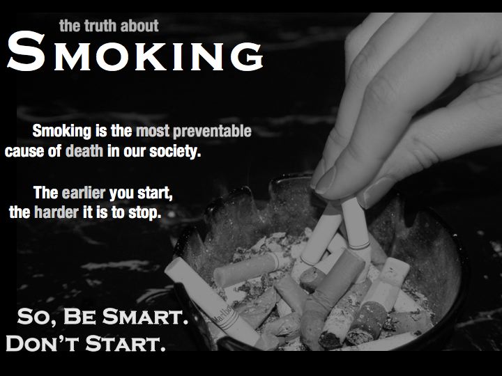
Web Activity 5 - The Truth About Smoking
 I wanted to keep my message the main thing. I believe this is effective and gets the point across. The image complements the text, and the text does not overwhelm the image. I know that I wouldn't take time to read five different facts about smoking, so why should I expect others to?
Activity 5

Eric - Web activity 5

Ok, first, I'd love feedback on this as I'm really not comfortable how it turned out. I chose the background as it indicates chaos and a mildly negative connotation of smoking in general. I used white text as the figure with the image as the 'ground'. My intention is for the viewer to switch between both figure and ground in which one can disregard the text and vice versa. I tried following the CRAP principles in alignment of margins and the two middle text boxes to line up too. My concern really is that the text is made interesting enough where my ground will quite possibly end up becoming the figure which is not the point.
Images from; http://healthylifecarenews.com/wp-content/uploads/2011/07/Cigarettes-healthy.jpg
Activity 5-Facts About Tobacco

I wrestled with this activity for the past few days...Based on the readings it seemed like my figure-ground image needed to be two-fold. The readings made it seem like an optical illusion. If you focused one way you could see the image and then focusing the other way you would see the text. I had a hard time making my own optical illusion. I found this image on google and loved it! I stretched it in PPT and then added text boxes for the words. As you can see from some of my previous images I really like black and white images and text.
Any ideas and suggestions would be appreciated!
Any ideas and suggestions would be appreciated!

First, I want to say that I think the image in the book was not too bad for a seventh grader. I tried to stay with the same concept but used color and alignment to make the text stand out. I used a different skull and cross bones to make it less blocky (I know that is not really a word). The heading 'tobacco' is layered on top of the skull a bit to make it stand out. I thought that there was too much text on the original image so edited the message to make it shorter.
While I found Aviary to be a more stable platform than Sumopaint, I still found it too limiting for serious work on design layout. My first idea for this poster was to take an image of a dementor from the Harry Potter movies and have the creature sucking the smoke exhaled by a teenage smoker. For those of you who are not Harry Potter fans, dementors are creatures who suck the souls from people in what is described as a dementor's kiss. The title of my image would have been 'The Kiss of Tobacco.' However, I could not convert an image to black and white with Aviary and had difficulties with re-sizing layers. I bit the bullet today and bought a copy of Photoshop that will be delivered later this week.
Credits:
Skull and cross bones: https://encrypted-tbn2.google.com/images?q=tbn:ANd9GcQmciA_hMJETENzv9lx18B20x1jQG4OaJumWfUvhL7DiSbb-AuW7Q
Tobacco Facts - Renee's Activity 5
 After reading the chapter, I wanted to keep my visual as clean as possible so that the message is not lost. I chose the fishhook in the cigarette to illustrate the fact that smoking is addictive. The letters that I chose for the prominent words seemed to blend into the white background, so I outlined them in black. I'm wondering if the lines need to be a hair thicker to make them stand out even more. Although the image seems to speak for itself, I wanted to make sure the message isn't lost or missed by adding the "Don't get hooked!" line. The image had sharp edges, so I softened them hoping that the cigarette and hook would dominate. Any suggestions are welcomed!
 http://www.google.com/imgres?hl=en&biw=1123&bih=766&gbv=2&tbm=isch&tbnid=pqMZ-bKxmA-U5M:&imgrefurl=http://www.infobarrel.com/Media/Hooked_on_Smoking&docid=WsFbIbBPOQaJqM&imgurl=http://www.infobarrel.com/media/image/43852.jpg&w=267&h=189&ei=FjQ4T_SRD8nz0gGVoayoAw&zoom=1
Renee
Web Activity 5

I used Pixelmator (a mac version of photoshop) to create this image. I was determined to use the burning cigarette as my background image, and decided to place the facts above it. I have applied a filter to the background image in hopes of muting it some, however after looking at the image over and over, I can not decide if it is too overwhelming or not. The text "Tobacco Truth" is placed next to the cigarette because it is both the prominent image as well as the focus of the text. I chose to use colors in the white family for my text to help them stand out, but to also blend with the image as a whole. Any and all feedback is appreciated!
photo from flickr.com (http://www.flickr.com/photos/seannaber/3308485218/sizes/z/in/photostream/)
Activity 5 Tobacco

Activity 5
 For this activity, I chose a picture online of a cigarette being put out. I then formed my text around the image. I like how the book example had facts about above Tobacco, but I chose to have "facts about" extend to the "o" in tobacco.
 I used red to highlight the important text as red is associated with bad. I enjoyed creating this image. I was trying to use a different background than white, but I think this works well. Suggestions??
Morgan McMullin
Web Activity 5
 I decided to take a similar approach to the example in the Lohr book. I tried to find a picture that also represented or served as a ironic metaphor, which is why I chose the image with the lungs as an ash tray. Then, I wanted to use size and color to emphasize and display the words about tobacco use.
I used the same font and main colors throughout. At first I had the title in a different font, but changed it back. Would having a title font different as the rest of the font look alright? I also chose to stick with yellow as the "highlighted" color. Could I have used different colors or is it best to be consistent?
Other comments and feedback are welcomed! Thanks!
Subscribe to:
Posts (Atom)