Hello! Here is a rough version of what I have so far for my visual resume. I just threw some text on there for place holding, so please disregard that mess! I'm planning on toning the tree/background down some. My goal is to make the image look less busy and find a way to make the text in the tree pop. I'll post an updated version shortly. Thanks for your input!
Saturday, May 21, 2011
Jessica's visual resume
Hello! Here is a rough version of what I have so far for my visual resume. I just threw some text on there for place holding, so please disregard that mess! I'm planning on toning the tree/background down some. My goal is to make the image look less busy and find a way to make the text in the tree pop. I'll post an updated version shortly. Thanks for your input!
Rework of Judy's logo
Hi everyone, Judy got started on her logo because she will be out of town at a conference. She posted the different iterations of her logo, and explained her objectives as she worked on the logo. She did a very nice job. You can read her posts if you click on Older Posts.
I have take her logo and reworked the type font and spacing of her two lines of text. Although I liked her choice of font in her last iteration, I felt that the serif font did not work as well with the logo as it could. I thought perhaps she could use a type font that had qualities similar to the tree in her logo - clean lines with thin and thick elements. Her logo almost had an Asian quality (like calligraphy), so I went looking for a font that would work with this. At the same time, her second line of text needed to be simpler. Here's what I came up with. What do you think?
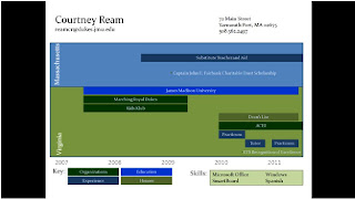
Courtney's Visual Resume
After 30 minutes of trying to figure out how to take a picture of my resume (since I did it in PowerPoint), I have finally got it in my post. I had another idea of incorporating a chalkboard since I'm going into elementary teaching but I didn't think it would look serious enough for a resume. Please let me know what you think.
B.Artis Visual Resume
My original idea was much like Judy's. It's very professional and would more likely be the one I would use if I gave it to an employer. However, one reason I am taking this elective is to step outside my creative box. So I began working on this draft. It's more colorful, contrasting, etc. I divided it between my experience at JMU and my work experience at home in the Tidewater, VA area. This is the one I will probably develop and turn in as my final product for this class, but I will keep developing my other draft for my personal use.
Judy Rannow Second Visual for Learning
As we get older the graphics become more complicated but are still useful in helping visually represent biology concepts. I am sure every child has looked at and drawn plant and animal cells to learn the differences between them. We not only use prepared visuals for learning, one of the best tools for learning is to draw what we see. This is why so many biology classes require students to keep visual journals of what they are learning about.
http://hyperphysics.phy-astr.gsu.edu/hbase/biology/phoc.html
Judy Rannow Visual Literacy Graphic
We use graphics all the time to teach biology. This would be a very simple graphic used for elementary school children learning about photosynthesis. While there are words, the teacher would be able to explain the basic priciple to children that could not read. Children that could read would be able to get the concept of basic photosynthesis by looking at the diagram.
Friday, May 20, 2011
Judy Rannow Logos
My first attempt at a logo. I liked the graphic but it did not mean anything. I liked the script but was not sure that was the meaning I wanted to convey.
My second attempt at the logo included another neat graphic and new fonts but it still had no meaning. I tried different colors and settled on dark green and burgundy.
Let me know your thoughts.
My second attempt at the logo included another neat graphic and new fonts but it still had no meaning. I tried different colors and settled on dark green and burgundy.
My third attempt was more meaningful as the graphic represented growth. Trees come from tiny seeds and given the right conditions, they can grow to be very strong and withstand adversity. Plus I do have a background in biology. I liked the tree but thought the leaves were too light green. I also liked the font. It is bolder than the original script.
I finally settled on four different variations of the tree logo with the darker green (two above and two below). I used some different fonts and colors in anticipation that I would use them in different ways depending upon what type of marketing I would be doing.
Let me know your thoughts.
Thanks,
Judy
Wednesday, May 18, 2011
Thinking Visually to Create a Visual Resume
When creating a visual resume, being able to think visually is of vital importance. What do we mean by thinking visually? Visual thinking is defined as thinking in images or pictures. It is the process of using your imagination to translate verbal information into mental images.
While this isn't a difficult task for those with artistic training, it may pose a challenge for those of you who are used to thinking in words. Believe it or not, there are actually exercises you can do to improve your ability to think in pictures! Check out the Visual Thinking Art blog for ideas on how to improve your visual thinking skills.
As you work on your visual resume and begin to translate your professional and educational experience into images, consider ways to use visual metaphors to describe your experience. Some metaphors that have been used in visual resumes are the time line, the subway or bus station, a road map, or a movie. Some creative individuals have used presentations or slide shows to showcase their professional history. Remember, you don't necessarily have to have outstanding art making skills. You just need to know the elements of good design, page layout, and how to design with type. If you don't have the ability or time to create images yourself, consider using images from Flickr Creative Commons.
This blog describes the process a designer went through to create the pictograms for the 2012 Olympics. You will be going through a similar process this semester as you create your visual resume, logos, instructional posters, picture books, etc.
Malcolm Grear Designers specializes in the creation of graphic images for identity, information, branding, marketing, and education. Consider the two images below and the one for the Olympics at the top of the post (by Malcolm Grear). What verbal message is being communicated in each image. Are these effective graphic images? How could they be improved?
As you look at the work of graphic designers like Malcolm Grear, consider how you can use graphic design principles to create a graphic representation of your professional background. What skills can you showcase in graphic form? How would you portray your skills, abilities, education, and places of employment in graphic form?
Reposting of Post by Allison Wood on Digital Resumes
Tips for Creating Digital Resumes
In the beginning of the semester, we learned a little bit about how to create a visual resume. I recently found an article from Mashable, 9 Dynamic Digital Resumes, that gives four great tips for creating a visual resume:
1. Give the reader your history
2. Aesthetics matter
3. Make it personal
4. Use graphics to inform
Do you agree with these principles? Did you use them in your visual resume?
Mashable also posted an article about creating impressive video resumes. It states that in order for a video resume to be successful, you should use the following guidelines:
1. Make sure it's appropriate
2. Don't just read out your resume
3. Keep it short
4. Don't be afraid to be creative
5. Make sure it passes the share test
The article also provides some great examples of video resumes. Have you ever created a video resume? What principles from our Visual Literacy class do you think apply to video resumes?
Subscribe to:
Posts (Atom)