Saturday, June 11, 2011

Friday, June 10, 2011

Thursday, June 9, 2011

My poster

Poster


Still working on the logo. I have the JMU Seal for the back of the book but its prooving to be a little more time consuming to get it to where I want it

Web Activity 6


Brandon got me in the NBA spirit for Web Activity 6. For this activity, I printed off a list of the final standings, based on record, from best to worst, then sought out logos and organized it in a hierarchy list.

poster update

Here is the updated version of my poster. I worked on text and image alignment and made the title part of my logo bigger. Now the logo balances out the top of the poster better.

Wednesday, June 8, 2011

Web Activity 7

I'm still a little bitter about Chicago not making it to the finals. Anyway, I used color coordination for organization. The highlighted parts of his body correspond to the color of the text that relate to each of those skills/body parts. Clicking on the body part would navigate through the interface.
http://cdn.everyjoe.com/files/2009/04/derrick-rose-bulls-playoffs-iconphotostwo191687-nba-jan-28-bull.jpg

Activity 7

Chemistry has been on my mind! I stuck with the water molecule idea.

Activity 7


Web Activity 6

Hi everyone, I couldn't get my activity 6 into a shareable format, but this will give you a good idea of my concept of visual hierarchy. I represented mine by starting with a water molecule and zooming out to a tear drop and then to an eye. Hope you like this!

http://www.newgrounds.com/portal/view/525347 (click the play button once it loads)

Poster

Here is the first draft of my poster. I am going to play around with making the logo font larger so that the title of the poster will be more prominent. I would certainly appreciate any feedback you can give.

Tuesday, June 7, 2011

Web Activity 6

I made a first draft of a hierarchy chart and I didn't like it. The next idea that came to mind (mainly due to the AHRD program) is Maslow's Hierarchy of Needs. So this idea isn't an original one, but it still uses the elements discussed in Chapter 6. I used multiple cues to illustrate that the chart is to be read from the bottom to the top as opposed to the traditional top to bottom. I used the directional arrows illustrating to move up the ladder. The red/green contrast may be confusing, but I interpreted the colors to go from harsh to calm. So the reader would be seeking to achieve calmness in the end (the top) as opposed to moving away from calmness. Finally, I spelled "Maslow's" name a letter at a time, beginning from the bottom of the pyramid and working upward. So it's like, as you achieve each subsequent level, you move closer to demonstrating Maslow's theory. It makes sense to me :) What do you guys think?
http://www.google.com/imgres?imgurl=http://www.businessballs.com/images/maslow_hierarchy_sm.gif&imgrefurl=http://www.businessballs.com/maslow.htm&h=535&w=686&sz=32&tbnid=vS9OUJxNmkz0fM:&tbnh=108&tbnw=139&zoom=1&hl=en&usg=__Ax8P2bwe2PbIXYddHhuLLbcplNk=&sa=X&ei=w_DuTaiII4Pk0QHPsMD2DA&ved=0CFQQ9QEwBg

GSC Poster

Here is my poster for the Graduate Student Colloquium. Please note that all events and details are fictional.


Image Sources
http://www.corbisimages.com/stock-photo/royalty-free/42-17445074/students-talking-in-hallway/?tab=details&caller=search
http://www.corbisimages.com/stock-photo/royalty-free/42-20585097/college-students-in-class/?tab=details&caller=search
http://fastcache.gawkerassets.com/assets/images/4/2011/02/apple_ipad_2.jpg
http://images.macworld.com/images/legacy/2007/05/images/content/macbook_blk.jpg
http://farm4.static.flickr.com/3602/3366720659_b746789dfd.jpg

Updated SDI Poster

Web Activity 6 - Rannow ISD Model Advanced Organizer


Web Activity 7


Here are the first, second and last slides I used to organize an online version of one of our workshops.

Monday, June 6, 2011

Poster


My brother decided he wanted a poster advertising himself as a DJ. I stuck with the red and black theme I had in my original logo but I had to change the logo to be all white since black on black wouldn't do so well. This is really just my first attempt so any feedback is welcome.

Web Activity 6


As I said in my other post, I created a social studies unit on Ancient Rome and Greece, so I made a slide showing the hierarchy in the Roman government, which can be really hard to understand - I had a hard time with understanding it so I know kids would too.

The information and pictures came from the link titled "Who Governed Rome?" on: http://rome.mrdonn.org/lessonplans/republic.html

Web activities

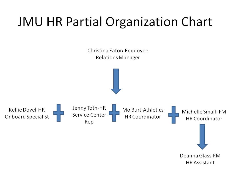
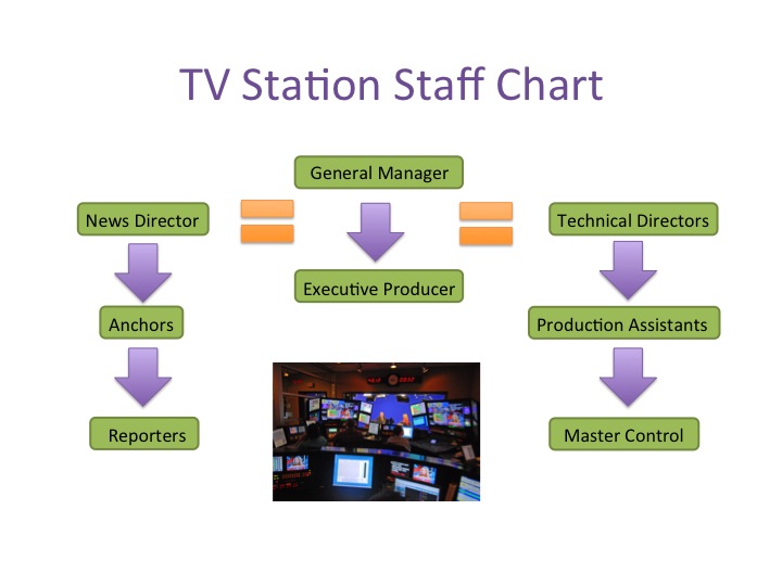
Here is my hierarchy chart. I added the picture at the bottom because I felt it illustrated what was the station does overall, plus it eliminated white space. Do you think I should keep the photo it or get rid of it?

This is my integration slide, I created it for a presentation that would be called "Get in Shape!"


******
Image credit: http://www.splashmedia.com/resources/blog/press/the-future-of-iptv-making-big-splash/

Clip art from Microsoft Clip Art


SDI Poster

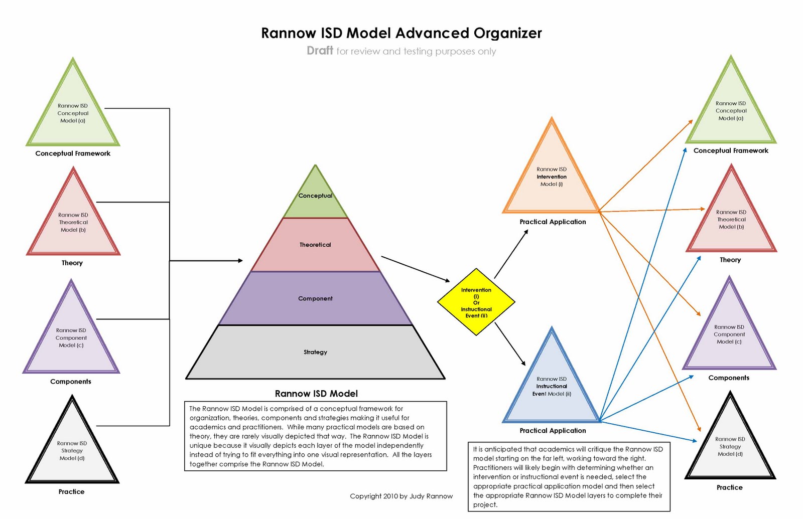
Here is the original SDI triangle that the new version is based on. Hope this helps explain some of why the graphic is the way it is.


I am working on a poster for the Strength Deployment Inventory (SDI) workshop I teach. There are sayings that go with each motivational value system (MVS). I have individual posters that I put around the room when I teach the workshop with the individual sayings but thought putting them all together in one would be a good idea. People taking the workshop really like the quotes. This poster is for a specific target audience using a specific tool, which impacts the colors and design. I thought about putting pictures/graphics with the text but did not want to distract from the quotes.

Web Activity 7


Last semester I created a social studies unit on Ancient Rome and Greece for third graders. For this assignment I decided to create a slide on the classical orders (columns) I could use in a PowerPoint to discuss Ancient Greece. I choose to use real images as opposed to pictures because if you go to Greece you won't be looking at pictures, you'll be looking at real buildings and the style of architecture that was used. I didn't use a lot of text since it is meant to go along with a presentation but even still people can understand the difference between the orders. And obviously the blue and white scheme is to correspond with Greece's colors. On the left I put the order of the presentation and italicized and put in bold the section this slide would be in.

Here are the link to the images I used:
http://thumbs.dreamstime.com/thumblarge_289/1216142414Z6WS46.jpg
http://www.the3dstudio.com/product_details.aspx?id_product=231709
http://college.holycross.edu/projects/worcester/growth/greek_revival.htm
http://www.wallpaper4computer.com/wallpaper/?flag-eu/1024/flag-gr

Sunday, June 5, 2011


Attached are Web Activities 6 and 7. For Web Activity 6, I decided to show part of an organizational chart to improve hiearchy using text and symbols. For Web Activity 7, I decided to create an instructional module that someone could follow when learning how to drive.