Saturday, January 21, 2012

Web Act. 2 - Making hot cocoa

I made this in Inkscape before I realized Word would have been sooooo much easier in sizing everything.


Images taken from:

  1. http://www.decor8.co.nz/Drawings/Cone_Mug.jpg
  2. http://www.lostdollar.net/spoon.jpg
  3. http://www.stockphotopro.com/photo-thumbs-2/stockphotopro_1633463GRU_no_title.jpg
  4. http://h2brodelivery.com/yahoo_site_admin/assets/images/Swiss-Miss_cocoa_sml.1565001_std.jpg

Friday, January 20, 2012

Web Activity 2: How to Make a Cup of Hot Cocoa

What is SOPA Anyway?

I don’t know if you guys have seen the news on SOPA (Stop Online Piracy Act), but I have taken notice of this proposed bill after seeing multiple posts on Facebook about it. To my understanding from Facebook posts I have read, this bill would lead to mass censoring on the Internet—I didn’t really understand it. So, I decided to do a little bit of reading on SOPA, and what it really entails.

I found an article on CNN that was very helpful in understanding what SOPA is really all about. The Stop Online Piracy Act has been proposed with the goal of cracking down on copyright violation. This “cracking down” would occur through the restriction of access to sites that host the “trading of pirated content”. For instance, YouTube would most likely shut down immediately due to this bill. Google searches would find substantially less search results. This seems like the “Napster” issue all over again. Even after Napster was shut down, more websites with the same intentions popped up all over the Internet.

Tech companies, who are largely against this bill, mobilized their users to speak up for their beliefs on January 18. For example, Wikipedia launched a site blackout. Protesters “hit the streets” in New York, San Francisco, Seattle, and Washington, D.C. A petition has been passed around via the Internet as well.

This article states that the SOPA (and PIPA bill) lost some of their Congressional backers because of the rebellion experienced. Both of these bills were postponed today, January 20.
I still don’t know all there is to know about the SOPA bill, and have not gotten into the PIPA bill yet. Do any of you have any more understandable information on these proposed bills? What are your thoughts? How do you think bills like these will affect the Internet as we know it in the future?

http://money.cnn.com/2012/01/17/technology/sopa_explained/index.htm

Thursday, January 19, 2012

Web Activity 2. Hot Cocoa

Cherelle Johnson

Caution Sign


When searching for a universal design relating to visual literacy, I can across this caution sign. The yellow sign is quite universal and functional. The fact that the sign is yellow is a plus for its functionality.  The symbol in the center is simple, but depicts potential danger. Although the sign is universal, the words “Wet Floor” provide extra clarity. When I am in a public place, the mall for example, and I see this sign, it immediately lets me know that something usually has occurred and to be careful. The instruction is simple, but can be vital in certain situations. 

Monday, January 16, 2012

Universally Ikea

Ikea's line of multinational stores tout sleek and functional design of easy to assemble home furniture. Ikea has developed universal instructions, without using language, that can be used globally in all their markets. While their presence in markets throughout the globe points to a universal appeal of their designs, the assembly instructions are often ridiculed for being vague and sometimes humorous.

Let's look at a few examples.

The above page appears at the beginning of an instructional leaflet. The first line which shows the tools you will need seems straight forward although the figure speaking these tools perplexes me a bit. The second line I also understood quickly-- assemble with two people.

The third line took me an extra moment or two to get. It seems to say that the unit should be assembled on a soft surface such as a carpet. This picture may be somewhat less effective as I had to compare the two to see that the rug was missing from the left side. I then had to infer that the broken piece on the left side was caused by being on a hard surface.

The fourth line demonstrates succinctly that Ikea can be called with any questions.

The below page is an example of an assembly instruction. Notice how the hand points to a set of holes that is important to how you orient the piece when assembling.

While all of this seems straight forward, I, and many of you reading, have been in the position where instructions or ambiguous parts have left us feeling like below.
Repeating the above steps 1-5 may however have its disadvantages. Depending on your tolerance, assembling several Poang items may cause instruction to become blurred or unclear as in the image below.


Sunday, January 15, 2012

Web Activity 1- Work Out


After reading a little more into the use of universal design images that were used for instruction, looking at videos that explained more of universal design, and lastly viewing the images that some of my classmates have chosen, I have been able to come to more of a clearer understanding of what really constitutes universal design use in instruction.

The image above, I believe is a very effective usage of universal design in instruction that many come across and probably use often. I for one work out and some times need the use of these images to help guide me in the correct execution of exercises, especially if there is no one trained to help or guide me, which is usually the circumstance I find myself in.

The images shows a series of stretches that an individual can perform. Each image has a person pictured performing the stretch in its executed position, which is a very good for those who are visual learners. Each image also comes with a name that corresponds to the stretch being performed. You also see that in some images that motion is depicted by either the use of a second correlating image, or a shadow image showing a changed position. All of these small components help make this image a good use of universal design. The simplicity of the chart makes learning accessible and easy to a variety group of learners, and visual literacy aims to do just that, make the use of information easy to read and interpret to a large population of learners.

Web Activity 1


The first thing I thought of when reading this assignment was what are some signs and/or instructions do I see when I'm out in public? How do those signs "make sense"? With that, I did a search for some examples of universal design for instruction and looked through a couple of pages and didn't find anything I thought would work for this assignment. I ended up searching/looking for images and instructions for emergency plans in case of fire or other emergency. I thought of this partly through what I saw when searching the Internet, but also because it is something I see everywhere I go.

The image (second image) visually represents the emergency plan for the U.S. Department of Labor's Occupational Safety & Health Administration. The universal design piece of this visual that stuck out the most to me are the symbols used. For example, the symbol for handicapped exit/access and indicating the symbol for "you are here." The second piece of this example that made looking and understanding this image was the instruction that came along with it. The image (first image) is a screenshot of the interactive emergency plan. To learn more about what each symbol represents, one can move his/her mouse over the topics to the right of the image and the description appears.

I think what makes this example such a good example of visual literacy in regards to universal design is that there is more than one option for viewing or understanding the emergency plan. There is the image of the floor plan with symbols, an interactive option where an individual can learn more about each component of the emergency plan and below the image and instructions (not shown in this blog post) are instructions in just text. This caters to all types of learners and universally understood.

Website for the image and the above information: http://www.osha.gov/SLTC/etools/evacuation/floorplan_demo.html

Web Activity 1


In looking at different definitions of visual literacy and universal design I ended up coming up with a smash up definition. That is the ability to read, interpret, and understand information that is presented graphically in a way that all walks of life are able to readily identify and can be in turn informed. The uses of bathroom signs in my opinion are forms of visual literacy as well as a universal design. It is almost safe to say that if you see a graphic of what appears to be a lady in a dress and a man wearing pants; you can then identify those two entities as being the men and women’s restroom facilities. Now my mother did one time walk into the men’s restroom, but that was because she wasn’t paying attention which I thought was pretty hilarious. In addition as a user you can identify a restroom that is meant for handicap use as well. This is also pretty universal because restroom signs have braille so those who are visually impaired can also receive information. As I researched universal design originated in the field of architecture in order to meet the needs of a public that was widely divers. When a UD approach is applied to the creation of products and environments, consumer access is broadened because inclusive features are incorporated into the design from the outset in order to anticipate a variety of needs, ages, abilities and disabilities.  

Web Activity One


Effective Universal Design

http://boomertechtalk.com/help-seniors-in-your-family-use-comcast-dvr-remote/http://boomertechtalk.com/help-seniors-in-your-family-use-comcast-dvr-remote/


Poor Universal Design


When thinking of types of images to search for in relation to universal design that addresses issues in an instructional context, I immediately thought of television remotes. While there are some TV remotes that remain simple and user-friendly, it seems that remotes have become increasingly confusing to use with the invention of things like On Demand and DVR. I chose to display two instructional images of television remotes created by different manufacturers.


The first image I posted is an example of effective universal design in my opinion. The black lines are easier to see, and simple to understand. Also, there is minimal text that is able to serve its purpose of description.


The second image I posted is an example of poor universal design in my opinion. The orange lines are not very easy to see, and confusing. There is also a lot of text very close together, which makes it more difficult to indicate which button belongs to which function description.


One thing to note here with these images is that while there are symbols on the remotes, the text is in English. Thus, these particular images do not address language barrier. That being said, the companies that manufacture these remotes most likely have these images with text in other languages to cater to their consumers' needs.


I think the first instructional image is much less overwhelming than the second. What do you all think?


Web Activity 1

I will be honest when I first looked at this activity I was sorta lost. I didn't quite understand what the question was asking. Then after reading the chapter and seeing my peers posts I began to understand that universal design is when you make something that everyone will be able to understand regardless of the situation. I found two images that I felt demonstrated universal design in learning. The first is the above image-tying shoes can be a difficult concept to grasp. Being able to see images really does aide in the process. Some of my students are still rocking velcro in the 3rd grade because we just can't master it. Images will help with this!

The second image I found included the play, pause and stop buttons on a keyboard. I felt like this keyboard would be AMAZING for young children. If they are not familiar with the keyboard they would be able to recognize these buttons from their remote or even DVD players at home It would help cut back on the confusion with which buttons to choose. Any thoughts?

Web Activity 1

My brother and I loved playing with legos when we were kids. Our favorites to build were M:Tron, Blacktron, and Space Police. My brother liked the M-Tron ships, so I, by default, adopted Blacktron as "mine." My favorite ship was the Aerial Intruder:

http://letsbuilditagain.com/instructions/6981/

I thought of this while looking for examples of universal design. The directions to build the Aerial Intruder are clear and easy to follow. Each step only adds a few new pieces so as to not be too overwhelming for a 9 or 10-year-old. It's not possible to tell from the online instructions, but each series of steps has a checklist of pieces you'll need. If you get to the end and have pieces left over then there's a problem.

Since this particular example is designed for young kids, the directions are relatively simple. When building more complex lego kits the need for clear design is even more important. Pieces are organized according to size, shape, type, and color among others. Poor design can lead to frustration, inability to finish building the legos, and a potential drop in sales.

Web Activity 1

I chose this graphic because it reminded me of directions that we are given often when assembling a new product.  I really liked the tag on my Dyson vacuum but was unable to get a good scan of that.  With universal design, learners are able to follow simple picture directions to get a finished product.  This sample gives a short description.  Many times you will not have words to read with the photos.  Think about all of the directions we get that are just in picture form. 

Web Activity 1


file://localhost/Users/bradfordnickerson/Desktop/990081-S-d-2-750.jpg


When searching for images associated with Universal Design I came across this image of an individual removing the door to an airplane. This is an emergency procedure that is done in potentially life threatening situations. Visual literacy in this instance becomes extremely important, so it is imperative that this image can be understand by any individual on an airplane that must remove the door during an emergency. One could also assume that the image must be even more simpler if you think about the state of hysteria an individual may be in when required to remove the door.

The image uses a variety of methods to make the image easy to understand. For one, it shows two different views. A regular view, and then a zoomed in view. This lets the individual removing the door know how to quickly and successfully begin the removal process. Secondly, with arrows, the image shows how the individual should apply pressure to the door. In this image, the arrow tells the individual to pull up and toward themselves. The second arrow then tells the individual to release the door away from themselves after it is loose to clear the door away from the plane. The image also shows effective body positioning and posture and tells you the weight of the door (41 lbs).

So, in a life threatening situation, this instructional image serves an important purpose.

Web Activity 1: D.C. Metro map, NY subway map

D.C. Metro Map
D.C. Metro Map
I chose the D.C. Metro map above because of my experiences using this instructional resource many times as well as the N.Y. subway system (which is awesome because it's all fast paced and requires quick processing from their map.)


I think this is a great instructional universal design for a variety of reasons. First, consider the colors used on the map. Each color signifies a certain line of transportation to certain areas. This is important as one may quickly identify which subway is needed, especially at multi-lined stops where several trains come and go at the same station. This may be the first line of cognitive processing for a first time commuter. Second, consider the dots located on each of the colored lines. Properly labeled, this is a great way to signify the appropriate stops for each train. Also, by making the dots white with a black outline, this makes the stops 'pop' more on the thick subway lines for easier readability. The larger dots with two black outlines also indicate a transfer stop. Making them bigger really makes it easy to see where a transfer would be and also that not every dot on the map that two train lines run adjacently are transfer stops. I also noticed how the map strips out almost everything but important landmarks and directional cues such as the Potomac River, a North directional arrow and the green areas for the national park areas. This helps the tourists especially who have no bearings to see much more accurately where they need to go. Finally, I think the map also is a great instructional resource as it is not to scale. Obviously, the stops will extend to great length into the surrounding areas but this is clearly not important for a commuter to have as what is important is getting on and off at the desired places and not worrying about scale in the map.


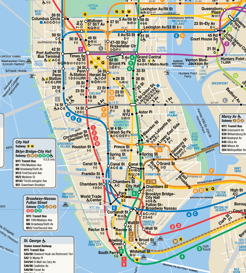
N.Y. subway map


The New York subway map is obviously much more complicated and larger compared to the D.C. map. However, many of the same principles are used as described above but to a greater degree and complexity.


Have any of you used these maps? How about the NY subway? Did it work for you?