
Saturday, March 21, 2015
Caudill Educational Leadership Brochure Final
After some great feedback and some revisions here is my final brochure. Thanks everyone for the great feedback!


Thursday, March 19, 2015
Rob Morgan Brochure Rough Draft
Here is my early attempt at the brochure. I decided to create one for my department for the AACP (Administrative Assistant Certificate Program) classes that we teach so that someone in AACP could see all of the classes that they need to take. I still have a lot of work to do on the inside of the tri-fold.

 Here is my updated tri-fold with all sections filled out.

 I decided to have the copy center print off 1 copy of the brochure in case my department wants to start using it. I took some photos of what they printed.


Erin Murphy ROUGH ROUGH draft

What do you think about the color scheme?
Am I missing anything that parents would like to know about this.
Wednesday, March 18, 2015
Leah's Brochure Draft
So! Whenever it comes to using Photoshop and creating original images...I go for my ferrets! Here's a little walk though that I made for new ferret owners! Too many times I have seen young ferrets given up to shelters because new owners get overwhelmed! And if you're thinking about getting one...DO IT! I got to highlight 3 out of my 4 fuzzies! I hope you like!
INSIDE-

OUTSIDE-

INSIDE-
OUTSIDE-
RET's Brochure Draft


This is a draft of the final brochure I would like to make for the Planetarium. I had to use placeholders because I did not have any photos that were actually my own or not in violation of copyright.
The final version would have several changes. First the text might change color so it is easier to read agains the banded background. Second there would be contact info at the bottom of the top center panel. This would include things like the planetarium website and facebook/twitter/instagram icons.
Hope you all like it so far.
Jordan's Brochure Draft 1

So far here is where I am. I don't have all of my content for each heading on the brochure edited yet, which I think serves to benefit, because I really want to make sure my artwork is pretty easy to understand before I add text into each of these boxes.
I'm also not feeling quite committed to the traditional brochure format yet, but this was the first and simplest format that came to mind. I've looked into some alternatives and might play with those over the next few days, but thought this would be a great first step for me to solidify an art style (And whether it might be appropriate to use a few colors here and there, although I'm really liking this whole black and white thing right now).
Last, I'd like to know how you guys feel about using the logo as like a folded out poster rather than having the outside of the brochure divided up into sections. Thanks in advance!
Jen's Rough Draft
After seeing all the cool examples of non-tradtional brochures that Dr. Wilcox showed us in class, I decided that this is what I wanted to do. The brochure is for my environmental group and the subject is the recent bee decline. We plan to add this brochure to our tabling supplies when we canvas festivals and such. I used a polygon shape because it reminded me of bees and, when combined, looks also like a flower. The idea is that each of the individual polygons are cut on every line except the one that connects them to the center polygon. Then, each of the polygons is folded into the center. This creates the perfect pocket for holding the echinacea seeds that we're giving out for people to plant in their yards and help save the bees. The only thing viewers will see until they unfold it is the polygon with the large bee for the front and the references polygon on the back. (I'm still working on how I want the rest of the polygons folded/arranged.) It took me a long time to do the graphics, so I'm still not finished. I tried to use as many of the different types of images as I could. Anyhow, I hope that I explained the folding well enough and that you get the general gist. I'll post pictures of the folding when it's done. I still need to add a polygon on the amazing uses for honey with graphics, the references, and I'm waiting on a high res .png of our logo.


Amanda Loeser's Rough draft
Okay, so I've had a really tough time making this brochure. I tried multiple ways of creating this and got pretty frustrated so I decided to do mine in a Word document. This caused many spacial issues because when I moved one thing, many other things moved as well. I am going to upload what I have now and will continue to work on this in Canva instead. I decided to do mine on a Wine Country Bike Tour that my sister and I did because I knew I had pictures for it. I plan to create many more symbols, but for now all I created are the bike tires in Google Draw. There definitely needs to be more color as well. The logo for the Bike Tour is an animal on a bike, which I got from their website as well as the color red. Please let me know anything and everything I can do to make this better. I know I need to make it prettier and am hoping this will look MUCH BETTER for my final product with all the changes I plan to make.


Leisha's Brochure Draft
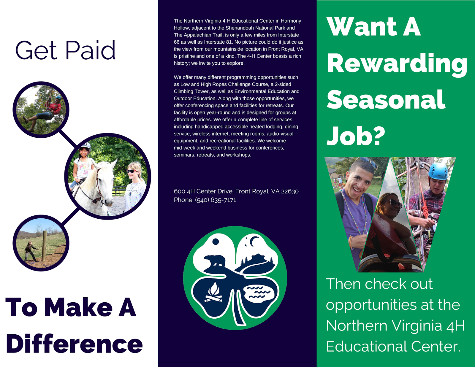
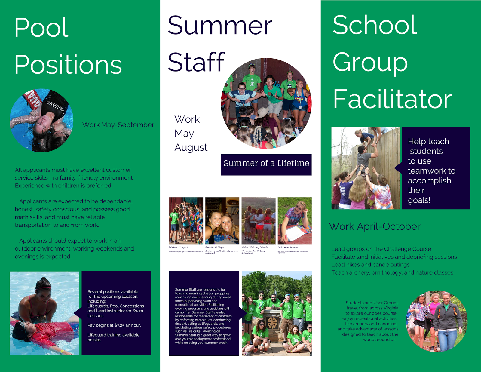
I used Canva to design a brochure for the 4H center where I work. They sometimes have a hard time hiring for their seasonal positions, so I think they could really benefit from some advertising. I chose to stick with the green, blue and white used in the logo. All of the images are from either my personal stash of pictures or from their Facebook Page. The brochure folds out like a normal trifold brochure. (The brochure case at the facility only holds those types. Otherwise I would be more inclined to create a more unique brochure design.) I think I need to play with my margins a little. Can I make this more exciting? What are some principles we have talked about that I am ignoring or omitting? Thanks for any critique!
 |
| Outside |
 |
| Inside |
Amanda Leech Brochure Draft


Here is my brochure for the daycare we use. I used a lot of the information on the handout they give to new parents, but need to make sure it works for them. I pulled in colors from the logo and tried to make everything consistent.
Kara's ROUGH draft
So, initially, I laid out a plan in Word, and then began creating the brochure in Photoshop. I'm not sure about the colors and I know there are some definite edits I need to make. I will gladly take any advice you guys can offer. I had to redesign my logo using a JMU approved font, so I used Futura for the majority of it. I also completely redesigned the hands to make it more of my own creation. I made the hands using Photoshop's cookie cutter tool and finished them up in Google Drawings. I changed the coloring to a more silhouette type effect. I felt this was emphasizing the lessened importance of skin color, and the reaching up from the purple into the yellow symbolized coming out of the darkness and into the light (while also incorporating JMU colors). The 'coming into the light' helps to represent the organization's goal of making others aware and seeing what issues exist within this group but also in having society recognize this group as well. Anyway, I welcome your critiques!
OUTSIDE
 INSIDE

OUTSIDE
Ashley Caudill Brochure Draft
Here is my rough draft of the Educational Leadership brochure, I am still working on the graphic on the front, it's still a little rough looking. I emailed a couple people trying to find images to add to the brochure but unfortunately they didn't have any or they wouldn't let me use them for this purpose, so my brochure is a tad text heavy and no images. I tried to keep the same theme as my poster including the colors and the checklist graphic. The brochure should be folded as a typical trifold brochure, but I labeled them so you can get the idea of how it should be folded.
2 6 1

3 4 5

Tuesday, March 17, 2015
Mariya's Brochure Draft
Here is my rough draft of the brochure assignment. I tried to keep it consistent with the theme, font, and colors. I also wanted to make sure that I was satisfying the company's needs since they wanted a brochure that was more like a pamphlet and less as a traditional tri-fold brochure. Since I am not very fond of the traditional brochure, I was satisfied with this as well. I am in the process of creating a graphic for the back page in order to add some statistical information about the efficiency of HVAC systems. I also was thinking of adding some minor statistical information to get some customers more interested in the company's selling point.
The second draft (the cube shaped object) was geared more towards the "creative" type of brochure that provides customers with quick information at their fingertips. The flaps fold inwards and they close on the back with a little flap that holds them down in the center (this is the circle that is right in the center of the cube). This was intended to be more of a wallet sized creation for customers to keep in a compact space.
These will be refined within the next few days, so any suggestions would be greatly appreciated! Thanks!


Lauren's Brochure Draft
I do not have a company/reason to create a brochure currently, so my old roommate who works in Johnson & Johnson's fitness center sent me some of their old ones. I recreated their personal training brochure. It was nice, but had a lot of redundant text...
 (original)
.png)
I chose to use a gate fold to be a little different.
Outside-
.png)

(original)
I started by creating a new color palette. I wanted to keep the red to match the logo and then chose a more muted blue and yellow to compliment it.
Outside-
The barbell on the cover is flush to the center fold so that it will connect when closed. The blue banner on the back is as well.
Inside-
What do you guys think about the colors?
Is there still too much text?
Do you think that it is chunked well or is it hard to follow?
I'm open to any suggestions, thanks!Monday, March 16, 2015
Solving Problems and Mapping Toast
Found a great TED talk that deals with mapping from a systems engineering standpoint. That and it also shows how to make toast. Check it out here: http://www.ted.com/talks/tom_wujec_got_a_wicked_problem_first_tell_me_how_you_make_toast
Subscribe to:
Posts (Atom)