Saturday, February 25, 2012

Middle Matters - 2


This is my latest version of the Middle Matters poster. I've used my own image and tried to use the same colors throughout. After looking at it again, I think I will change the heading to make it more prominent (maybe larger, I will have to play with that). But in general, what do you think?

Friday, February 24, 2012

Middle Matters Poster


I decided to go in a different direction from my first draft of the Middle Matters poster. The image is an original, and the colors seem to work better together than the ones I chose before. Feedback is appreciated! :)

Middle Matters poster

I think I like this design but still have time to change things. Let me know your thoughts. Thanks, Matt

Thursday, February 23, 2012

Instagram a New Photo Sharing App on the Rise


For this blog post I decided to focus on visual communication. In doing so I decided to focus on Instagram which is one of the newest applications for iPhone, iPad, and iPod Touch users. This application definitely utilizes visuals and communication. Instagram is a photo sharing application that allows its users to take photos and utilize a filter to change the hues and textures. You can make pictures look retro, add water marks, a frame etc. This is noted to pay homage to Kodak and Polaroid. In addition it allows your photos (visuals) to be communicated to an audience. The interesting aspect about Instagram is that allows you to have an audience for what you produce. Many articles have acclaimed this application to be social networking which I do believe it definitely can be considered that sort of medium. You can "like" or comment on the photos, and see what's new and what the visual trends may be out there as well as communicate and connect with others.
To use the app you can take pictures within the app or use photos that already exist in your camera roll. You add a digital filter and then photos can be instantly shared, and not just using Instagram, but also facebook, twitter, Flickr, and Tumblr.  
As I stated before the application is pretty cool because it allows you to manipulate the photo with 11 different filters. Even pictures that you feel are boring can even be jazzed up and shared. For example I took a basic photo my Christmas Tree at my parents' home. I wanted to accent the bright star so I used Instagram to give a watermark that blurred the rest of the photo to focus on the start itself. 
Another awesomee aspect is that huge companies are utilizing Instagram for marketing efforts. Ford for example lauched a really interesting campaign to market one of the newest features of one of their newest vehicles the Fiesta. The feature that they wanted to highlight was its rearview mirror. They felt that the average consumer did not know that ( I did not know that) and they wanted to change that by using Instagram and they called it Fiestagram. This was a six-week contest in which users could submit photos and win prizes. Ford launched the Fiestagram contest and  each week announced a new hashtag (#) that was associated with one of the Fiesta’s high-tech features, such as #entry, #music and #hidden. People could then submit photos on Instagram, tagged with “#Fiestagram” and that week’s associated hashtag. Interpretations were up to the users which gave creative rights to how the visually communicated the hashtag for that week. For example, one of the hashtags like stated before was #entry so people submitted extraordinary doorways. The best photos that were taken were featured in galleries as well as Ford giving prizes each week. The final prize was of course a Ford Fiesta (How cool?). Here is how it worked: http://www.youtube.com/watch?feature=player_embedded&v=wXme8JAMPwM
Many other organizations are choosing to use Instagram as well here a few:
·         GE
·         Starbucks
·         ABC News
·         National Geographic
·         Sharpie
Follow the link to read more and view photos http://12most.com/2012/02/17/12-prodigiou-brands-instagram/
I never thought this app that I stumbled upon on my phone could be so popular  and have such an impact to the point that big name organizations would use it. I have found this to be fascinating. Please give your thoughts and feedback.              

Monday, February 20, 2012

Middle Matters 1st Draft

Web Activity 6


When I was reading about visual hierarchy, I immediately thought about magazine covers and website layouts. Magazine covers have what they think will grab their readers’ attention in big bold words; they also have a celebrity or attractions as the main picture, and some times with other smaller pictures. To create an image that uses words and symbols to imply hierarchy I created a magazine cover to represent London, England. I used a picture that I took of a red phone booth to represent London, because people automatically think of London when they see them. For the components to represent visual hierarchy, I used size by using different font sizes to show the importance of the text that demand more attention. The viewers’ eye is drawn to the title and then to what is inside the magazine. I used color by having the color red stand out in a black and white picture; red has a high visibility and is an intense color. The image shows alignment and repetition by having the main components of the magazine on the right hand side in the order they appear inside. The magazine cover is organized in a way that is easy to read and consistent to viewers.

Web Activity 6

Middle Matters

I was interested in just getting directly to the point. By having the questions on the side I was hoping to get the reader interested if they answered yes to the questions and thus could take the time to read more about the information below. I thought by adding the chalk board, the "middle matters" would make more sense. I also thought by using the school bus yellow, people would think of the education field.

Web Activity 6- Christina Saunders

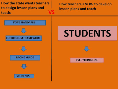
For this web activity, I wanted to use size to represent importance as well as top to bottom representing importance and chronological order. I did the state's idea of lesson planning and teaching versus the importance of students we have learned in all of our classes. I was prompted to use this after reading a very good article about the Atlanta public school scandal with cheating for higher test scores because of pressure by the former superintendent. The article was discussing how a new superintendent has come in and completely changed the ideology of the system. Here is the article if anyone is interested (its a great read).

Sunday, February 19, 2012

Middle Matters


For this iteration, I have science, a student, and a teacher represented on the left hand side of the poster, and the description to the right. I am playing with some other ideas, but am having trouble finding/creating images to fit my vision. I'm still working to fix the balance in this particular image, let me know what you think!

Activity 6


I chose to show hierarchy through the placement of the images (illustrating the life of a plant) as well as through the sizes of the images. I decided on a blue background to stay within the boundaries of plant life.

Middle Matters DRAFT-- Dingo

Obviously this is still in the draft stage. I like the message but need to add contact info, logos, and some more color into it. If there is anyone more experienced in Ps than I am, I need some help in creating a dotted line just inside the silhouette of the teacher sort of like one would see in a cut-out book. Thanks.

Web Activity 6


When I read the web activity, I immediate thought of the ADDIE model--as it is a process. I started looking for images for inspiration, and actually found an image that expressed how I would like to interpret the hierarchy of the ADDIE model. Most images of the model portray it as a five step process that cycles, or just five steps in a row. I think this image shows the flow of the ADDIE model, and drives home the point that evaluation is the focal point of the process, occuring during every phase.


First draft of Poster

This is my first attempt at the poster. Right now, you can see that the poster is lacking some images and some other things. I am thinking of the best approach. I wanted to keep the chalkboard and chalk theme, but I am having trouble thinking of appropriate images to increase the effective. Your criticism and feedback is welcome!

Web Activity 6

To show Hierarchy, I used Maslow's Hierarchy of Needs. I chose to make a little different than the original pyramid image. The concept is similar though.

Web Activity 6

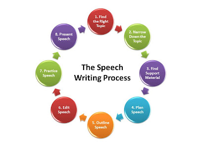
For my web activity I chose to focus on the speech writing process. In this hierarchy I chose to depict it in a cycle utilizing arrows as well as numbering each step so that the learner will know where to begin.

Web Activity 6- Hierarchy

When I thought of hierarchy, I immediately thought about the NCAA Tournament Challenge. Although, I am in no form a basketball fan, I feel that this image clearly displays a sense of hierarchy. Starting from the edge of the image, we can see that they are a lot of teams present. As we move inward the number of teams lessen indicating they have lost and the better team has advanced. This image shows that the teams are broken up into regions (east, west,...etc.) Based on the results of last season and this image we can see that Kansas was the best team in NCAA basketball last year and that is clearly depicted. I hope his provides a clearer sense of hierarchy.

Middle Matters Draft 1- Title Revision

This is the revised version. On the other I had the title wrong. Feedback is greatly appreciated! Thanks

Girl Source: http://officialpsds.com/LITTLE-GIRL-DOING-HOMEWORK-PSD77899.html

Web Activity 6

When someone mentions hierarchies, I immediately think of Maslow. As a sports fan, I also think of league tables such as this one from the English Premier League, the highest soccer league in England. The top level is comprised of 20 teams; each team plays at home and away versus each of the other 19 teams (for a total of 38 games/season). A win is worth three points and a draw is worth one. After each game week, you can see which teams moved up, moved down, or stayed in the same position. So, for example, this week Arsenal moved from sixth position to fourth by winning, while Chelsea and Newcastle both moved down a slot because they lost their matches.

Middle School Matters- Draft 1

This is draft one for my poster. Feed back is greatly appreciated!!!
Girl Image Source: http://officialpsds.com/LITTLE-GIRL-DOING-HOMEWORK-PSD77899.html

Web Activity 6

While I was reading about hierarchy in Lohr, I was reminded of a lesson I gave to 7th graders about the number systems. I drew several visuals for them to help them understand how some sets of numbers are subsets of another. One of the visuals looked a lot like this graphic. I used a flow chart to show relationships between the sets. I also used the colors to show the levels, and the size of the boxes to represent how big the sets of numbers were comparatively. 

Middle Matters Poster draft

Draft of Poster

Here is my first attempt at the Middle Matter's poster.  Please share feedback :)

All images were found using Google.

Morgan McMullin

Poster Draft


Here is my first attempt at the poster for HCPS Middle Matters program. Feedback is appreciated. Thanks!

Images were found using Google images.

Web Activity 6 Hierarchy


For this web activity I chose to focus on a social studies themed visual to show hierarchy.  In this visual it shows the alliances in World War I and how it changed over the course of the war.  I used vertical hierarchy along with some of the "cue" words that were listed in the chapter.  This order shows the sequence of events.  I then used some horizontal hierarchy to show that each alliance had key members that played a role in the war.  Each of these members are on the same level to signal equal importance in the war.  I chose green as the background to signal the beginning of  the war and red to represent the end in the second box.  Lastly, I used complementary colors to make each element stand out a little more.  Let me know if you think this is an effective visual for hierarchy and what I can do to make it more effective.

Activity 6

I chose to show how my first graders develop spelling.  Typically students come to my first grade classroom with letter sound recognition.  We then focus on beginning and ending sounds and work towards mastery of CVC (consonant, vowel, consonant) words.  Very few students in my class are introduced to long vowel words. 

Morgan McMullin

Activity 6-Writing Process


For this hierarchy assignment I chose to go with the writing process. Since this process builds on the next step I felt that it was appropriate for the assignment.

I must give credit where credit is due-I found a similar image on google images but used the concept to make the idea my own. Feedback is welcomed....


Middle Matter Second attempt

This is my second attempt.  This has the correct dimensions for the poster and it has the same colors as the last one.  It has different text though so it might be a little too much text. It does have a white border around it which you can't see because of the background. Let me know what you think!