Saturday, February 28, 2015

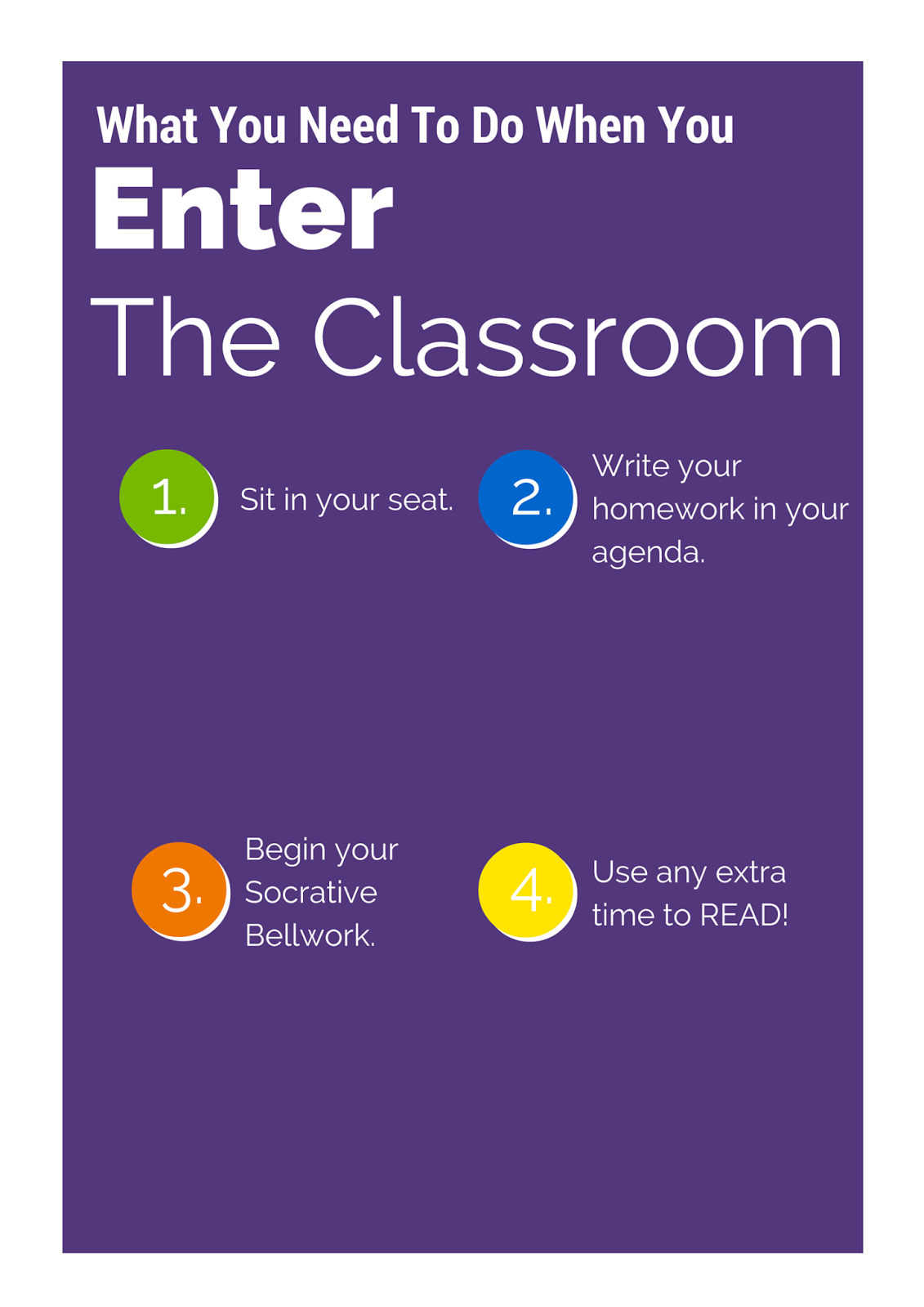
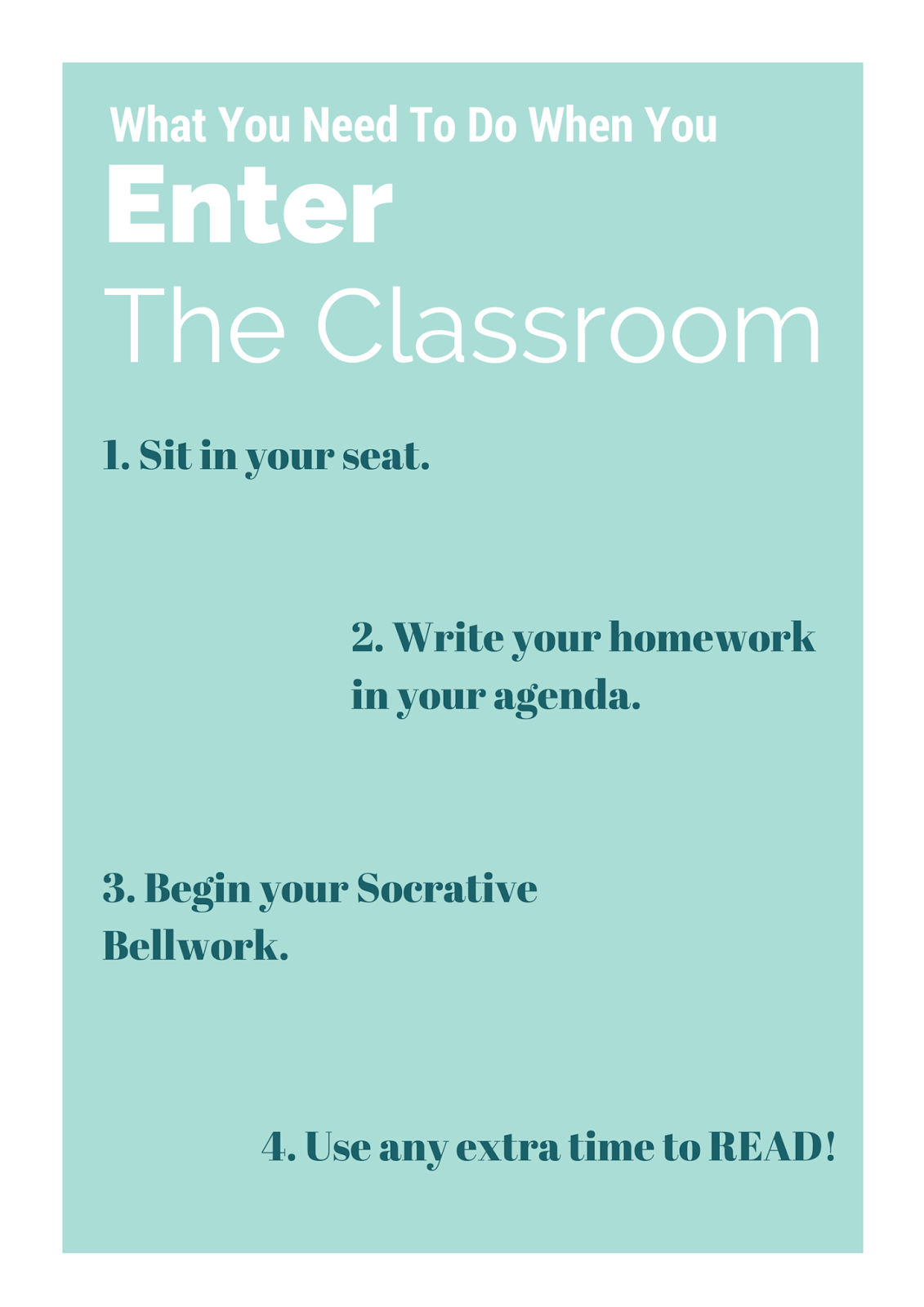
Ashley Caudill Final Poster


Here is my final poster, I made a couple changes after receiving some great feedback from you guys.
I moved up the "try educational leadership" text and logo up to be closer to the other text to try to remove the trapped white space.  It was also brought to my attention that my margins didn't quite match on all sides, so I fixed those, as well as decreased the size of my borders around the images and checklist.  Overall, I am very pleased with my finished product.

Sources:
Online Master’s of Science Education [Online image]. Retrieved February 22, 2015 from         http://www.wgu.edu/sites/wgu.edu/files/images/MA-Science-Student.jpg
Educational Leadership [Online image]. Retrieved February 22, 2015 from                     http://onlinegrad.marygrove.edu/Portals/133299/images/business-        istock_000010106679medium.jpg

Friday, February 27, 2015

Leah's Poster Draft>Assistance is appeciated

My second attempt at Photoshop! After some user error this is what I came up with! I plan to alter my images using the same art technique...as soon as I figure out how! :D Any tips and suggestions would be GREATLY appreciated!!! I created the images in Word and copy/pasted into Photoshop. Is there an easier/more attractive way to do it?

Lauren's Poster - Final


Thursday, February 26, 2015

Christy's Poster Draft

I still have some tweaking to do, but I am pretty pleased with my first draft of this poster. I continued the Ed. Leadership theme with this assignment. I thought Ashley did a great job with her version of an Ed. Leadership poster, so I wanted to create something that the program director could use in addition to that. Since I work as a graduate assistant for that program, I asked the program director, Dr. Crowder, what would be most beneficial to him. He liked the poster focusing on the Master's track of the program (kudos to Ashley Caudill), and he emphasized how beneficial an informational poster about the certificate program would be for recruitment purposes..

I already had a lot of background knowledge about the program, which helped me to know how to organize the content. Dr. Crowder requested that I include other information such as potential job titles and state endorsement requirements. I had created the cohort map for a previous project of his; I just modified the coloring to match JMU's identity colors from the logo assignment. I really tried to think about how I could use the different sorts of images we've discussed in this assignment. I think I've covered representational, organizational, and interpretive images.


Leisha's New Draft

So my first plan failed because of snow, I was not able to get the pictures I needed for my original poster idea.  I decided to try again from scratch.  This time I decided to create a hiring poster for the summer camp where I work.  I tried to incorporate the colors from the logo using the green and blue to contrast with the white.  I used images from past summers. I'm still struggling with trying to create a more dynamic design.  I also feel like I really struggle with setting up columns that flow. 
I'm afraid there might not be enough color in this one.  Fun Fact: I'll be getting married in the campfire circle pictured here in fall of 2016.  :)

I think it is a little too perfect that the staffer (my sister) in the picture is wearing a green staff shirt with blue shorts that match the color scheme.  Almost too perfect. 


Is there not enough text here?  I feel weird calling this an informational poster because there is so little written information on here. 

RET's Poster Draft

Holy cow I let the date slip by me.  My fault folks.   Here is the poster I designed for the Planetarium.  We currently review how to find the north star Polaris a lot in our talks.  I thought it would be fitting to put an instructional poster up with two ways to find Polaris.  I used a lot of layers in Photoshop and had a lot of fun with this.  The image was taken with a long exposure and EVEN THEN was still kinda grainy so I cleaned it up and then hand drew the stars.  Hope you like it.


Wednesday, February 25, 2015

Jen's Poster Draft

I decided to do my poster on how to cook spaghetti squash.  I always forget what to set the oven at and how long to leave it in the oven.  So, I decided to create a poster that I could frame and hang in my kitchen that was decorative and informative.  I started off my choosing my color scheme.  I found that it was really hard to get the right color yellow for the spaghetti squash.  I used a new online tool that I found to help me with my color palette.  It's an online color wheel.  Very cool.  Here's the link.  Once I had my colors, I started drawing all of my graphics in Illustrator.  This was the most time consuming part.  But, I wanted them all to match and it gave me a good excuse to keep practicing my graphic design skills.  I made sure that all of my graphics were within the color scheme.  Next, I picked my fonts.  I decided to use a font family called "Charcuterie."  It just seemed to scream out "kitchen" and "cooking" to me.  I played around with arching the text around a big spaghetti squash at the top, but that ended up making my poster too long.  So, the only fancy thing that I did with the font is overlay the same words to give it the dual color effect.  For queueing I used numbers and colored them red to draw the eyes there.  I tried to alternate laying the steps out from left to right down the page.  I also tried to keep the steps very close to their pictured actions so that the proximity was good.  In terms of repetition, I used the same colors.  I used the same general shapes in the flourishes around the words.  And, I tried to keep all of the utensils going at roughly the same angles. The images in the poster are representational, interpretational, and when taken all together, organizational.  I was going to add a graphic at the bottom that compared the nutritional value of spaghetti squash to regular pasta, that would have been transformational, but it seemed that the poster was already getting long.  I welcome any feedback.  Thanks!


Mariya's Poster


I apologize for taking this long to post my instructional poster. I have very little internet access at work and have been getting home very late in the evenings lately. I have two different instructional posters that I have designed and have been playing with for the past week or so. Since Dr. Wilcox asked us to create our own images, I took some of my own around my own house and AC/Heating units that I have access to. I edited them using Pixlr and then used Photoshop to configure and arrange my poster. I tried to stick with the theme of the logo that I made for the previous assignment, however, this was proven to be extremely difficult since I know absolutely nothing about HVAC systems. Half way through the assignment, I debated just dropping the heating and cooling poster, but I decided to just stick with it and try to figure out how to make a difficult concept (for me), more user friendly.

I know some of it doesn't work well but I am still trying to figure things out. I am not completely done with my poster just yet, however, I wanted to post what I have so far and get any suggestions as to what I should do with it.


Here is what I have so far...here goes!


Leisha's Kind of Draft

So, my poster is obviously missing images, but that is because I haven't been in a real classroom to take the pictures I need.  My dad is going to try to take some pictures in his classroom tomorrow so I have something to work with.  If not, I may have to change my idea.

I used Canva and duplicated the pages to work in layers.  I think my poster is kind of boring and clearly static.  Any advice on how to make this poster more dynamic (but clear to understand) would be greatly appreciated. 
I used the colors from my updated logo and attempted to create some contrast with the purple and white. 
In the blank spaces I want to insert alternating images.  I like this color scheme, I think it is calm and inviting, but the white might be difficult to see. 


Amanda Leech Poster Draft


I admittedly have not had a ton of time to work on this yet this week, so I am open to lots of feedback! Because my job is to get people involved with alumni chapters, I thought I could make a poster instructing graduating seniors on how to stay connected once they graduate. I think I need to work on the layout, and I'm open to suggestions!

Amanda Loeser Poster draft


Hi all! I created my poster trying to advertise an activity my sister and I did in Sedona called a Pink Jeep Tour. I wanted to use pictures that I've taken myself and then I edited them to have a pinkish color. I like the filter, but let me know if anyone finds it distracting or hard to see. Also I wanted to stick with the colors pink and navy because those are the colors of their website and so in order to be consistent, I followed that color scheme. Overall I like it, but am concerned there is not enough white space... should I make the pictures smaller in order to have white space or do we like it all filled up like this? I'm also a little concerned that there is overall too much going on in this. I really wish I took a picture without me and my sister in front of the pink jeep, but because I did not, I wasn't sure if I could take one off of their website or not? Should I move anything around or delete something that is unnecessary? Orrrr add some more info about the trip, like contact info, price, etc? I would appreciate any and all advice! :)

Tuesday, February 24, 2015

Kara's Poster Draft


So, at first I started out this design using photos from the internet, and then when looking back over the rubric, I saw that Dr. Wilcox recommended we create our own images. So, I actually went and got all of the ingredients for this dish, took photos of each thing (even my final creation - which you can see at the top of the poster (chips and guacamole)!) and was able to get rid of the background using the magnetic lasso tool in Photoshop. The magnetic lasso is the BEST THING! Haha! While it did take some time in doing all of that for each image, I am very pleased with how they turned out. I tried to stay mindful of the margins and white space.  I also attempted to utilize chunking and columns. I found the grid view to be extremely helpful when determining placement of all my vegetables and chips. I am still struggling with a background color though. What do you guys think? I have the greener background which I pulled the color from the lime, and then a yellowish background in which I pulled from one of Photoshop's default background options. Your input would be greatly appreciated!


Erin Murphy Poster

I used canva for the creation of this poster.What are your thoughts?

Rob Morgan Poster

This is still a very early rendition of a poster I am working on. I'm not sure if I like it right now. I saw something similar at a bus stop once and I've always wondered about how I could recreate it. I need to change the font on the bottom and I am still not sure if the picture works at all. But eventually this will be a poster for upgrading to Office 2013.

Here is my updated poster...
Here is what I think my final poster will be...


Ashley Caudill Poster


Here is my poster, I grabbed two images from google that I thought represented the educational leadership program.  I tried to stick with the works every time layout, when I was designing the poster, I also thought that a more static poster made more sense with this topic as opposed to a dynamic poster.  Thoughts on the checklist?  Should I add any check marks to the list?  Does the text look weird since its not outlined by a box? Any suggestions would be great.

Also, for some reason the image is showing up with a line at the box right, which its not in the original but it shows up when I upload the image to the website, so disregard that pesky line....


Sources:
Online Master’s of Science Education [Online image]. Retrieved February 22, 2015 from        http://www.wgu.edu/sites/wgu.edu/files/images/MA-Science-Student.jpg


Educational Leadership [Online image]. Retrieved February 22, 2015 from                 http://onlinegrad.marygrove.edu/Portals/133299/images/business-istock_000010106679medium.jpg

Monday, February 23, 2015

Lauren's Poster Draft

So I had started to create this before class today, and now I'm not sure that it is actually what Dr. Wilcox is looking for...

I had taken instructional poster literally and created a poster I could see helpful in my middle school classroom.  My audience is 10-13 year olds so I used several colors.  My theme was originally the greens and blues but I needed to use the contrasting warm colors to highlight different aspects of the shape.

Some questions I have are:
1. Do I address "Design principles have been applied to the poster design - contrast, repetition, alignment, proximity" in the rubric?
2. Does my poster "use representational, interpretational, organizational or transformational images" well?
3. Is there just too much information?
4. Is the PRISM font hard to read? I wanted to choose a block font that resembled 3D figures.

Let me know what you think, please!


Sunday, February 22, 2015

Christy's Headshot


                                           Original Picture
 I'm not completely pleased with this headshot...mainly because I think it could have been better with more quality equipment and a different background. Still, I think I improved upon the original a lot! I have been using Sumo Paint for most of the image editing I have done for this class, but I experimented with Pixlr for this assignment. I think Pixlr is a bit easier to use without a lot of experience, partially because of the simplicity of the user interface. In Pixlr, I increased the contrast and vibrancy, adjusted the focus, and added a filter with a subtle effect. I like that Pixlr allows the user to adjust the amount of effect a filter has on the image...I didn't know of an option like that in Sumo Paint.

I also used a large white poster board to reflect natural light from the window in a warmer, more even way. I think it definitely helped, and it was an interested learning experience to see how this trick really helped to improve numerous aspects of the original image.

Christy's Color Schemes


                                Monochromatic color scheme

                     Itten's Contrasts: complementary color scheme

                              
              Illusion of transparent or overlapping hues color scheme

Here's to hoping I didn't create some wacky combinations--I am one of the rare females that is color blind (actually, color deficient--with blue/yellow and even more so with red/green)!

Katie's Head Shot

I used the iPhoto editing software.  I increased the exposure to brighten the color, the contrast to add definition to facial features, sharpness for clarity, and an edge blur effect to make the focus more on my face.

AFTER....


BEFORE.....


Katie Bowser Color Palette

Monochromatic...


Itten's Contrast of Hue...


Overlapping Transparent...


Font-tastic!

I have always loved playing around with fonts.  I love mixing and matching fonts in graphic design to try and capture the very essence of the message that I’m trying to convey.  Now, graphic designers are so lucky.  There are so many free fonts to download and play with.  In just a quick Zite check-in, I found several posts with new fonts that I ended up downloading

20 Fresh Free Fonts for Designers:  http://goo.gl/jHI2iH
The Best New Free Fonts Released in January 2015:  http://goo.gl/1S2YU7

Besides fonts just helping to make a design more aesthetically pleasing, fonts even have the ability to influence our cognitive ability.  It has been widely accepted for a long time that serif fonts allow readers to read more smoothly on paper and sans serif fonts are easier to read on a screen.  However, now we are widening the research to determine a wider range of how fonts can affect readers.  The Typographic Design for Children Project (www.kidstype.org) aimed to find out how typography affects children’s motivation to read. They tested different typefaces, line spacing, and letter spacing.  They found that all of these elements and combine to affect children’s motivations and feelings about reading.  They even developed their own font, Fabula, which children are supposedly better able to read than many commonly used serif fonts found in books.  Fabula creates easier to read “a” and “g” letters, constructing them much the way children first learn to write them.    

In addition to this, there are also now fonts that researchers have demonstrated can help readers with dyslexia (http://www.dyslexiefont.com/).  A Dutch man created the font, called Dyslexie, as part of his final thesis project.  The font stresses the shapes of letters like “b” and “d”, making them easier to differentiate.  Studies have found that students with dyslexia made fewer mistakes when taking a test using this font.  Another font that has been created for dyslexic readers is Read Regular.  It turns out, that when you start researching fonts for readers with dyslexia, there are myriad fonts that seem to help these readers (http://www.dyslexic.com/fonts).  Reading this made me wonder if research is going to soon find that certain fonts are more helpful for autism or ADHD.  Or, maybe designers will create new fonts, such as the case with Dyslexie, that will prove more helpful.  The age of technology could also make it possible for readers to be able to read in any font that they choose.  I think that this is powerful.


In conclusion, the one drawback that I have found to having a love of fonts is that they are so very hard for me to organize.  I began to wonder how professionals curated and organized all of their myriad fonts.  After doing a quick search, I found that there are programs that are actually designed for this specific task!  Who knew?!?  I found a great review of many font organizers on the Smashing Magazine website.  (Note:  If you don’t know this website, plan to spend some time.  So many wonderful and free resources).  Here is the link:  http://goo.gl/WQ8irA.  While most of them cost something,  $100 is money well spent for me if it means that I can call up that fancy font when I need it.  Happy typefacing!

_____________
Addendum:

I found another cool font cool today called Font Ninja.  This internet extension (for Chrome and Safari) allows you to identify and even download free fonts that are used on the web.  So, if you see something you like, you can find out what it is.  Pretty cool!  Here is there link:  http://fontface.ninja


Jen's Head Shot

Well, the snow and weather really cramped my style this week.  I had originally wanted to take the picture outside.  With the frigid temperatures and 8 inches of snow yesterday, that didn't happen!  I had also planned on getting my hair cut beforehand (overdue), and that didn't happen either.  We were in Winchester this weekend for my sister's birthday, so I had to use the backdrops available to me in my parents' house.  I tried several, but ultimately the blue chair was the only place where the light was good enough to not cast a lot of shadows on my face.


I played around a lot with the picture.  First, I cropped it to reduce the busy background.  Then,  I increased the contrast, saturation and color hues.  I also played around with the lowlights and highlights until I thought that the picture was better balanced.

Jordan's Color Palettes

Contrast:

Monochromatic:

Overlapping Hues:

Jordan's Headshot


Which came from 


Headshots Rob Morgan

Original:


Updated:
I darken the background a little and tried to cool the face with a layer on top of it.


Just messing around in pixlr version. I may decide to use this on my website somewhere but I was just playing with different options on pixlr.com


Lauren's Head Shot

    Final:

Original:
hahah so embarrassing....


Peter Piper Picked a Pack of Colors

Since one of the things I struggle with most when designing content is color/font combinations I enjoyed this exercise. I liked being able to see what colors worked well together.

Monochromatic composition:
Illusion of overlapping/transparent hues:
The contrast of warm and cool:


Erin Murphy Head shot


 Original headshot


Final head shot.

Its nice to see myself "tan" without the damaging effects from the sun.