Extraneous Load and Choosing the Right Colors
Can you think about a time when you saw a sign and thought that the colors they chose took away from the signs effectiveness? This is what is called Extraneous Load.

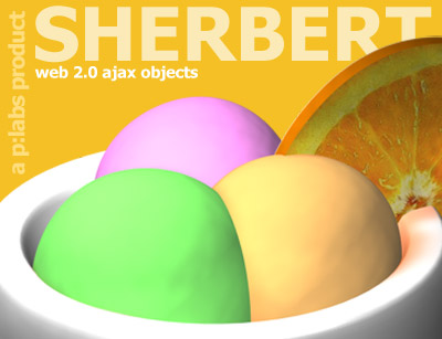

image taken from: https://blogger.googleusercontent.com/img/b/R29vZ2xl/AVvXsEgYwlxWGQmAg1BBV4PKWN9Z6hD9Canm0jW1EqzZtjkE4jppKNPSwrYfdRJVdTvWITM87k3rXuBEzCbJgd6TGF2GzPFc7NZax_1Lcvq43iRc1gzlxsgBuuzQHYa5H0lPDhjKM4lW_rh0JUc/s320/sing_it_loud_album_art.jpg

image taken from: http://fc02.deviantart.net/fs26/f/2009/238/a/3/Nike___Crazy_Color_by_mtmac.jpg
Above are four examples of advertisements and/or logos that can be accompanied with an instructional training session. I have chosen these images because they are great examples of enhancing or limiting Extraneous Load, when instructional designers choose colors.
Extraneous Load is defined as "The type of cognitive load that is based on content irrelevant to the important message"(Linda 2007 p. 46). This definition refers to images or colors (in this case) that take away from the important content. Now, this does not mean images have to lack color, like example 3, because that would create extraneous load. Nor do the colors we choose for our images have to contain vibrant colors, like examples 1 and 2, because that would create extraneous load. However, limiting extraneous load means that instructional designers need to be more cautious of color choice.
The Bad and The Ugly
When we examine the four above choices, which ones do you think is the best example of LIMITING extraneous load?
Example 1--I have no idea of what is going on in this picture. I think that the loud and vibrant color choices in this image take away from the main focus of this image (which is the woman...I think). When we look at the colors chosen in this image, it causes the viewer to focus more on the background than the woman in the picture. This picture is a great example of color choice enhancing extraneous load.
Example 3--This picture is an example of choosing dull colors, which distract the viewer from the logo's main content "Sing it Loud Come Around". If you focus on the "Come Around" text at the bottom of the logo, it is a very obscure grey color. This color, in my opinion, is two shades lighter than the white background. The color chosen for the "Come Around" creates more Extraneous Load, because the viewer is trying to understand what the text actually says. Thus, this image is another great example of color choice enhancing extraneous load.
Example 4--This last picture is a great example of color choice enhancing extraneous load. The colors in this picture are so loud and vibrant that it causes the viewer to focus on them and not the shoe that is being sold in the picture. Did you even see the shoe that is being marketed? Once again, this picture is a great example of color choice enhancing extraneous load.
The Good
Example 2--This image in my opinion is a great example of smart color choice that limits extraneous load. Anyone who has had ice cream sherbet knows that it is colorful and delicious. Well, this picture capitalizes on this known fact and the designer uses it well to market the sherbet. The colors are very vibrant, but in my opinion they fit very well into the picture. Once again, this is a great example of color choice limiting extraneous load.
Conclusion
As we move into the world of work, please be cautious of the colors you choose enhancing or limiting extraneous load. If you can think of any examples of color choice enhancing or limiting extraneous load please upload them and thank you for reading this blog! Have a great and enjoyable snowy weekend!
