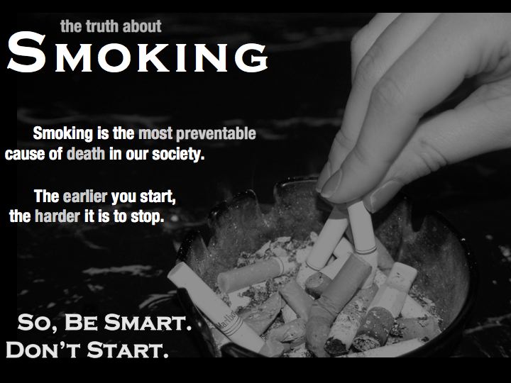
I took the photograph of the cigarette being put out and decided to use it to represent the mindset of putting cigarettes out. I made sure the photo was slightly transparent to the black background so it would not compete with the information about tobacco, although I am unsure if the photo is too much. I included two strong facts because I did not want to cluster the image with too many words and I thought these two facts would be most efficient for the learner to be engaged with the image. I put important key words in a light grey to grab the focus of the learner to pay special attention to the facts about tobacco. The image ends with a catchy slogan, “Be Smart, Don’t Start” and is in the same font as the main focus: “Smoking” in the Title.
Well designed. Is the writing a bit too close to the edge? I almost feel like it could be moved over a little bit. Also, I would remove the "so" in the Be Smart Don't Start slogan. Really like the black and white, works well for this poster.
ReplyDeleteGood use of image, contrast. Try using text that is flush left with a larger margin on the left side. Your picture bleeds off the page on the right side, but not off the top or bottom. Each of those have distinct margin. Be consistent in your use of margins.
ReplyDelete