Saturday, March 10, 2012

Web Activity 8-Icons


I repeated the same border and colors throughout the icon.  I chose the colors because there was a lot of contrast between the background and the font color.  I did a lot of busy design with the alignment, proximity, and repetitions boxes and left the contrast box a little plain.  I did this so that there would be more contrast between this box and the others.

Web Activity 7

I chose to do the Atom as my interface.  As you can see this particular picture is dedicated to the diagram of the atom but as you continue the students will learn more about the different parts the atom has.  I use repetition and color coded each part of the atom.  I then color coded the labels and arrows pointing to the parts as a way to separate and highlight that each part is unique in their function within the atom.

Eric - Web activity 8

Here's the web activity. I put contrast twice so one can see the contrast of both words in both spaces.

Web Activity 8

For web activity 8, I decided to use more color to help show the differences between contrast, alignment, repition, and proximity. I changed the way that proximity was shown, and I also changed repition because I didn't feel that the repeating N really represented what repetition was.

Friday, March 9, 2012

How Apple Does It


For this week’s blog post I decided to focus on the trends and ways in which Apple has revolutionized an entire industry. One of the most notable things about Apple is its unusual way of doing business. Unlike other high-tech firms, Apple chooses to focus on multiple sectors of the high-tech industry. In an article recently published, the author notes that:


"Apple makes its own hardware (iBooks and iMacs), it makes the operating system that runs on that hardware (Mac OS X), and it makes programs that run on that operating system (iTunes, iMovie, Safari Web browser, etc.). It also makes the consumer-electronics devices that connect to all those things (the rapidly multiplying iPod family), and it runs the online service that furnishes content to those devices (iTunes Music Store).”


Because Apple makes its own hardware and software, there exists a sense of full control of its products. Steve Jobs, the CEO of Apple, feel that maintaining control is crucial to the organizations success. Dell, Microsoft, and other competitors, create products that can be access and used on other systems brands, Apple feels that by controlling all aspects of its product, they can ensure that every little thing integrates and works together. The one thing that most Apple product users agree on is its ease-of-use. I know from personal experience, once I purchased my first Apple product, I felt the sense of not being able to live without it. Now that I have expressed a brief understanding of the way in which Apple’s CEO, Steve Jobs, has structured the organization, my next point deals with the releasing of new version s of existing products and services.


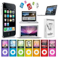
The image on the left shows the various products Apple has release over the last three decades. Although other product releases are of significant impact, I would like for you to focus on the period from 2001 to the present.


Apple General Timeline or Product Releases


2001 marked the release of the iPod and the OS X operating system,


2004 the iMac G5


2005 the iPod Nano,


2006 the iMac & Macbook Pro


2007 the first iPhone and Apple TV


2008 App Store


2009 revamp the iPhone to include video calling, iPod line of Nanos, iPod Touch,


2010 Macbook Air, iLife, Facetime, iPad


2011 iCloud, Mac OS X Lion iPad2


2012 iPad 3…


As you look through the various product upgrades and releases Apple has done, I begin to wonder how much of it is a “marketing scheme” or actually new and improved devices. The iPod touch, once only used for music, now comes with a camera, although the iPhone camera technology existed prior to the new upgrade. The iPad did not originally come with a camera. The iPad progressed from no camera in version 1, back camera in 2, and not the back and front facing camera in the most recent version. The iPhone 4 has front and back camera unlike the iPhone 3, however the iPhone 4S has the newly added feature of Siri. What are you opinions on the upgrades and new releases of Apple?


Thoughts!!!


  1. Do you think instead of releasing a new product or upgrade every 6 months, Apple could possibly combine all “upgrades” and “new features” into one?


  2. Is this merely a way to keep users coming back and purchasing the next best NEW Apple product?


  3. Do you think Apple upgrads and new features are truley "new and improved" versions of their existing products?

Source:


http://www.time.com/time/magazine/article/0,9171,1118384-1,00.html


http://www.reuters.com/article/2011/03/02/us-apple-timeline-idUSTRE72170T20110302

Thursday, March 8, 2012

Web Activity 8

These are the icons I created for Web Activity 8

Background: http://stockfresh.com/image/165688/hexagon-metal-background

Kendra's Web Activity 8

I decided to use one of my own photos to create CRAP. As you can see, some of the categories can overlap (for example, proximity - could also partly represent repetition). Other than that, I wanted to use an image because that's what helps me remember concepts best - when represented by an image and accompanied by words!

Kendra's Middle Matters Brochure - Draft 1


Above is my first attempt at the brochure for Middle Matters. I still tried to incorporate the theme from my poster, which contained an image of a ferris wheel and had the line "Come take a ride with us!" I also tried to match the colors to the image that will appear on the back of the brochure. Any feedback is appreciated! Thanks.

Web Activity 7

Sorry this is late but here is the interface that I created. I decided to play around and create a new JMU Apple operating system call "OS iDuke", of course designed by the great students of the AHRD program. As you can see, the menu on the screen shows users the different modules that learners can interact with.
Image Source:
http://www.flickr.com/photos/skynoir/6943670933/


http://the-best-top-desktop-wallpapers.blogspot.com/2011/01/purple-wallpapers.html


http://tw.rpi.edu/web/org/JMU


http://officialpsds.com/iPad-Safari-PSD42165.html


Web Activity Eight

Wednesday, March 7, 2012

web activity 7


One of the lessons I taught during my student teaching was on Energy transfer.  I think this would have helped the students to grasp the concept of the different members of a food chain if I had created a visual more like this one where they can see what part of the chain I am talking about. 


Monday, March 5, 2012

Web Activity Seven - Client Project

As the Teaching Assistant in LTLE 485, I often get questions about the requirements outlined in the syllabus. All the information is in the syllabus, of course, but because it's paragraph after paragraph of information it can be overwhelming and difficult to digest. Visually representing the material as I've done here would serve as a nice supplement to the course syllabus next semester. When a component of the Design Documents is selected, it becomes bold and brings up a short description.

Sunday, March 4, 2012

Web Activity 7

I chose to do the solar system for my web activity. This would be for elementary or middle school students.

Kendra's Web Activity 7

I created my activity to run interactively. Obviously, since we have to save them as images, this wasn't possible. So, the first image represents the "whole" of the lesson, which is the History of M&M's. The viewer can click on one of the four M&M's to read about the history, ranging from 1940 to now. The division of years is the parts to the whole.


The second image represents the "parts" of the lesson. This is the page or slide the viewer would see when clicking on one of the M&M's from the homepage. The logo M&M's in the top right corner takes the viewer back to the homepage.

The color of the bullets on this image are blue to correspond with the larger blue M&M. The other pages would have the color of the M&M correspond with the larger M&M in the right hand corner.


Web Activity 7

I created this interface for a lesson that is taught in the capstone course of the HRD minor at JMU. The lesson is on module drafting, and includes a basic module floor plan. This floor plan has 8 components, which can be seen in the navigation menu on the left side of the image. When one component is selected, the main content about that component will show up in the box toward the right of the image.


Feedback is appreciated! :)

Web Activity 7

I chose to use a "Blackboard Course Management" theme because I seem to be in blackboard a lot these days! To the right, are menu items, the one addressed in this portion is bold and a brighter shade than the others. The title of the course is at the bottom, and the screen shot, which is the focal point of this image, is the largest portion. I used call out boxes to give instruction and added numbers as well as tiers to give users an idea of what order they should proceed in. Any feedback is welcomed!

Renee's Web Activity 7 - Baseball Positions

Color: The repeated red and tan throughout keeps the color consistent.
Repetition: The repeated diamond reminds the viewer of the baseball diamond.
Alignment: The baseballs are aligned across from each other. Each of the positions are aligned across from each other as well.
Proximity: The names of the positions are close to the position on the field. To make the diagram even clearer, four of the positions have arrows demonstrating their field positions.

Activity 7-Explorers


The explorers are a third grade SOL. Each child is responsible for knowing the explorers sponsor, years of exploration, reason for exploring and achievements. Feedback is appreciated!

Web Activity 7-- Dingo

As I am working on a digitally delivered training for Juniata College entitled Safety and Security for Short-Term Study Abroad Leaders, I took the opportunity to use Web Activity 7 to do a mock-up of how a web site might organize the training content. I have been a beta tester for the new Adobe codeless web design product Muse (code name). This program allows one to design web sites merely with tools typical of design layout programs such as InDesign. The below screen shot shows the page in Muse one can use to plan the layout of the different pages in a web site.


The bottom page defines the master or what will be present on every page. My master has a tiled map background, a blue header, a lighter blue box for text and a horizontal menu that links to my main pages-- Home, Legal Concepts, Pre-Departure Tools and On-Site Procedures.

Each of my main pages are defined at the top of the planning screen with nested or 'child' pages for content relating to each main page below it. Below are my main pages with content that will be expanded in nested pages listed in blue.

Home

Legal Concepts

Pre-Departure Tools

On-Site Procedures

If you like what Muse can do with no coding by the designer, you can download a free copy from the Adobe site to use without charge while it is still in the beta testing stage. Muse's release, under a different name, is expected sometime in the first half of 2012. It will be sold as a subscription service after it is released.

Matt Dingo
March 4, 2012

Eric - Web Activity 7

I chose a grammar elearning unit. To address the overall unit organization the title "Grammar E-Learning" is at the top followed by the sub-heading "parts of speech". This sub-heading indicates the unit of information to be conveyed. Next, I have a sidebar that shows all subordinate units under the parts of speech. This is indicated by a callout box pointing to the desired word which is also pronounced by a bold, italicized and larger feature than the other units. This indicates clearly which unit one is in. The large callout box that's grey on the right side has the appropriate information according to each corresponding word on the side.

Activity 7

I used Matter as my topic for Activity 7.  The information is geared toward lower elementary students.

Morgan McMullin