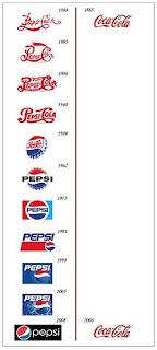
Great Post! I enjoyed looking through the blogs you listed to see how people create various logos. I also loved the Coke vs. Pepsi example. I agree that a company logo should have at least part of the logo be a timeless element. This helps people recognize the company even if there is a shift in the items they are trying to market.
I also think that it is interesting how memorable logos can be. The image only showing one letter of a logo was amazing at how many I thought I knew! I also found this picture (from: amsterbrand-emilio1982.blogspot.com) when looking through other logo examples:

What do you notice when you see the image? When one looks closely they will start to see why the logos seem a bit off. I had to look closely at this image to notice that the logos were not with the correct label. Do you think that logos can represent multiple companies even thought they were created with one specific company in mind?


