Wednesday, April 8, 2015
Picture Book/Manual/Website Decision Guide
When considering our upcoming picture book/manual/website assignment, I have found myself going back and forth on which platform to use to display my information.
I was tempted to do the picture book simply for the challenge. It relies heavily on our use of images to interpret our story or message. However, given the fact that my audience is a group of high-potential professionals, I don't think this is the best platform. If you are brave enough and feel this platform fits your audience then I found a site that I think will help ensure a powerful picture book!
Check it out:
http://www.rif.org/us/literacy-resources/articles/getting-the-most-out-of-picture-books.htm
Next I considered the website option. I have previously created a website using Wix-which I would HIGHLY recommend. It's an extremely user-friendly application that builds a nice clean website! However, given my intentions, I didn't feel that I had the quantity of content suitable to create an entire website. I found a website that gives great insight when designing and developing your webpage which also ties in nicely with the expectations we have learned and Kara's CRAP model post.
Take a look:
http://www.socialmediatoday.com/content/24-things-consider-when-designing-and-developing-website
When I finally decided that something important to my cause of driving associate's everyday development is their Individual Development Plan (IDP), I was able to determine my best route-the manual. Currently, there isn't a great deal of direction for associates filling out their IDP. I intend to use what I've learned so far in this course to develop a Kohl's oriented manual. I found yet another walkthrough for a manual design that incorporates images.
One more time:
http://www.wikihow.com/Create-a-User-Manual
I hope you find these links helpful and that your decision comes easy!
Good luck!!!
Tuesday, April 7, 2015
Kara's Main Post: C.R.A.P. Principles of Design
So awhile ago, I was in the Belk here in Harrisonburg, and I came across an instructional poster. Immediately I thought about this class and began critiquing the visual. In doing so, I thought about what a great post this would make! Below is the photo I took of the poster. I enhanced the brightness a bit so you could read it better.

What are your thoughts?
I thought it would be interesting to show you all and get your opinions on the poster and how well they incorporated the four principles of sound design - Contrast, Repetition, Alignment, and Proximity. If you need a refresher, I found a great article/presentation on the different principles of design: C.R.A.P. Principles of Design
I personally am not sure how I feel about the numbering and and placement of the captions. I also feel that it looks to be a little bit crowded. Maybe more white space is needed? I think if the designer had focused more on proximity and knowing that grouping things closely together creates the idea that they are related, he/she may have separated the different captions and images of the shirts/bow tie a little more. I know it's also a minor detail, but the line on number 6 is not centered with the box like the other lines are. I also think it's odd that number four has no line when the others do.
What are your thoughts?
Monday, April 6, 2015
Rob Morgan Final UI
I did not change much between my rough draft and final draft. As per suggestions I minimized the black line under each of the options and I moved my logo over to the right slightly.
There was a suggestion to add buttons to my content but I've been in a flat design.minimalistic design mood recently when it comes to eLearning design. I like the idea of having the button simply be text without the shaded box around it. I'm not sure how long this will last but right now I am liking the "apple" simplistic design model. While it is lost in a screenshot the actual eLearning module would have states built in so that when a user hovered over a menu option the colors would change which I think would assist with the idea behind why I should add a button shape.


There was a suggestion to add buttons to my content but I've been in a flat design.minimalistic design mood recently when it comes to eLearning design. I like the idea of having the button simply be text without the shaded box around it. I'm not sure how long this will last but right now I am liking the "apple" simplistic design model. While it is lost in a screenshot the actual eLearning module would have states built in so that when a user hovered over a menu option the colors would change which I think would assist with the idea behind why I should add a button shape.
Erin Murphy Storyboarding in Edu. Blog post
In teaching one of the main goals is to have students understand the connections between lessons. Storyboarding can be an ongoing activity through out the unit. Storyboarding can be an anchor activity at the end of the lesson. It also provides a tool to help students organize their thoughts about a lesson and or unit.
In this PPT I found backup as to why using Storyboarding strategy to help students conceptualize a unit.
http://www.slideshare.net/DamianGordon1/storyboarding-in-education
You can use some of these ideas to help explain systems,which is great for a science teacher. History and English lends themselves for storyboarding because you can tell a story, and plan out the characters.
Sunday, April 5, 2015
RET's Interface
Had a bunch of good feedback from the group. I tried to implement the changes however I have been getting hung up on some of the coding. I decided to show an example I do have working and keep some of the others as they were until I can find a way to fix some of the background issues. Hope you all like it:


I didn't change too much on the home page. I would like to add in a footer that is fixed however that keeps messing up when I add it after the buttons. Additionally I tried adding some javascript for the buttons but the animation is a little slow.
Within the star talks page the objective is to give new planetarium employees a concept of what a star talk is and how to give one. A video explaining star talks would eventually replace what is here and a star talk generator would be added. This page was the first that I changed the background of per Jen and Rob's comments. A little difficult but should be doable on all pages.
Jordan's Final Interface

I used Adobe Muse to make my website/interface because the program helps you organize your work as you build the website, and even gives you a nice visual flow of your web navigation as shown above. All I had to do when I finished with the site was grab a screenshot!
As for the website, feel free to navigate it if you like! I made this for the band I play in sometimes out in Winchester.
Here's the link:
Leisha Final Interface
While I liked my Doodlekit Design, I ultimately went with Wix because there is just so much more you can do on the website. I tried to use white against the purple for contrast, and I'm trying to focus on only using colors from my logo, focusing on the orange, purple and green. I don't think Yellow has a good web presence and I want to switch the blues over to purple. Switching the color of every piece of text is very time consuming, so it's not all finished quite yet. I reorganized the different pages and subpages to hopefully make a little more sense. I also tried to incorporate some more symbols and images to help direct the viewer.
Here is the new page layout...


Here is the new page layout...
 |
| Menu Bar |
 |
| Banner Logo is used at the top of every page. Colors are Purple, White, Green, Orange and some Blue. |
 |
| Symbols are used to help direct the viewer. |
 |
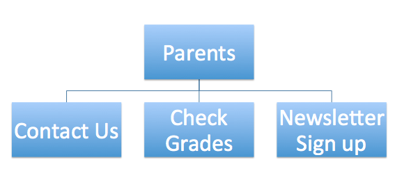
| Team Welcome Page (Names will eventually be hyperlinked) |


Erin Murphy interface design


Amanda Leech Interface Final


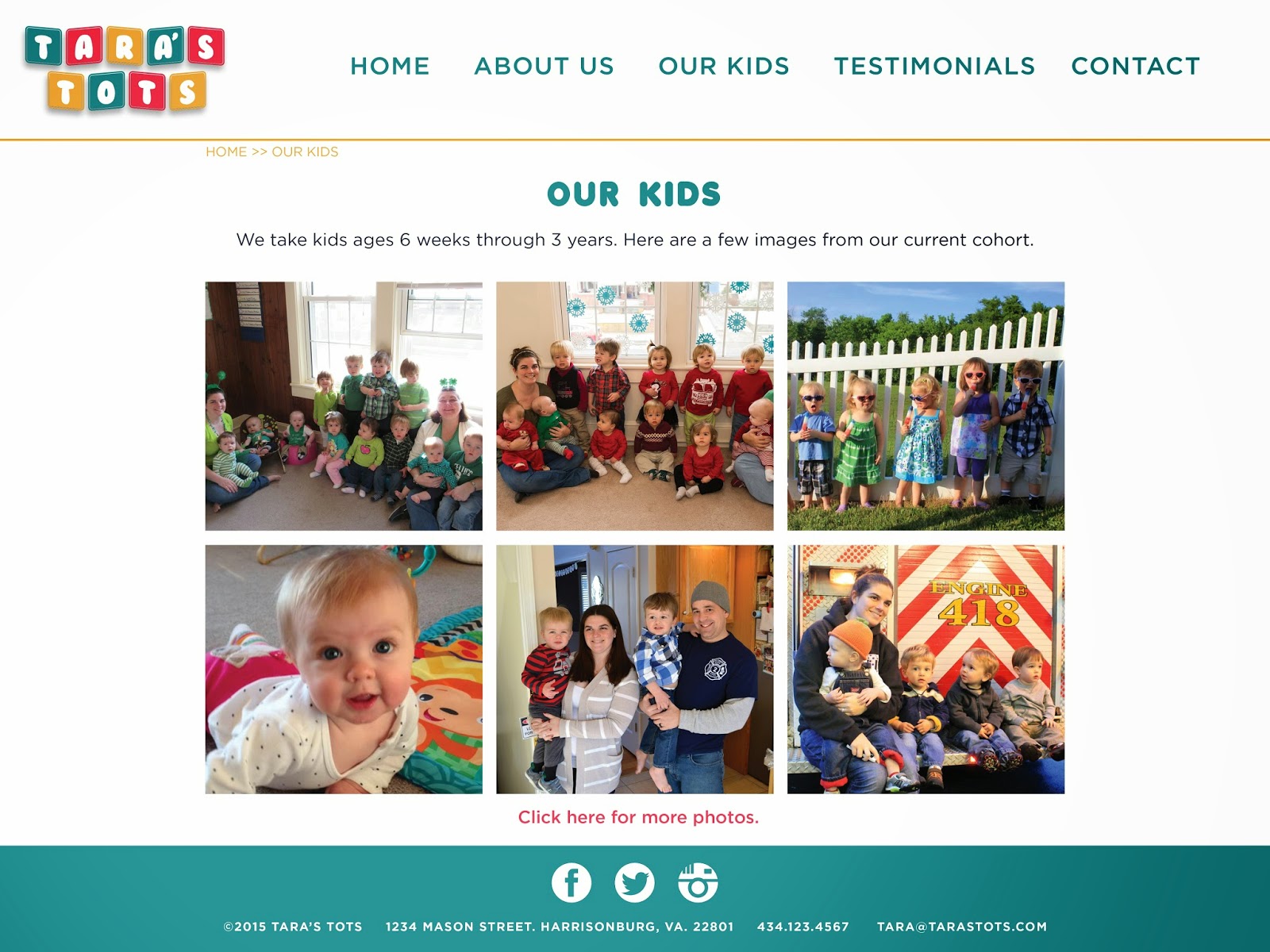


Here is my final interface design. I took the feedback from my peer review partner and made some small tweaks, such as adding a breadcrumb at the top so that you can navigate easily through the pages.
Amanda Loeser's Interface Design
I took Leisha's advice and changed my icons to something a little more pleasing to the eye. I am afraid that this takes out a lot of my visuals, but at the same time it looked too cluttered the other way so I am pleased with how this turned out.


Subscribe to:
Comments (Atom)