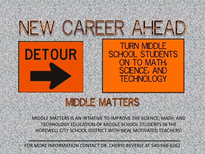
Ok, I had the idea to use road signs as the theme using different road signs on each of the documents - poster, brochure, etc.... so I tried a background to look like a road. All suggestions are welcomed!
Hi Renee! I see what you were trying to do. At first glance, the colors seem a bit of a turn off. However, I can identify with "detour" and the same color for the other sign because of the familiarity with road signs. It is difficult to read the black text on the textured background, but I do like the font!
My suggestion is to find a picture of a road (winding, straight, whatever), then you could either have signs alongside the road explaining the program OR have the road come to a T or end and use your idea of a Detour sign. You could also show some other signs like the intersection sign, or one of those "Harrisonburg 10 miles -->" Does that make sense? I hope this helps! Let me know if you have any questions!
Hey Renee, I think your idea and concept is great however I have a couple of suggestions. Try to stay away from using patters within text (looks pretty cool) but can be hard to read. You may want to consider darkening the concrete background and changing the text color to white.
The title is catchy, try using a font that is a little bit bolder "impact" to allow it to stand out a little bit more. Overall GREAT job!!!
Renee, How about using the shape of a standard road sign for the box that contains "turn middle school students on..." Maybe the shape of a caution sign? If you don't like that shape, how about a different one? If you were to do this and then implement the suggestions made by Kendra and Brad, I think your poster would be in good shape. If you want to see some examples of potential road signs, go to: http://www.alphabetsigns.com/signs/c/TR02.html
 Ok, I had the idea to use road signs as the theme using different road signs on each of the documents - poster, brochure, etc.... so I tried a background to look like a road. All suggestions are welcomed!
Hi Renee! I see what you were trying to do. At first glance, the colors seem a bit of a turn off. However, I can identify with "detour" and the same color for the other sign because of the familiarity with road signs. It is difficult to read the black text on the textured background, but I do like the font!
ReplyDeleteMy suggestion is to find a picture of a road (winding, straight, whatever), then you could either have signs alongside the road explaining the program OR have the road come to a T or end and use your idea of a Detour sign. You could also show some other signs like the intersection sign, or one of those "Harrisonburg 10 miles -->" Does that make sense? I hope this helps! Let me know if you have any questions!
Hey Renee, I think your idea and concept is great however I have a couple of suggestions. Try to stay away from using patters within text (looks pretty cool) but can be hard to read. You may want to consider darkening the concrete background and changing the text color to white.
ReplyDeleteThe title is catchy, try using a font that is a little bit bolder "impact" to allow it to stand out a little bit more. Overall GREAT job!!!
This comment has been removed by the author.
ReplyDeleteRenee, How about using the shape of a standard road sign for the box that contains "turn middle school students on..." Maybe the shape of a caution sign? If you don't like that shape, how about a different one? If you were to do this and then implement the suggestions made by Kendra and Brad, I think your poster would be in good shape. If you want to see some examples of potential road signs, go to: http://www.alphabetsigns.com/signs/c/TR02.html
ReplyDeleteThank you for the help!
ReplyDelete