
Saturday, January 31, 2015

Rob's Visual Resume
So...my wife ended up getting induced unexpectedly a few days ago which threw off my timing for working on class projects. But we are back home now with our 1.5 day old baby daughter (Madison Rose) and I have a few minutes to upload my visual resume. I ended up using a website called re.vu they were ok but I would have hoped for a lot more options in regards to customization. You could change themes but not much beyond that.
Rob Morgan Visual Resume
Rob Morgan Visual Resume
Friday, January 30, 2015
Jen's Visual Resume
I'm apologize everyone that I am late getting my draft up! I completely mixed up the peer review process due dates and thought that we were supposed to have our drafts up by Sunday because I was referencing the due date that was showing up in Canvas. I'm an idiot. In the future, I need to remember that the Canvas calendar doesn't show the due dates for our drafts! Whoops!
I decided to use Illustrator to design my visual resume. I used some of the graphics that I had used to design my website last semester. I also chose a complimentary color scheme so that when it is uploaded to the website it complements the visuals that are already in place there. I also tried to use similar shapes to capitalize on the "repetition" factor of design. So, there are a lot of circles. Thus far, I like most of the layout and elements that I have. However, I need to work on the bottom banner. The "hobbies" section just doesn't take up the proper amount of space. So, I might try and find some different visuals or a different infographic to use there. I also want to somehow set the gray background apart more from the white box. I still need to add in all of my learning experience data. But, I wanted to get this posted ASAP so that I didn't hold up my peer review partner (I'm so sorry, Katie!). I would appreciate any and all feedback since I've never attempted a visual resume before!
Edit: I've continued to play around with my resume and think I've figured out how to fix the bottom. I also added a QR code that links to my website. Other than that, I just did some more fidgeting with centering, coloring, etc.
Thursday, January 29, 2015
Leah Waite's Visual Resume

Above is my attempt at a visual resume! It's certainly a fun idea but I'm not sure that I would ever consider submitting one for professional review. Please let me know how I can spruce this up!
Thanks!

Christy's Visual Resume Draft

Wednesday, January 28, 2015
Katie Bowser Visual Resume Draft

I am a music educator, so I created my resume around a musical staff, with a modern-art style with the treble clef and sharp key signature (which I created), use of silhouette clip-art, and the simplicity of using only 2 colors. Each section of my resume has it's own spot in the spaces of the staff, with art that correlates with it's heading. I only used Times New Roman, with 3 font sizes and 2 colors based on it's importance.
Mariya Khan's Visual Resume Draft
Okay, so I actually am quite surprised at the amount of time that this took me to complete. For some reason, I had so many ideas in my head, but I was so limited with what I could actually create since I do not have too much experience in photo editors. Interestingly enough, manipulating the photo editors took more time and effort than actually coming up with the idea. I used Photoshop to create my visual resume and I enjoyed using it. I did try to use an application that I have never used before so that I could gain the experience and to ensure that using these applications would become easier in completing future assignments.

This is the visual resume that I am able to upload onto Blogger. My more recent one (that actually looks a bit more visually appealing) was unable to be uploaded. I chose the color scheme because it represents colors that I pretty much use on a daily basis (in my classroom, room, etc.). I also designed a "Smartboard" at the bottom of the page to demonstrate my experiences throughout my teaching career so far. I know it isn't the absolute best in terms of creativity, however, I am still working on it and I am completely open to suggestions in order to clean it up a bit!
Robert Turner's Visual Resume
About three years ago I started this assignment. I wanted a visual resume but didn't necessarily want to learn all the software necessary for creating the images in it. After some poking around on Google I found Vizualize.me and made a resume using it. I gave it a quick update and put a link (through the picture) to it below:

Resume generators are very cool and I think they are a great project to give a intermediate level code student. The idea is that there are templates and that a user will fill them in. The downfall of this system is that the creative control is mostly lost (not all...I still could control color and select which cookie cutter theme I wanted to use).
Several years ago I had realized this and started to embark on making a visual theme of my own. My code of choice was LaTeX, a typesetting language. I have used it to create reports before. The best thing about it is the output, pdf files that no amount of emailing around or zipping will destroy the format. I have tried to use LaTeX for a visual CV and this is my draft thus far:

%%%%%%%%%%%%%%%%%%%%%%%%%%%%%%%%%%%%%%%%%%%%%%%%%%%%%%%%%%%%%%%%%%%%%%%%%%%%%%%%%%%%%%%%%%%%%%%%%
%SHORT CV TEMPLATE by Robert Evans Turner
% Creative Commons Attribution HTML: <a href="http://creativecommons.org/licenses/by-sa/4.0/" rel="license"><img alt="Creative Commons License" src="https://i.creativecommons.org/l/by-sa/4.0/88x31.png" style="border-width: 0;" /></a><br /><span property="dct:title" xmlns:dct="http://purl.org/dc/terms/">RET Short CV LaTeX Template</span> by <a href="https://www.blogger.com/www.robertevansturner.com" property="cc:attributionName" rel="cc:attributionURL" xmlns:cc="http://creativecommons.org/ns#">Robert Evans Turner</a> is licensed under a <a href="http://creativecommons.org/licenses/by-sa/4.0/" rel="license">Creative Commons Attribution-ShareAlike 4.0 International License</a>.<br />Based on a work at <a href="http://www.robertevansturner.com/2014/11/23/short-cv-template/%20%E2%80%8E" rel="dct:source" xmlns:dct="http://purl.org/dc/terms/">http://www.robertevansturner.com/2014/11/23/short-cv-template/ ‎</a>.
% Please attribute and share. Thanks.
%%%%%%%%%%%%%%%%%%%%%%%%%%%%%%%%%%%%%%%%%%%%%%%%%%%%%%%%%%%%%%%%%%%%%%%%%%%%%%%%%%%%%%%%%%%%%%%%
%Document Setup
\documentclass{article}
\usepackage[utf8]{inputenc}
%Title, author, and date
\title{RET-Short CV 2014}
\author{Robert Turner}
\date{September 2014}
%Necessary packagementation and such
\usepackage[top=1cm, bottom=2.5cm, left=1cm, right=1cm]{geometry}
\usepackage{eso-pic}
\usepackage{graphicx}
\usepackage{pifont}
\usepackage{color}
\usepackage{stmaryrd}
\usepackage{amsmath}
\usepackage{wasysym}
%Optionally set a primary, secondary, and tertiary color for labeling
\newcommand{\PrimaryColor}{black}
\newcommand{\SecondaryColor}{black}
\newcommand{\TertiaryColor}{gray}
% Choice of white, black, red, orange, green, blue, cyan, magenta, purple, yellow, or gray
%Optionally include a background image
\newcommand\BackgroundPic{
\put(0,0){
\parbox[b][\paperheight]{\paperwidth}{%
\vfill
\centering
\includegraphics[width=\paperwidth,height=\paperheight]{OrangeBKG.jpg}%
\vfill
}}}
\begin{document}
\thispagestyle{empty}
\pagestyle{empty}
%\AddToShipoutPicture{\BackgroundPic} %Add a custom background image
%%%%%%%%%%%%%%%%%%%%%%%%%%%%%%%%%%%%%%%%%%%%%%%%%%%%%%%%%%%%%%%%%%%%%%%%%%%%%%%%%%%%%%%%%%%%%%%%%%%%%%%%%%%%%
%
% Contact Information
%
%%%%%%%%%%%%%%%%%%%%%%%%%%%%%%%%%%%%%%%%%%%%%%%%%%%%%%%%%%%%%%%%%%%%%%%%%%%%%%%%%%%%%%%%%%%%%%%%%%%%%%%%%%%%%
\begin{minipage}[t]{0.3\textwidth}
~\\
\includegraphics[width=0.75\textwidth, keepaspectratio]{PersonalImage.jpg}
\centering
\medskip
\textbf{\LARGE{\underline{\textcolor{\PrimaryColor}{Oldman Youngs}}}}\\
\medskip
\normalsize123 Sesame Street\\
Newtontown, KS 54321\\
(555) 487-9930\\
Your.Email@gmail.com\\
YourWebsite.com\\
~\\
%%%%%%%%%%%%%%%%%%%%%%%%%%%%%%%%%%%%%%%%%%%%%%%%%%%%%%%%%%%%%%%%%%%%%%%%%%%%%%%%%%%%%%%%%%%%%%%%%%%%%%%%%%%%%
%
% About Me
%
%%%%%%%%%%%%%%%%%%%%%%%%%%%%%%%%%%%%%%%%%%%%%%%%%%%%%%%%%%%%%%%%%%%%%%%%%%%%%%%%%%%%%%%%%%%%%%%%%%%%%%%%%%%%%
%\noindent\includegraphics[width=6cm, keepaspectratio]{AboutCloud.png}\\
%\includegraphics[width=3cm, keepaspectratio]{AboutCloud.png}\\
\centering
\noindent\LARGE{\textbf{\underline{\textcolor{\PrimaryColor}{About Me:}}}}\\
\medskip
\normalsize\noindent Write a short section about you. Some good starting points come from Michael Goldberg's TED Talk (http://tedxtalks.ted.com/
video/Rediscovering-Personal-Networki) Specifically at 16:00. Use Profession, Expertise, Environment, Call to Action. Write that and an interest and your about sections should be full!\\
~\\
%%%%%%%%%%%%%%%%%%%%%%%%%%%%%%%%%%%%%%%%%%%%%%%%%%%%%%%%%%%%%%%%%%%%%%%%%%%%%%%%%%%%%%%%%%%%%%%%%%%%%%%%%%%%%
%
% Skills
%
%%%%%%%%%%%%%%%%%%%%%%%%%%%%%%%%%%%%%%%%%%%%%%%%%%%%%%%%%%%%%%%%%%%%%%%%%%%%%%%%%%%%%%%%%%%%%%%%%%%%%%%%%%%%%
%These should be very broad categories but still skills. Example - Creative Thinking or Computer Programming. Use the Capabilities section to highlight specific examples and then be ready to back up anything with a good portfolio example.
\noindent\LARGE{\textbf{\underline{\textcolor{\PrimaryColor}{Skills:}}}}
%\noindent\textbf{\textcolor{\PrimaryColor}{}}\\
\normalsize
\begin{align} %add a \talloblong or take one away to show level of proficiency out of 5
\text{Most Notable 1} &: \talloblong\talloblong\talloblong\talloblong \nonumber \\
\text{Most Notable 2} &: \talloblong\talloblong\talloblong \nonumber \\
\text{Most Notable 3} &: \talloblong\talloblong\talloblong\talloblong\talloblong \nonumber \\
\text{Most Notable 4} &: \talloblong\talloblong\talloblong\talloblong\talloblong \nonumber \\
\text{Most Notable 5} &: \talloblong\talloblong\talloblong\talloblong\talloblong \nonumber \\
\text{Most Notable 6} &: \talloblong\talloblong \nonumber \\
\text{Most Notable 7} &: \talloblong\talloblong\talloblong \nonumber \\
\nonumber
\end{align}
\end{minipage}
%%%%%%%%%%%%%%%%%%%%%%%%%%%%%%%%%%%%%%%%%%%%%%%%%%%%%%%%%%%%%%%%%%%%%%%%%%%%%%%%%%%%%%%%%%%%%%%%%%%%%%%%%%%%%
%
% Separating Column
%
%%%%%%%%%%%%%%%%%%%%%%%%%%%%%%%%%%%%%%%%%%%%%%%%%%%%%%%%%%%%%%%%%%%%%%%%%%%%%%%%%%%%%%%%%%%%%%%%%%%%%%%%%%%%%
\begin{minipage}[t]{0.05\textwidth}
~~~\\
%\Letter \\*
%~\\*
%\Telefon\\*
%\Email\\*
%\Keyboard\\*
\end{minipage}
\begin{minipage}[t]{0.58\textwidth}
%%%%%%%%%%%%%%%%%%%%%%%%%%%%%%%%%%%%%%%%%%%%%%%%%%%%%%%%%%%%%%%%%%%%%%%%%%%%%%%%%%%%%%%%%%%%%%%%%%%%%%%%%%%%%
%
% Experience
%
%%%%%%%%%%%%%%%%%%%%%%%%%%%%%%%%%%%%%%%%%%%%%%%%%%%%%%%%%%%%%%%%%%%%%%%%%%%%%%%%%%%%%%%%%%%%%%%%%%%%%%%%%%%%%
\begin{center}
\noindent\LARGE{\textbf{\textcolor{\PrimaryColor}{Experience:}}}\\ \hline
%\noindent\textbf{\textcolor{\PrimaryColor}{}}\\
%\medskip
\end{center}
\noindent \normalsize \textbf{\textcolor{\SecondaryColor}{Internetation Engineer} \textcolor{\TertiaryColor}{\textit{Nov 2081 - Aug 2094}}}
\noindent Give a solid paragraph description of your previous or current job description here. Remember to highlight what you were hired for and what reasons you took the job. Take liberties here if you have space, write projects you started or works that showcase your capabilities.\\
\noindent \normalsize \textbf{\textcolor{\SecondaryColor}{Tinkertoy Executive} \textcolor{\TertiaryColor}{\textit{Dec 2000 - June 2080}}}
\noindent Give a solid paragraph description of your previous or current job description here. Remember to highlight what you were hired for and what reasons you took the job. Take liberties here if you have space, write projects you started or works that showcase your capabilities..\\
\noindent \normalsize \textbf{\textcolor{\SecondaryColor}{Last Surviving 19\textsuperscript{th} Century Dude} \textcolor{\TertiaryColor}{\textit{May 1809 - May 2000}}}
\noindent Give a solid paragraph description of your previous or current job description here. Remember to highlight what you were hired for and what reasons you took the job. Take liberties here if you have space, write projects you started or works that showcase your capabilities.
%%%%%%%%%%%%%%%%%%%%%%%%%%%%%%%%%%%%%%%%%%%%%%%%%%%%%%%%%%%%%%%%%%%%%%%%%%%%%%%%%%%%%%%%%%%%%%%%%%%%%%%%%%%%%
%
% Education
%
%%%%%%%%%%%%%%%%%%%%%%%%%%%%%%%%%%%%%%%%%%%%%%%%%%%%%%%%%%%%%%%%%%%%%%%%%%%%%%%%%%%%%%%%%%%%%%%%%%%%%%%%%%%%%
\begin{center}
\noindent\LARGE{\textbf{\textcolor{\PrimaryColor}{Education:}}}\medskip
\hline
%\noindent\textbf{\textcolor{\PrimaryColor}{}}\\
%\medskip
\end{center}
\noindent \normalsize \textbf{\textcolor{\SecondaryColor}{Institute for University Technology} \textcolor{\TertiaryColor}{\textit{Aug 2080 - Present}}}
\noindent Currently studying full time.\\
\noindent \normalsize \textbf{\textcolor{\SecondaryColor}{84 PhDs in Science Mars University} \textcolor{\TertiaryColor}{\textit{Aug 2030 - May 2072}}}
\noindent Graduated with a 4.0+ major average. Concentrations included Alien Anatomy, Medicine, Neurobiology, Biophysics, Basketweaving, Hyperspace Travel, Hyperspace Hospitality, and Literature.\\
\noindent \normalsize \textbf{\textcolor{\SecondaryColor}{Andromeda Galaxy Study Abroad} \textcolor{\TertiaryColor}{\textit{June 1824 - Nov 1990}}}
\noindent Studied abroad at the nearby Andromeda Galaxy. The space travel might account for my age, not totally sure because I lost track of time out there. You know how study abroads are, mostly just an excuse to have some fun away from home and get college credit. I mean what?\\
%%%%%%%%%%%%%%%%%%%%%%%%%%%%%%%%%%%%%%%%%%%%%%%%%%%%%%%%%%%%%%%%%%%%%%%%%%%%%%%%%%%%%%%%%%%%%%%%%%%%%%%%%%%%%
%
% Other Qualifications
%
%%%%%%%%%%%%%%%%%%%%%%%%%%%%%%%%%%%%%%%%%%%%%%%%%%%%%%%%%%%%%%%%%%%%%%%%%%%%%%%%%%%%%%%%%%%%%%%%%%%%%%%%%%%%%
\begin{center}
\noindent\LARGE{\textbf{\textcolor{\PrimaryColor}{Capabilities:}}}\medskip \hline
\end{center}
\normalsize
\begin{center}
\begin{tabular}{cc}
\CheckedBox Relevant Qualifications & \Square Additional Abilities \\
\end{tabular}
\end{center}
\begin{tabular}{l|l|l}
\Square \text{ Licensed Spaceman } &\Square \text{ PHJava }&\Square \text{ HTML } \nonumber\\
\Square \text{ \LaTeX Typsetting } &\Square \text{ MS-Office Suite }&\CheckedBox \text{ Technical Writing } \nonumber\\
\CheckedBox \text{ Anti-aging } &\CheckedBox \text{ The Science }&\Square \text{ Basket Weaving } \nonumber\\
\CheckedBox \text{ Galactic Language } &\Square \text{ Binary }&\Square \text{ Adobe Futurismo } \nonumber\\
%\Square \text{ WordPress } &\Square \text{ Test Planning }&\Square \text{ Logo Design } \nonumber\\
\CheckedBox \text{ 5D Film } &\Square \text{ Travel Ready }&\Square \text{ Report Design } \nonumber\\
\CheckedBox \text{ Math Background } &\CheckedBox \text{ Science Background }&\Square \text{ Bio-sports Journalism } \nonumber\\
\end{tabular}
\medskip
\end{minipage}
%\hline
\centering
%\textbf{References:}
~\\
~\\
%\textbf{*References available upon request.*}
%\end{parcolumns}
\begin{center}
\begin{tabular}{c|c|c}
\multicolumn{3}{c}{\textbf{References:}}\\
Dr. Flek Blob&Abraham Lincoln XVII&Pope George Paul Ringo\\
illobsorbyou@gmail.com&somuchfreedom@cornerstone.net&whereisjohn@netscape.com\\
(555) 555-5557&(555) 555-5547&(555) 555-5257\\
\end{tabular}
\end{center}
\end{document}
Resume generators are very cool and I think they are a great project to give a intermediate level code student. The idea is that there are templates and that a user will fill them in. The downfall of this system is that the creative control is mostly lost (not all...I still could control color and select which cookie cutter theme I wanted to use).
Several years ago I had realized this and started to embark on making a visual theme of my own. My code of choice was LaTeX, a typesetting language. I have used it to create reports before. The best thing about it is the output, pdf files that no amount of emailing around or zipping will destroy the format. I have tried to use LaTeX for a visual CV and this is my draft thus far:
I think it needs work, personally I like some other designs but could not implement them into LaTeX (yet). Here is the code from the project:
Leisha Martin's Visual Resume Rough Draft

Tuesday, January 27, 2015
Amanda Loeser's Visual Resume Draft

Here is the rough draft of my visual resume. I went through many different layouts, color schemes, font choices, and wordings and finally came up with what I have. I don't know why it took me so long to figure out a design for the one I have up here seems pretty basic. I used canva again because I felt comfortable using it for my poster and figured it would be a great tool for my resume as well. I kept wanting to add more and more text to this resume, but kept deleting things because there was not nearly enough white space. I still feel like there is too much text, but I couldn't figure out what to keep and what to take out. I used two fonts throughout and three colors, but pretty minimally. Let me know what I need to work on and what needs to be added/deleted!
Kara Martinez's Visual Resume

Amanda Leech Visual Resume Draft
.png)
I again chose to use Canva to create my visual resume but this time around had a much more difficult time with the program. Seems as though when you get in to the nitty gritty with it, it has some kinks. I had a difficult time exporting my file, as the formatting would change once I exported my image (did anyone else have this issue with Canva?) and the program does not work super well with moving lots of little pieces, i.e. when I would select a text box, the program would automatically move or change something about the box.
I went with this type of design because the field I work in is very relationship-oriented. I wanted an image of myself on the resume because it helps the reader get a better sense of how I come across in person, which is something that can't be written with words on paper. The colors were visually pleasing and the layout of the text bubbles demonstrate creativity and balance.
Lauren Proctor's Visual Resume

Well here's a draft of my resume! I started several times but I think this is the best compromise I could make between a traditional and visual resume. I used the program Canva. I tried to add more images but I felt that they were decoration and did not serve a representational/ organizational purpose. I settled for including written information for my education/experience but including the images at the bottom for the extracurricular activities. If the interviewer wants to talk about them I could elaborate, but they each serve a purpose; whether it is an activity I participated in, professional community I am a part of, or certifications I have. Let me know what you think!
Ashley Caudill's Visual Resume

I had a lot of fun with this assignment. I first, I thought I would never use it, but after designing it I think I could definitely use it! I designed my resume in Photoshop, I had a LOT of rough drafts and different color schemes, but this look became my favorite.
Monday, January 26, 2015
Sketchnoting (Visual Notetaking)
After reviewing several of the posters I saw that several folks do the same thing I do - journal designs. Personally I like to write down lots and lots of notes and even go back and make them look neat. A few years ago I found out that this is a practice called sketchnoting, practicing note-taking using a combination of text, images, and structure to emphasize content. It relates heavily to visual literacy. Here is a general overview of the process and several links to good articles on the subject:
Basics of Visual Notetaking
Sketchnoting in Web Design
Basics of Visual Notetaking
Sketchnoting in Web Design
Sunday, January 25, 2015
Christy's Mindforge Fractions Poster
Initially, I approached this assignment from the perspective of a parent trying to help their own struggling child. I think my mind jumped to this idea because I am a parent of a four year old, and I also figured that a parent would be the one ordering this software. In that frame of mind, I was going to use the image below because I thought it would grab a parent's attention if they knew their child was struggling with math.

Image from:
After reading Dr. Wilcox's additional comments in Canvas, I changed my approach. Strange as it may sound, I was more intimidated to design a poster appealing to kids than I was when I was planning it to appeal to adults....So, this was a good learning experience for me. Since my son is at the young end of the age range for this product, I really tried to filter my design decisions through his perspective as much as possible. I know that many children love both dogs and pizza, so I used that as my starting point to create the image at the top. I think it was an excellent idea to use food as the basis for the fraction lessons, so I continued with the pizza theme. I tried to depict a brief story, complete with a hungry dog, some humor in the dog's recognition that he had no food, and satisfaction once he used the power of fractions to eat the appropriate dog-sized serving of pizza (in a hypothetical cartoon world where dogs eat pizza, haha).
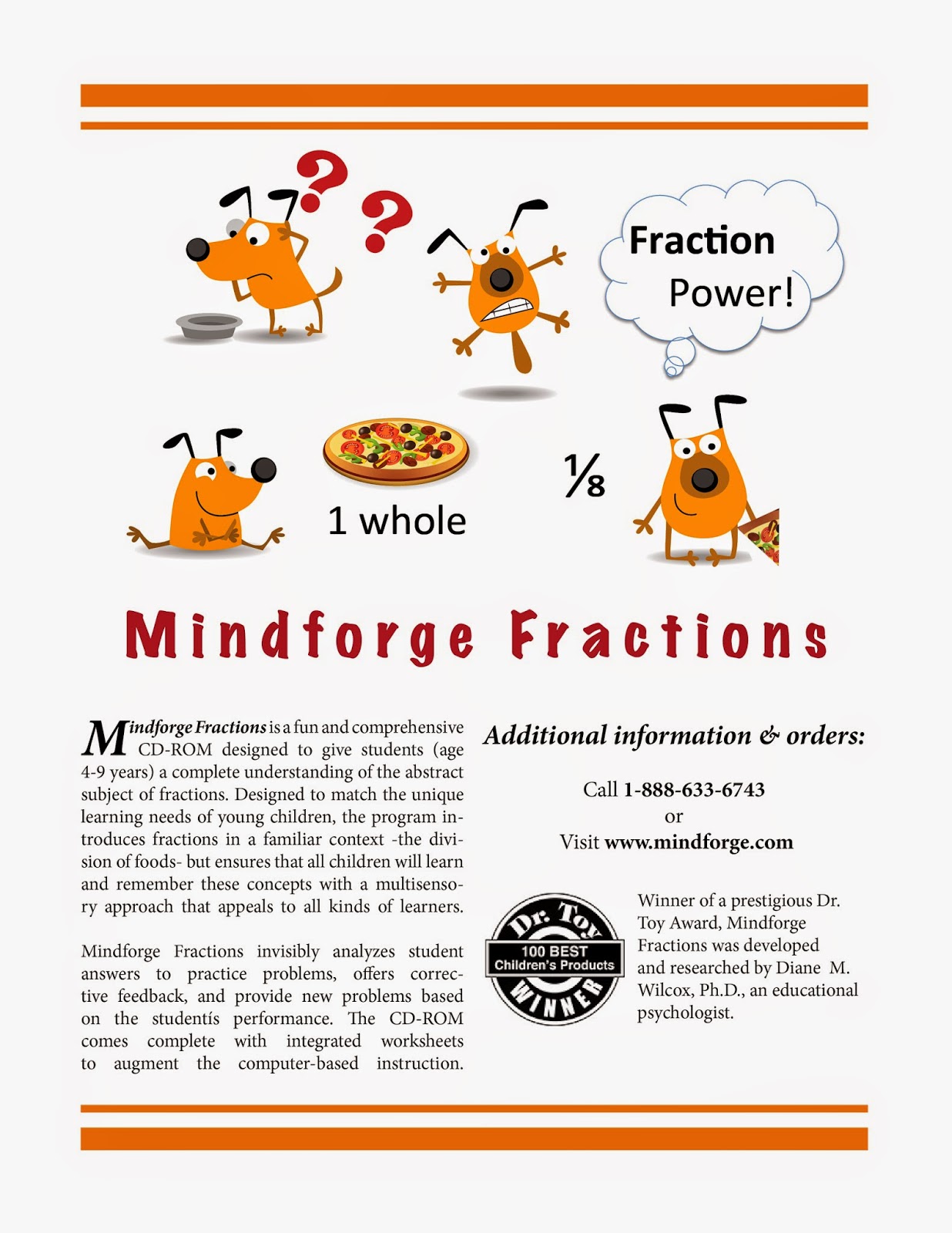
I used two programs in this project: I created the visual in Microsoft PPT and exported the slide as an image. It was more efficient for me to use a program that I know well for tasks that don't require the advanced features of other programs. I chopped up the images I had collected and arranged them in a way that I liked, then I experimented with the quality of different file formats, which helped me to understand the material on file types in the Canvas modules. A pdf worked the best for my graphics, and I further enhanced the resolution and visual quality of the image file in Photoshop. My experience with a new program--Adobe's InDesign--came at the final stage, when I was assembling the pieces. I thought the program was somewhat intuitive, and the range of flexibility and control was incredibly fun to explore. I would love to use this application in the future.
I did not write the descriptive paragraphs, although I tweaked some of the text. I took Dr. Wilcox's suggestion to pull the text from the articles that were provided on Canvas. Below I have listed the sources for all the images/ text used in this project.
Cartoon dog
Pizza
Dr. Toy Logo
Text
Jirawat's Poster

This poster is made with Pixlr demonstration a compose of bright orange color and white space background. Using words to depict the fun and delightful feeling. Pixel style font is used as a product name "Mindforge Fractions" to show the technology perspective side and idea.
Robert's GIMP Poster

Amanda's Mindforge Poster
.png)
The first thing I did when creating my poster was to create margins and columns. After that I went on to pick my visual. I knew I wanted something math related as my main image and what better way to represent math than with numbers?! I decided to have my main picture be of playful, colorful numbers. I found this picture by doing a google search and once I saved it to my desktop, I uploaded it into canva. Once I uploaded the image, I stretched it out to cover the top of the poster from left to right. When I did that though it became a bit blurry. I then decided to contrast it to the extreme to see what would happen and that seemed to fix my blurriness problem as well as give my poster a more brighter and creative feel. I figured kids between 5-9yrs old respond well to the brightness and makes looking at numbers a little more fun. Because I did not need a cutline or a "caption" I decided to add a purple line underneath the image to separate the image from the headline to make it look neater.
Next I moved on to playing with fonts and text. Canva is nice because it gives you plenty of options to choose from when creating texts. After clicking on about all of the options, I finally decided to stick with two fonts; Fredoka One and Special Elite. I used two lines from the websites provided to us about the game and adding in the bubble text.
As I am writing this, I am realizing that the bubble with the question in it might have been better to put as the last thing on the right side of the page since that is the last thing the audience would be reading..I feel as though that that is more creative than the quote and might be what hooks the reader?I also decided to add a cow icon as sort of the logo for the computer game because it's not only super cute, but the audience may be able to infer who the character of the game will be.
Overall I had fun making this poster and learning about the Works-Every-Time Layout. It's really interesting how someone figured out what is most visually appealing to people as well as the best way to effectively communicate and relay information.
Images from:
http://www.firstpalette.com/Craft_themes/Alphabet_and_Numbers/Exploding_Numbers/Exploding_Numbers.html
https://shinnichika.files.wordpress.com/2009/01/baka.gif?w=468
Erin Murphy's poster with new software

I really want to incorporate a fraction line into my final poster. I started with the headline on the top, and I really liked the way the headlines looked at the top of the page. I choose the colors black, gray and blue for the poster because I feel the product name is very strong and need colors to show that strength. I used the website pixabay for my illustrations to show that the program uses food to help students learn fractions.
Overall I am very helpful with my final product. Photoshop was a great product to use. I struggled a lot at the beginning but by my 4th layer I felt really confident using it.
Leisha's Mindforge Poster

For
my poster I used a combination of both Pixlr and Sumopaint. With the
exception of a one week Photoshop assignment in my Educational
Technology class, I've never used any sort of image editing software
before, which meant that there was a significant learning curve when it
came to using Sumopaint. After some frustration I resorted to Pixlr to create the top image with the original cow and then transferred that image to Sumopaint,
where I added the pie chart in place of the letter "o" in "Fractions",
and added the rest of the wording and images for the poster. I found Pixlr to be much more user friendly, which helped, because I'm so new at this.
I
wanted to keep the original cow (I mean, come on, he is really cute)
but I wanted to change the color. Red seemed really intense, and not
exactly inviting. I went with the blue
because I think it is less harsh of a color. The original intention
was to have the dark blue offset by much lighter blues and white.
However, since I'm still new at this, all of my attempts to incorporate a
lighter blue resulted in a very tacky picture. I was hoping to use a
lighter blue when I transferred the image to Sumopaint,
but light blue font wasn't visible and when I tried to use a light blue
background, it came out super tacky again. From there I tried to go
sort of minimalist with the dark blue font and white background.
Looking at it now I think it is all too dark and not the inviting blue I
was trying to go for. This picture might appeal to teachers, but not
to the children ages 4-9.
For the overall layout I stuck with the "Works Every Time" design, with the image first, headline, informational text aligned to the right, extra material on the left and the website/logo in the bottom right hand corner. I used "Chalkduster"
as the headline/product font to try and convey that this was a
kids/educational program. In order to make the white letters stand out
more against the dark blue background, I used the paintbrush tool and
outlined each letter to darken the pixels. To create a representative
image, I used the pie shape piece in Sumopaint to replace the "O" in fractions. I also searched Mindforge and found the Mindforge design logo, and the Dr. Toy Winner stamp, which I used in the bottom right portion of the poster.
I'm upset that I feel like I had to compromise my original design because I could not get Sumopaint
to cooperate. It would freeze, or delete text, or fail to save layers,
which was all very weird and frustrating. By doing this assignment I
learned what worked, what did not, and what I would change if I could do
the assignment again.
Images collected from
Jen's Mindforge Poster
Hi all! I tried to do a lot of brainstorming before beginning my actual poster, which was a good thing because I changed my mind some many times! Here's a picture of my chicken scratch!

I designed my poster for a teacher/parent audience, and not specifically for kids. At fist, I played around with using a balloon image where the balloon would be sectioned into a pie chart. I was going to have a tag line say, "Up your fraction game." I gave up on this concept, however, because I ultimately didn't find that the balloon/pie chart idea really translated that well. Then, I began to play around with new names for the software. I came up with several ideas, but Fract/Fun was the one that clicked. (The line between the words, is supposed to be a fraction line.) The tag line, "Play Math. Learn a Ton." immediately came to me. I loved it because it conveys that math can be learned via playing games....and, it rhymes. Bonus. :)
I tested out a bunch of poster making software before I began, as I hadn't heard of a lot of them. I looked at Smore, Posterini, Postermywall, Sumopaint, and Pixlr. The first three were too "template-based" for what I wanted to create. I ended up using Sumopaint, Illustrator, and Photoshop to create or tweak graphics. I used InDesign to layout my final product. I was not very familiar with any of these programs, except for Illustrator and Photoshop, which I used once last semester in Dr. Wilcox's class. I found Photoshop and Sumopaint to be fairly similar in their interface. I like working within layers. Sumopaint, however, gave me some trouble. First, when I was working with multiple layers, it sometimes didn't show me which object was selected at any given time, which made it kind of hard to build complex shapes. Also, it was also unable to upload several of the larger resolution graphics that I wanted to tweak. I tried to download the program, but you have to pay for the pro version. Photoshop was great, although it definitely has a steeper learning curve. I used Photoshop to create the Fract/Fun banner at the top of the arcade. Once I had all of my images finished, I created my poster in InDesign. InDesign also has a steep learning curve. However, I was able to watch a couple brief YouTube videos and learn enough to do my simple layout.
For the aesthetics of my poster, I started by picking a color palette. I chose this palette, because it had so many vibrant colors and it seemed very kid-friendly. I created all of my images using source images that I downloaded from Vectorstock. I definitely wanted the poster to convey a gaming theme. I found an arcade graphic, changed it to my color palette, and then added the cow, pizza, talking bubble, and big title on the top. For the poster background, I designed a graphic that uses blocks to create a top and bottom border. I used these blocks because they seemed like video game pieces and they also convey the theme of "building." Since this software aims to build knowledge, it seemed like a perfect fit. Lastly, I selected my fonts. I settled on Orbitron because it looks like an arcade/robotic font. I used it for all of the main text. Next, I went through my font library to try and find one that paired well with Orbitron. I thought Ubuntu Condensed was a nice complement. I used that for all of the secondary text.
The only thing that I'm not totally happy with is the layout of the secondary text, bullet points, and logo. I tried a one-colum layout, and that seemed worse. I tried putting the bullet points on the right side and the text on the left. Ultimately, I think that I would change up the logo and then re-work the layout. Anyhow, here's how it turned out:
Poster using Sumopaint

Poster with New Software: Mindforge Fractions
The poster I developed was based off
of Dr.Wilcox’s Mindforge Fractions software. In creating this poster, I
utilized the “Works-Every-Time-Layout.” Before I began, I set up the margins
ensuring that there was enough white space on all four edges of the poster.
I also went ahead and set up the two columns within the margins. I used these
columns to center and organize my text. I placed the image at the top of
the layout because people tend to look at images first. I then wanted to
attempt the cutline, and when I did, I made sure it was flushed to the left and
was directly underneath my image. I attempted to make my headline eye-catching
through the use of a larger font and used the same color as the frosting on one of the cookies/donuts through the use of the eyedropper. I also tried to find a similar font to the one used on the food, which I found Comic Sans to be the closest. Following the headline, I wanted to include some information about Mindforge
Fractions, so I copied and pasted information from the Applelinks website that
talked about Mindforge. I made sure that the font used for the informational
text was transparent by using the Times New Roman font. I
also used a couple of tags in one of the columns by including the phone number and
website address for those who may be interested in purchasing Mindforge
Fractions. The last thing I did was the border. I felt like the poster needed something to bring it all together, so I used the eye dropper tool to get the color of one of the pink donuts and used that color as my border.
To do all of this, I used SumoPaint. There were times when I became frustrated with it because I would do something such as add text, and when I went to add another layer, it would disappear. I would then have to retype everything again. The assignment took longer than I expected, but I learned a lot through trial and error.
References
Laster,
Nicole. Food Fraction Fun! Photo.
Retrieved from http://bookbuilder.cast.org/view_print.php?book=46450
22 Jan. 2015
Macintosh
News: Fractions Made Easy. (n.d.). Retrieved January 23, 2015, from
http://www.applelinks.com/staff/tif/98jul/980721mindforge.shtml
Mariya Khan's Poster
When I initially began this assignment, I had it in my mind that although this is geared towards children, there will be a huge market for teachers and parents (a wide variety of adults). My thought was, that if the market for the adults is much greater, then maybe I should create a poster geared towards them. However, the more I thought about it, the more I began to realize that I need to brand a poster for the company that captures the attention of both young children and adults.
Trial 1: (where I started - poster for the adults)

Side note: More of an interpretive illustration for adults.
I have definitely learned a lot about how to format visual images. Before I completed the readings, I failed to realize how commonly mistakes were made when creating visual images (some of which, I have made in the past myself). Such as, not providing enough margin space, or even the fact that putting an image at the top of the page will help to capture the attention of the intended audience. Therefore, when I drafted my ideas for the graphic, I continued to think about what image would be the most effective in capturing the attention of the intended audience.
Once I reviewed the directions several times, I decided to use Pixlr to create my images. Since I have minor exposure to image editors, I decided it would be beneficial to refine those skills in order to ensure that the graphics I create in future assignments, will be more purposeful. Meaning, I will spend most of my time thinking about what I would like the image to look like in order to meet the needs of my audience, rather than still learning about the application I am using.
Poster Number 2 (Assignment 1 - Final Product)
Geared towards both adults and children

Side note: When I created the image, I thought about what both children and adults are drawn to. My elementary kiddos love social media, so I thought this would be more effective than the first.
Subscribe to:
Comments (Atom)