
Saturday, January 24, 2015
Leah Waite's Poster
Lauren Proctor's Poster
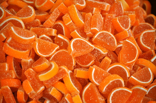
I struggled to find an image that I
thought would represent Mindforge Fractions appropriately. Therefore, I went with the direction of
food because it sounds like that is what the program uses to teach the fraction
concepts. I settled on candy,
because what do children love more?
The image at the top is divided evenly like fractions and I chose bright
colors to intrigue kids. Then, I
thought it was important to include the description at the bottom. After all, it is the parents that need
to be persuaded to buy the product.
I used Canva to design this
poster. The program was very
simple and user friendly. I think
I will continue to use Canva in the future. I only need basic design elements as I do not plan on
pursuing graphic design; the limited options do not deter me. Many of the more interesting elements
cost $1 each and I can see how this could quickly add up.

Images:
Amanda Leech: Poster Assignment

I had a lot of fun coming up with a concept for this poster, but found that my lack of artistic abilities made it more difficult to execute than I originally thought. First, I thought that a fun way to rebrand this product would be to do a Ninja who slices foods in to different fractions (i.e. the user has to slice the food in to the fraction presented). I am not sure how copyright works, since there is already a fruit ninja app for the iPhone, but I thought that might add to the appeal. Kids are exposed to so many different games and the idea I had was that this game could appeal to that sense but trick them in to learning while playing.
I chose to use Canva to make my poster because I had not yet used it and it seemed very easy. It ended up being a pretty simple program to use, and the Works Every Time format made it easy to decide how to lay everything out. I thought that the orange color would be appealing, as well as the colorful fruit. I did decide to go with a more script-like font, which the WET format suggested not to do, but it worked so well with the design that I had to stray from that one particular aspect of the format. If I were to give myself some critical feedback I would say that this is a little more adult than the age range, but my thought is that the top half of the poster appeals to children, while the overall design would appeal to parents that are ultimately purchasing the product.
Ashley Caudill: Poster Assignment

I decided
to use the program called Sumopaint for my poster. I have heard that Sumopaint is similar to
Photoshop and since I know Photoshop pretty well, I thought Sumopaint would be
less of a learning curve for me. Overall,
for a free software Sumopaint is great, the tools and layout are almost
identical to Photoshop. I had a couple
issues when working with Sumopaint, one of the main ones was using the text
tool, when I was trying to enlarge the text, if it happened to run off the
page, it would delete the text that bled off the page. This made me quite frustrated because I had
to keep creating a text layer and enlarging the size until I got it to the size
I wanted. The second issue I ran into
was the free transform tool, when I was trying to use it, instead of selecting the
entire image to enlarge it like I’m used to in Photoshop, I had to outline the
image, and if I didn’t outline the entire image, it would only enlarge what was
inside of the transform box. Other than
those two issues I ran into Sumopaint seemed quite easy and a suitable software
to make a poster, it just took me a couple tries to figure out how to use certain tools.
For my
poster I wanted to make it appealing to children as well as informational for
parents. I thought having a cartoon
chef with a pizza as well as common words and numbers they see in a math class, would both appeal to children and compliment the title, Easy As Pie. I tried to use gender-neutral colors when
designing the poster as well as colors that seemed fun and bright. I tried to follow the “works everytime”
layout, which I think I was quite successful with. I changed the logo to a square clipart image
because I felt the shape of that logo worked better with the layout of the
poster as well as fit with the fractions theme.
Overall I
found this assignment to be surprisingly more difficult than I would have
thought, I can’t quite figure out why, but I think it had to deal with the limitations of making
sure every design element and layout decision fit within in the “works
everytime” layout parameters, which I am not used to when designing posters. This layout is definitely something I will make sure to follow in the future, but it will take some time getting used to.
Sources:
[Untitled illustration of a chef]. Retrieved January 24, 2015 from http://www.clipartpanda.com/clipart_images/find-the-perfect-clip-art-1782137
[Untitled illustration of pizza fractions]. Retrieved January 24, 2015 from https://www.etsy.com/listing/156508958/cheesy-pizza-fractions-mega-clipart-set
[Untitled illustration of a fractions logo]. Retrieved January 24, 2015 from http://blog.richmond.edu/openwidelookinside/archives/3295
Friday, January 23, 2015
Rob Morgan Poster Assignment
I decided on a program called canva.com based solely on the fact that we mention it in a class I teach on Cascade at JMU. In that class I usually discuss pixlr.com but recently the SME I work with told me he prefers canva.com so I thought I would take a look. The site was simple enough although very fee based for anything but the most basic tools.
I read Chapter 3 in WSINYE and, since this is not my area of expertise, I decided to grab a blank sheet of paper and draw along with the suggestions while reading.
Here is what I came up with as a template/rough guide.

My final poster is not exactly what I started with but it is close. Here is the poster I created.
.png)


But none of them felt quite right. The only one that I thought worked well on my poster wast the girl with the spear but since I had no idea what the fraction software would be I couldn't tell if she would make sense on the poster or not. I also felt like she needed a male counterpart and I could not find one I liked.I found the cow on pixabay.com and it was a CC0 image meaning that the author has given up all rights and it is in the public domain now.
I chose red for the color at the top of the poster since I thought it caught the eye. I chose yellow in the bottom since I wanted the poster to have a fun colorful feel. I'm sure there is research around it, but I didn't look it up, but I am always drawn to something that has won an award. Not only does that help ease any teacher, parent, administration fear about a child playing a game but I feel like even as a kid I liked winning stuff and the fact that the game is associated with an award would make me think it was better even if I had no clue what that award was for.
I'm not sure if the new software has won anything but the original software was a Dr. Toy 100 best in 1998. The image that I ended up with, of the cow, was the closest I could find to the original cow. I thought that even if the software was new or redone it should carry something from the original so I brought the cow along to connect the new product with the original product.
The catchphrase on the bottom was adjusted a few times throughout the process. I started with "Are you in?" then switched to "are you game?" which I really liked but I questioned the grammatical correctness of it. So I finished with "Are you ready?" putting the emphasis on YOU. I played with a few different fonts but I wanted something looked handwritten and fun. I had read an article that said when marketing to children you should hook their curiosity and challenge them. I think the oversize cow makes you curious but it doesn't give much away about what the game is. And the catchphrase at the bottom is a direct challenge. Are YOU ready, can you handle this, are you up for this game?
And that is how I got my poster.
Tuesday, January 20, 2015
Amanda Leech Main Post- A Complete Guide to Visual Content
Found a great blog post about visual content that applies to what we're working on in this class. I also liked how it relates to your own personal social media- I've noticed a lot of my friends in the creative arts doing more of these practices only to see their social media numbers skyrocket. I've never personally thought about my own "brand" but it's something to consider as I move through this class and how I want to be represented to the outside world.
Lots of good stuff in here: rule of thirds, new programs for creating content (has anyone every used Canva?), and my personal favorite:

Lots of good stuff in here: rule of thirds, new programs for creating content (has anyone every used Canva?), and my personal favorite:
This chart displays colors and how they are perceived. Great for determining what colors to use in a visual depending on the message you're trying to convey. Definitely bookmarking this for future reference.
Ashley Caudill Main Post: Tips for Creating E-Learning Visuals
Most of us will have to create visuals sometime in our career, but what makes a great visual versus a bad one? Inserting a random picture makes my visual more effective, right? Should I use a bulleted list or infographic? Do visuals really make a difference?
Most of us have probably asked ourselves some of these questions or similar ones. If you are like me, you might get nervous when creating visuals for new clients or might not know where to even start.
Luckily, SHIFT E-Learning has created a checklist to help avoid common mistakes when creating visuals. Most people associate the “4 Cs” with diamonds, but this checklist is the “5 Cs”… not as exciting as diamonds, but this will probably end up being more useful to you in the long run.
Here is what I took away from the checklist:
Clear: Make sure the message you are trying to convey is clear. Use images with a purpose, if the image doesn’t help the user understand the content better, DON’T USE IT!
Concise: Visuals should represent information related to the content, if it doesn’t get the point across, doesn’t make sense, or makes the content more confusing, DON’T USE IT!
Connected: Make sure all elements on your graphic relate to the information you are explaining. Learners shouldn’t have to make the connection themselves, it should be understood.
Compelling: When working with visuals make sure they are both eye-catching and related to the topic at hand. Visuals should reiterate the information presented.
Consistent: Make sure the visuals have the same feel and look throughout your entire presentation or course. Staying consistent in the visuals will help brand your course.
Hope these “5 Cs” will help you when creating visuals in the future. Do you have a certain set of rules you follow? Do you agree with this checklist? Do you think there should be more or less rules?
Here is a link to the article if you are interested:
http://www.learndash.com/tips-for-creating-elearning-visuals/
Source: J. Ferriman. (2015, January 14). Tips For Creating ELearning Visuals. Retrieved from http://www.learndash.com/tips-for-creating-elearning-visuals/
Subscribe to:
Comments (Atom)