1. All text, scant pictures. A bad brochure has lots of text and almost no pictures.
2. All paragraphs, no lists or subsections. One sign of a bad brochure is text content that are made of all paragraphs with no lists, no subheadings and no sub sections.
3. Wild font style, Lots of font styles. A bad brochure has a wild font style or it has lots of different font styles.
4. No pictures of people. A bad brochure has no pictures of people.
5. Too many colors. Another big sign of a bad brochure are layouts with too many colors.
6. No call to action. A call action such as “call now”, “buy now” or “join now” is important in brochures.
I think the article is still debatable, for Instance picture of people. I don’t think that all brochures must contain pictures of people. It really depends on what is the point or purpose of a brochure. If we create a brochure for informing audiences about detail product descriptions, I don’t think it is necessary to put pictures of people on the brochure.
What do you think about the signs of a bad brochure? Do you agree with those signs?
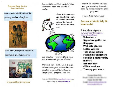
The following is an example of a brochure.

What do you think about the brochure? What wrong with it?
Hopefully by knowing signs of a bad brochure, we can avoid them in order to create a good brochure.