Initially, I approached this assignment from the perspective of a parent trying to help their own struggling child. I think my mind jumped to this idea because I am a parent of a four year old, and I also figured that a parent would be the one ordering this software. In that frame of mind, I was going to use the image below because I thought it would grab a parent's attention if they knew their child was struggling with math.

Image from:
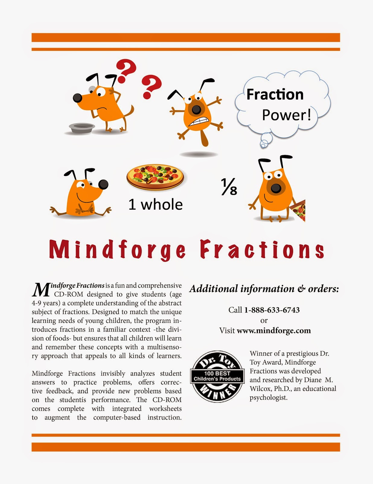
After reading Dr. Wilcox's additional comments in Canvas, I changed my approach. Strange as it may sound, I was more intimidated to design a poster appealing to kids than I was when I was planning it to appeal to adults....So, this was a good learning experience for me. Since my son is at the young end of the age range for this product, I really tried to filter my design decisions through his perspective as much as possible. I know that many children love both dogs and pizza, so I used that as my starting point to create the image at the top. I think it was an excellent idea to use food as the basis for the fraction lessons, so I continued with the pizza theme. I tried to depict a brief story, complete with a hungry dog, some humor in the dog's recognition that he had no food, and satisfaction once he used the power of fractions to eat the appropriate dog-sized serving of pizza (in a hypothetical cartoon world where dogs eat pizza, haha).
I used two programs in this project: I created the visual in Microsoft PPT and exported the slide as an image. It was more efficient for me to use a program that I know well for tasks that don't require the advanced features of other programs. I chopped up the images I had collected and arranged them in a way that I liked, then I experimented with the quality of different file formats, which helped me to understand the material on file types in the Canvas modules. A pdf worked the best for my graphics, and I further enhanced the resolution and visual quality of the image file in Photoshop. My experience with a new program--Adobe's InDesign--came at the final stage, when I was assembling the pieces. I thought the program was somewhat intuitive, and the range of flexibility and control was incredibly fun to explore. I would love to use this application in the future.
I did not write the descriptive paragraphs, although I tweaked some of the text. I took Dr. Wilcox's suggestion to pull the text from the articles that were provided on Canvas. Below I have listed the sources for all the images/ text used in this project.
Cartoon dog
Pizza
Dr. Toy Logo
Text
I love the dog, Christy! Definitely age appropriate and you used the works every time layout really well. The only thing that I would suggest is that you make the headline a little bigger and with a slightly more playful font to match the dog images. Other than that, great work!
ReplyDeleteThought this was a very effective poster Christy. Great job. Keeping to a few colors really helps to bring the theme together. If I was to offer one critique (and I am digging for one) it would be to keep fonts more consistent. The comment and the title could stem from the same font and, as Amanda said, the headline could be a little bit larger. Again, excellent job.
ReplyDelete