So, my poster is obviously missing images, but that is because I haven't been in a real classroom to take the pictures I need. My dad is going to try to take some pictures in his classroom tomorrow so I have something to work with. If not, I may have to change my idea.
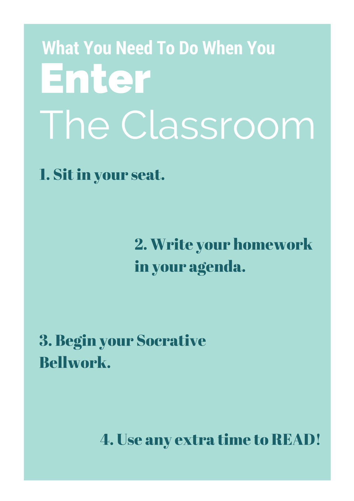
I used Canva and duplicated the pages to work in layers. I think my poster is kind of boring and clearly static. Any advice on how to make this poster more dynamic (but clear to understand) would be greatly appreciated.
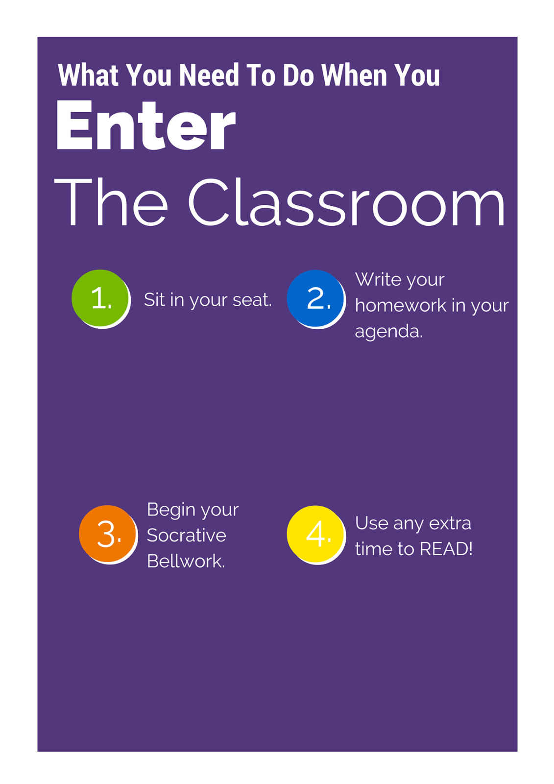 |
| I used the colors from my updated logo and attempted to create some contrast with the purple and white. |
 |
| In the blank spaces I want to insert alternating images. I like this color scheme, I think it is calm and inviting, but the white might be difficult to see. |
|
|
Leisha, It looks like a great start. I love the purple color and the way the numbers are circled. It really draws your eyes from step to step. What will your focal point be? My only suggestion on what you have so far is to make sure you have consistent margins. In the top poster the "your" seems really close to the edge. Can't wait to see what you end up with!
ReplyDelete