I used Canva to design a brochure for the 4H center where I work. They sometimes have a hard time hiring for their seasonal positions, so I think they could really benefit from some advertising. I chose to stick with the green, blue and white used in the logo. All of the images are from either my personal stash of pictures or from their Facebook Page. The brochure folds out like a normal trifold brochure. (The brochure case at the facility only holds those types. Otherwise I would be more inclined to create a more unique brochure design.) I think I need to play with my margins a little. Can I make this more exciting? What are some principles we have talked about that I am ignoring or omitting? Thanks for any critique!
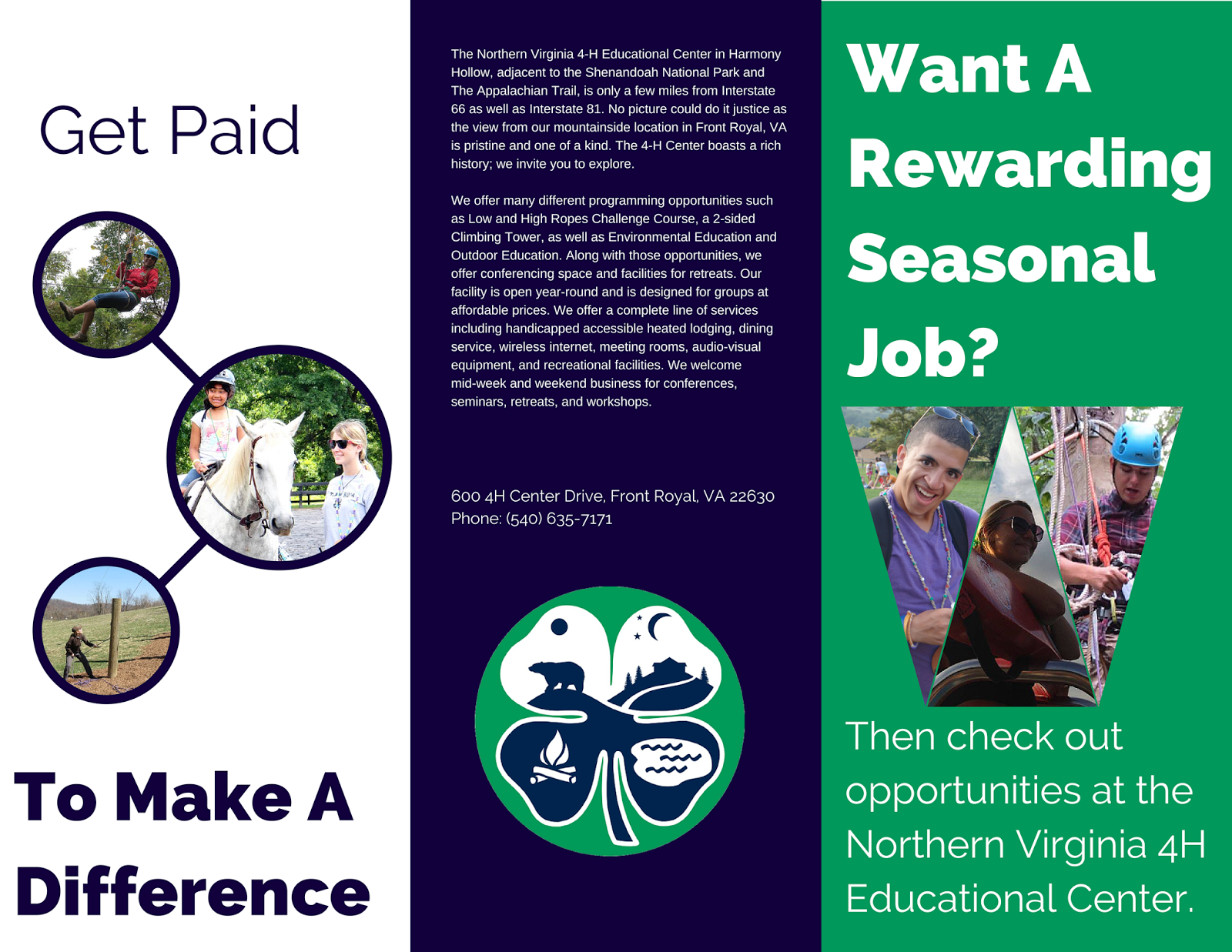 |
| Outside |
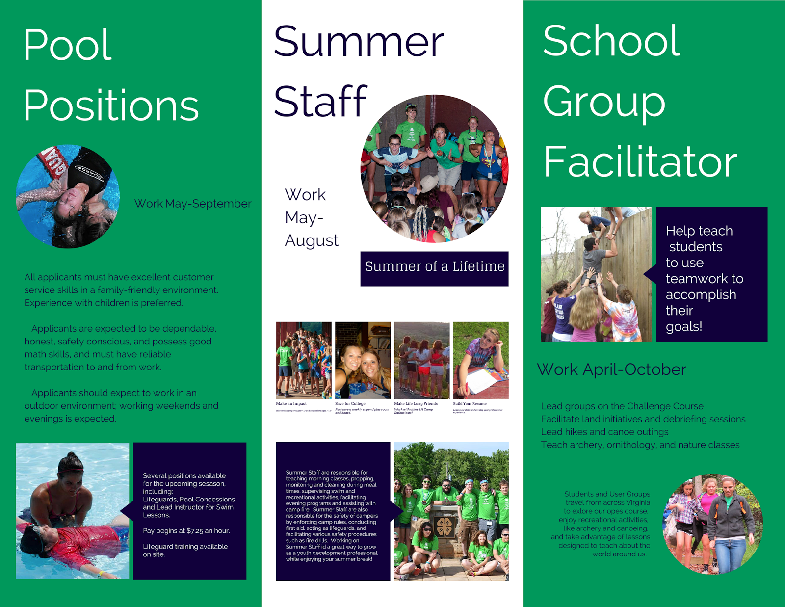 |
| Inside |
Hey Leisha!
ReplyDeleteI realllyy like your brochure and like that you decided to stick with your camp. I think if I stuck with my poster idea my brochure would have been easier...
I like that you used all three colors on all of the pages and that they all have a little different of a layout. The only thing I would suggest is to use more symbols instead of pictures. For example, where you have pool positions, maybe put a symbol of water? or where it says get paid, you can have a money symbol? or on the rewarding page, you can have a thumbs up somewhere? I just know for my assignments i've used mainly "decorative" pictures, but Ms. Wilcox would like to see more symbols being used to replace those decorative pics. Other than that, I think it's really good! Nice work!