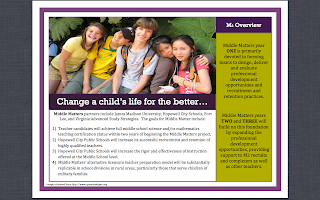

For my Middle Matters draft I used a template in Word to get the columns aligned correctly and then went back and took out their design and created my own, the template was only used to get my columns straight-the design and colors are my own. Any feedback is appreciated!
Looks great, Jessica! It goes well with your poster. I like the repetition of the green and purple - and the photo is great!
ReplyDeleteJessica--
ReplyDeleteThis is laid out very well. All the colors, fonts and boarders work well together. I like how the brochure opens up to a full page spread.
I'm not sure the content in the green box is necessary for the brochure's audience. There was not, however, much guidance given for the content. I might include contact info on the inside also. That way it could double as an 8.5x11 poster.
Matt
thanks renee and matt! great idea about making the inside similar to a poster!!
ReplyDeleteJessica!
ReplyDeleteit looks great!! I love the colors together and one page spread when the brochure is opened. Everything is displayed and laid out very nicely too. It is easy to read and it flows when you read it. I also like the questions on the front to draw attention to viewers. The only little thing I can see is the information on the back that is boxed in looks a little trapped, maybe just having it there without the box around it?
It looks great!! Good Job!
-Sarah