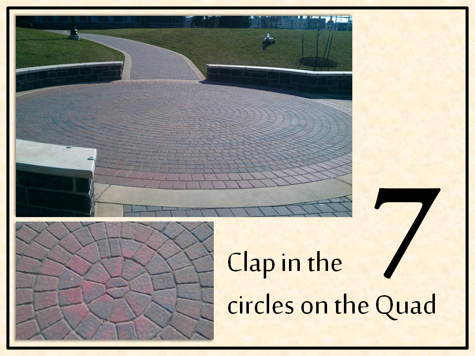
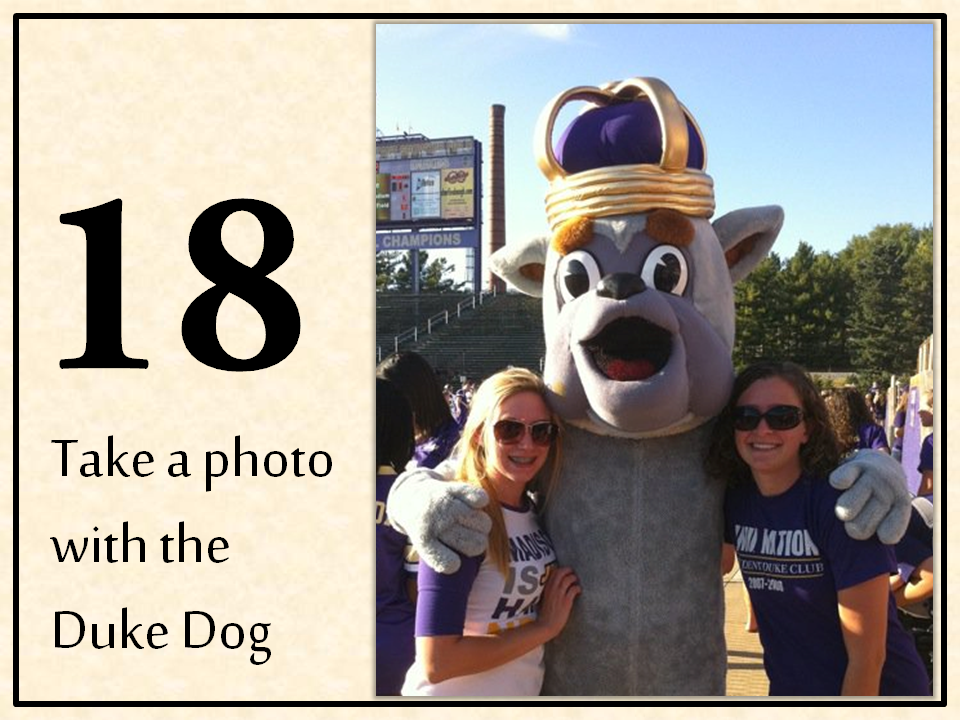
Here is my Picture book so far! I am still in the progress of trekking around JMU to fill in the gaps in photos. Let me know your feedback on the ones that I have finished though so I can implement your suggestions as I continue to move forward! Thanks, guys!











Great concept - i'm excited to see the finished product.
ReplyDeleteMy only feedback has to do with the placement of the number. Some are on the back ground, some are on the pictures and some are overlapping both - its hard to see the color of the number on the darker pictures. Consider finding a more consistent placement for them.
Let me know if you need company for #20 (enjoy a Kline's flavor of the week) picture taking!
Oh yes I do! Gonna be up near the 80s for a few days! Let's go get some Kline's:
DeleteWolfe Street: week of April 4 Red Raspberry
Main Street: week of April 4 Pnut Butter Cookies n Crm (<- 2 flavors or one mashed together?!)
I love this theme! I know we had been talking about JMU bucket list before graduation; I am glad you were able to put it to use. I agree with Catherine's comment about the number placement, it is not very consistent. I can see that you were probably changing it up as far as the layout but I think if you just stuck to changing the layout of the pictures rather than the pictures and numbers then that would fulfill the consistency ruling. Even if you put the number in two different places and alternated them throughout that would give it a more consistent feel than it does now. Another smaller comment I have is that for your number five picture (you with JMaddy), the coloring of your picture is a little dark, especially compared to your other photos. It may just be me, but maybe you could mess around with the lighting on the particular photo. Besides that it is looking good so far!
ReplyDeleteI have my class JMU shirt with the fight song if you need one to photograph :) Let me know if you do.
I do! I never got one so I would really appreciate it. Bring it to consulting class? I'll be over there doing work tomorrow night :)
DeleteI'll change back the numbers. I was trying to vary it for the photo layout but maybe I'll just stick to top right and left?
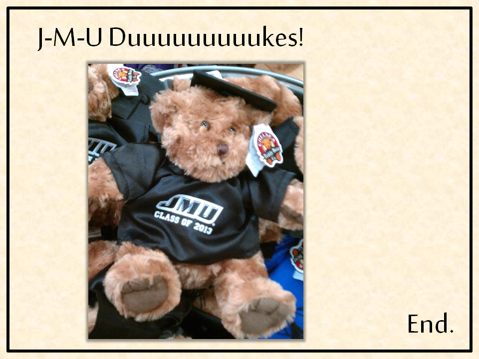
Haha oh I was actually going to say that I like the way you varied your number placement! I think that the placement inconsistency could work if you maybe as long as your number size, font, and background remained the same. I think it is a bit too distracting when the number overlaps the photos, BUT as long as it sits on the beige background on all pages, I don't think it would matter where the actual number sits on the page honestly. Now, if this were a children's book, the placement of the number would probably matter more because young readers would likely get confused easier with the alternation between layouts, but I think for adults (probably your intended audience) the layout alternating adds interest. That's what I think at least! Oh and also, did you make your purple background for the first and last pages? It just looks like the textured pattern was "tiled," because you can see the seams a little. Does that make sense at all? Just something to keep in mind. If you're able to get those seams out though I think it'd be great. Are you planning on adding anything to the front cover? Right now it just looks so empty in the middle, like it's asking for something more!
ReplyDeleteGreat work!
ooooh I just had a random idea and it would probably take too much time to create, but I wanted to throw it at you regardless: What if the positive space of each number (right now, it's the black) was actually from a photo? So like if you had two layers in Photoshop, one with the photo, and on top of it the layer with the number, and you rasterized the number so it was a shape, then selected the number with the magic wand, then did "inverse selection," then selected the photo (in the other layer) and deleted the outside part of the photo so that just the "photo number" showed? Oh gosh...I am probably making no sense! It's so much easier to show people these ideas rather than tell them!
ReplyDeleteI agree with being consistent with the number placement. I think this is a great idea for a book!
ReplyDelete