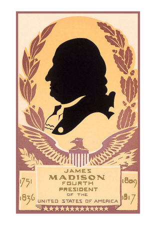
From the options Dr. Wilcox provided, I chose to do my logo, poster and brochure on the Adult Degree Program. Upon looking up information on the department, it is pretty much what it sounds like: a way for adults to be able to finish their degrees around their own lives on their own schedules and it does not have to be in a specialized field of study. That being said, I felt the more important points were to focus on the misc factors that come with being an adult in the program, rather than just the academic aspects of the program. ADP stands for Adult Degree Program, however I made part of the letter "P" into a clock to symbolize perhaps a typical learner in the program and their schedule, the importance of time etc. Instead of numbers, the 12, 3, 6, 9 are silhouettes of a bust of J. Maddy ( to rep JMU), a baby (to symbolize family), a briefcase (to rep a working individual) and finally graduation, which we all hope they will do. I embossed the images and letters, and also made the hands of the clock gold to tie in our JMU colors. I'd appreciate any feedback.

http://cache2.allpostersimages.com/p/LRG/22/2239/ST7ZD00Z/posters/silhouette-of-james-madison.jpg
http://kilenscustom.com/images/baby_silhouette.gif
http://thumb10.shutterstock.com/thumb_small/178900/178900,1213840361,2/stock-vector-briefcase-vector-illustration-13927054.jpg
http://chezmylady.no-ip.org:443/PSP-materiel/Alphabet/KKS~Graduation%20Silhouette/KKS~Graduation%20Silhouette%200.gif

I really like this logo Brandon! Great job! I love the idea of the clock to demonstrate that even though they are in school, there is still time for their adult life.
ReplyDeleteThe clock is a great idea! I second what Austin said. I think if the images in the clock were somehow bigger/easier to see, that would bring this to the next level. I'm looking at it on my laptop and I am having a hard time seeing what exactly the black shapes are.
ReplyDelete