I decided on a program called canva.com based solely on the fact that we mention it in a class I teach on Cascade at JMU. In that class I usually discuss pixlr.com but recently the SME I work with told me he prefers canva.com so I thought I would take a look. The site was simple enough although very fee based for anything but the most basic tools.
I read Chapter 3 in WSINYE and, since this is not my area of expertise, I decided to grab a blank sheet of paper and draw along with the suggestions while reading.
Here is what I came up with as a template/rough guide.
I added the margins, and then split the paper into two columns as was suggested. I decided I wanted my title at the top and I wanted to fill the center with an image. Originally I was thinking I would go with some cartoon characters and maybe warriors. Many of the software boxes I saw online had excited action characters as the focal point and I liked that idea. I also thought I would like to have a slogan at the end as their eyes are drifting off the paper, something that would stick with them. Since the audience is 5-9 years old I wanted a lot of eye-catching color.
My final poster is not exactly what I started with but it is close. Here is the poster I created.
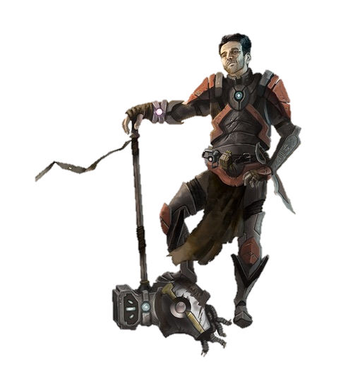
I started with the product name at the top since that is the most important thing. I wanted the kids saying "Teacher can we play with XXXX again!" I played with a lot of warrior and cartoon characters like these:

But none of them felt quite right. The only one that I thought worked well on my poster wast the girl with the spear but since I had no idea what the fraction software would be I couldn't tell if she would make sense on the poster or not. I also felt like she needed a male counterpart and I could not find one I liked.I found the cow on pixabay.com and it was a CC0 image meaning that the author has given up all rights and it is in the public domain now.
I chose red for the color at the top of the poster since I thought it caught the eye. I chose yellow in the bottom since I wanted the poster to have a fun colorful feel. I'm sure there is research around it, but I didn't look it up, but I am always drawn to something that has won an award. Not only does that help ease any teacher, parent, administration fear about a child playing a game but I feel like even as a kid I liked winning stuff and the fact that the game is associated with an award would make me think it was better even if I had no clue what that award was for.
I'm not sure if the new software has won anything but the original software was a Dr. Toy 100 best in 1998. The image that I ended up with, of the cow, was the closest I could find to the original cow. I thought that even if the software was new or redone it should carry something from the original so I brought the cow along to connect the new product with the original product.
The catchphrase on the bottom was adjusted a few times throughout the process. I started with "Are you in?" then switched to "are you game?" which I really liked but I questioned the grammatical correctness of it. So I finished with "Are you ready?" putting the emphasis on YOU. I played with a few different fonts but I wanted something looked handwritten and fun. I had read an article that said when marketing to children you should hook their curiosity and challenge them. I think the oversize cow makes you curious but it doesn't give much away about what the game is. And the catchphrase at the bottom is a direct challenge. Are YOU ready, can you handle this, are you up for this game?
And that is how I got my poster.

.png)


Rob, great job on your poster. One small change that I think would be nice would be to match the red of the cow's tongue to the red on the top bar. That may bring the red all the way through the poster, since you used it in the slogan as well.
ReplyDeleteRob, I like your cartoon theme. Even your font echoes that theme! Great graphics and style. I agree with Amanda about your colors. It would be great if you could synch those up for more repetition. Well done!
ReplyDeleteRob I really like the detail on how you thought through this. This is a fantastic poster. The margin might be a little small but I would argue that it is fine. Great job!
ReplyDelete