Continuing where Rob left off, it can be very obvious if a visual aid, infographic, or media is poorly constructed. Typically these products come with a set of prescribed expectations:
1. Information that is presented is accurate
2. There is a purpose to present information together
3. A good visual informs a target audience
Depending on which type of visual one is designing, there are other expectations. For example, an infographic is expected to present a set of data accurately, tell a story, and inspire learning or action. Some of the most common signs that visual media has been designed poorly include not having an intended target audience, misrepresenting data, being too complex (not having a cohesive message), and not providing enough information to decipher the visual.
While human beings are arguably one of the best pattern recognition species on the planet, they still cannot decode messages that are not complete or organized. In the case of Rob's chair, poor visuals led him to put a chair together the wrong way. Other bad examples of visuals can be misleading!
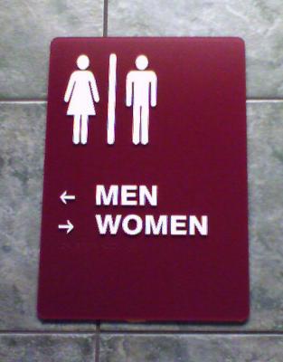
While studying abroad in New Zealand I had to become acclimated to different visuals and ways of communicating. One that perplexed me was the sign to a public restroom. On the two bathrooms (one women's and one men's) in the bar I was (studying) at there were signs designating gender. One had a picture of a Kiwi bird and the other was a chicken, possibly a rooster. If I had felt strongly about the rooster I would have had no problem, however the problem was that the signs looked androgynous! A similarly misleading situations is shown in the picture below:
When designing, what questions should you ask in order to confirm your visual is not misleading, poorly designed, or inaccurate?
Image Reference: Leucht, K. (n.d.). What's wrong with this sign? Retrieved February 6, 2015, from http://www.leucht.com/blog/wp-content/uploads/2008/05/02-strangesign-restroom.thumbnail.jpg

I would imagine, when putting together a visual, that my first question would be the message that needs to be delivered. Then I would ask myself if my visual made sense, and was organized, if there was logical eye flow, margins. I would probably ask a neighbor or friend to see if they understood my message.
ReplyDeleteI think that I would also design with the "end in mind." Who is the target audience? What is the message that you wish to convey? Once you know the message you wish to create, you can work backwards through the design elements to make sure that you are choosing colors, a layout, graphics, and type that support your message.
ReplyDeleteI agree with Katie and Ms. Creasy--they both listed questions that are important throughout all design stages, particularly at the beginning. Another thing I would add to this discussion is the importance of what we already do in this class--peer review!! I think asking the questions mentioned above will help to produce a better product from the outset, but each revision should be evaluated by one or more people in order to answer the questions Rob asks: whether the visual is not misleading, poorly designed, or just plain inaccurate. Another qualification about peer review: I think it is most effective when you can get reviewers who are part of your target audience. That way, they can review your product for aesthetic elements as well as content validity!
ReplyDelete