My role is as the instructional designer, project manager, and web developer. I will have student employees assist with the copywriting and publishing tasks. Most likely, we will continue to enhance the graphic design as next semester as we pilot, evaluate and revise the course.
I took a prototype approach to this draft. By that, I mean that I'm using placeholders instead of graphics, sample fonts instead of final choices, and stand-in copy instead of final text. Having a low-cost prototype means that the website development can proceed although the graphic design and writing/editing phases of the project are still pending. It also make it easier for the client to understand how their decisions impact the final product because you can implement those choices in a prototype without investing time and money in creating production-ready media.
 |
| Top-Level Home Page |
 |
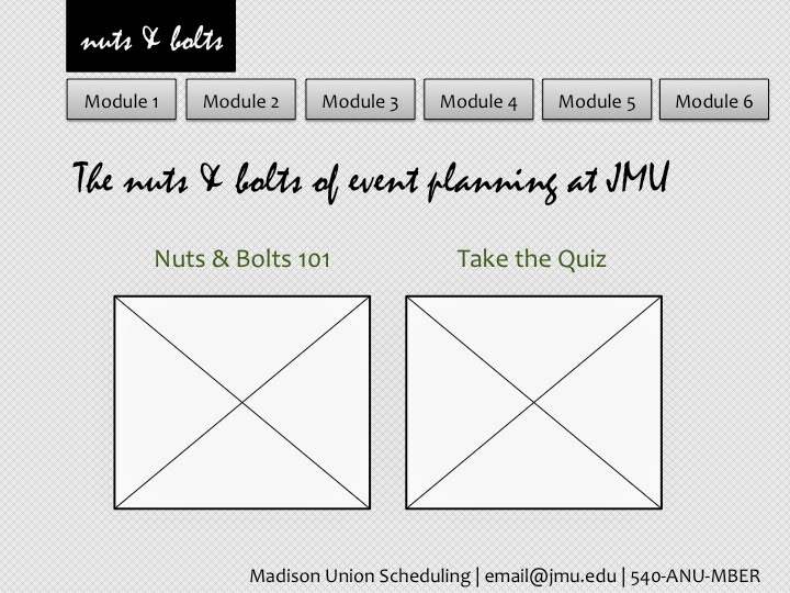
| Secondary Home Page |
 |
| Sample Content: Paragraph with List |
 |
| Sample Content: Paragraph |
 |
| Sample Content: Paragraph with Image |
 |
| Sample Content: Paragraph with Sidebar Menu |
 |
| Blank Page with Header and Footer |
I can say that this sort of training is long overdue and will be welcomed on campus. I like the layout and how it it broken into modules. Will the modules be independent or will they need to be taken in order? Also, the 2nd to last slide seems easiest to navigate ( I am guessing you have several layouts that you will be using). While they all look good, this one with the module side panel seems to provide the easiest way to navigate through each module. Otherwise (maybe I am missing something) it seems that once you are in the secondary module (6 choices) you enter one and either navigate forwards or back. Like I said, I think each individual layout looks good, but it is hard to tell how the module will work without seeing one example of completed module. I am not sure if these are just sample pages or one full module. I do like the direction.
ReplyDeleteI agree with Andee, it is difficult to understand where the user is on any given page (besides the first two mocks you show). Maybe by adding some context, like a breadcrumb, to the page will help sell the point of where the user is (ex: above or under the page heading place "Module 1, Page 1/6" or something like that). Also, the buttons are no longer "green" in your later mocks, is that on purpose? I think it makes sense to keep the active page's button highlighted (green in this case) to help the learner understand where they are at a given moment. Making these changes may help your issue you tried to solve with the sidebar menu, but really you don't need to have a full list of the pages if you expect the learner to go through them all in succession. Simplify.
DeleteGreat design though! Really professional looking! And your approach is very informative for the design process you are involved in. So thank you for explaining the project to us, the context helps.
I think the layout you have here looks very user friendly and straightforward. I like the background you have-- it's different but still neutral and simple. If I were going to alter something, I think the left margin being larger than the rest is a little odd. Overall, great job!
ReplyDeleteThis UI very user friendly. I like the simplicity and minimalist design of the pages. My only critique would be with the script font (even though i know it isn't the final). It is a little tough to read. Other that that this looks amazing. Great job!
ReplyDelete