
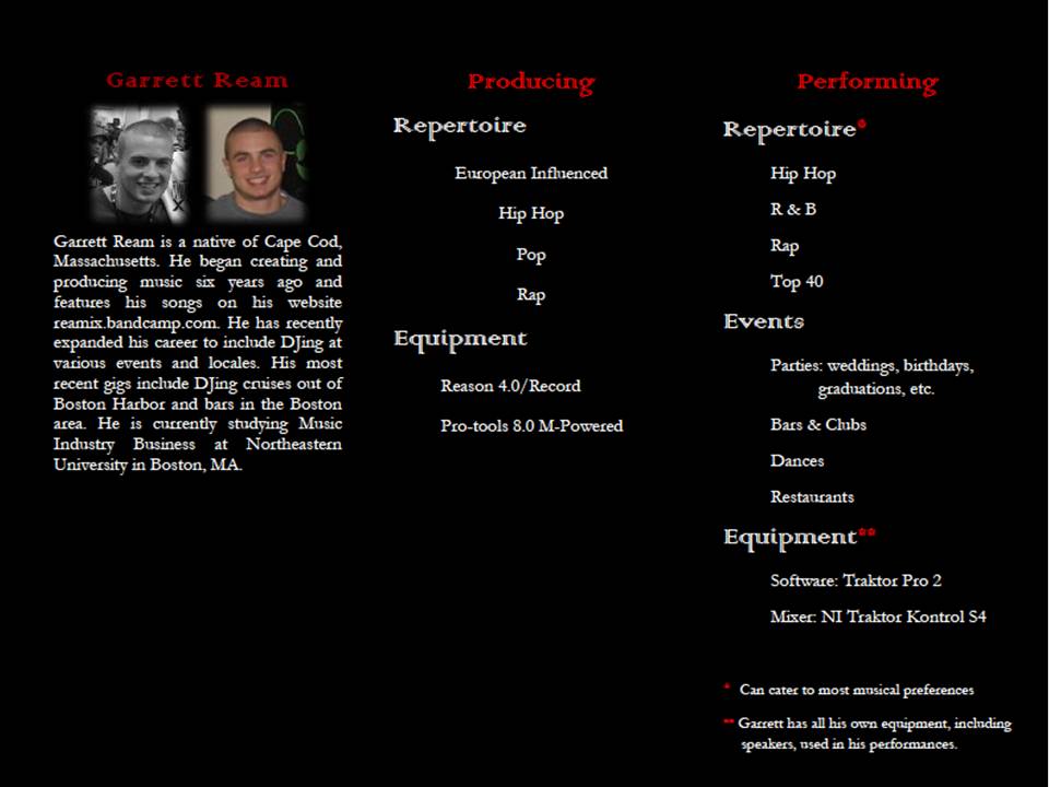
 I have some empty space if anyone has any suggestions about what to put in their. I'm also not planning on keeping the 2 profile pictures. i just thought I would see which any of you preferred. I think I'm leaning toward the black and white. I wish my brother had more pictures of him DJing but alas he does not. i might end up having him pose for some to maybe fill the space. If you were looking at this as a perspective employer, what else would you want to know about him before you hired him?
I think you should have him pose while dj-ing and then use filters to make it look like he is at an event! That would add a lot to the brochure. If I was an employer, I would want to see his energy while performing. Also, any quotes from satisfied customers might work well too!
ReplyDeleteI think once you fill in some of the negative space it will work fine. I agree with Jessica on staging the pic and photo effects, and the black and white pic would be nice if you want to keep one of those. I would break up the pages a bit too. Have a black backdrop behind the text as opposed to making it on one continuous black page (in the event he decides to really use this)
ReplyDeleteCourtney, I agree with the others. The black background is a bit consuming to the overall brochure. I wonder what it would look like if you used the image on the front panel as a background. Maybe by expanding the image and making it a little blurry to use it as a background? It would add some great contrast to the background.
ReplyDeleteI like the comments above. I am looking forward to your final brochure.
ReplyDelete