A successful logo can be recognized in a split second. In fact, some people argue that you don't even need to see the whole logo for it to be recognizable. The image below shows how easily most Americans can recognize logos when given only one letter. How many logos can you identify?
I recently read a blog post from Just Creative Design about designing effective logos. The blog states that there are five principles of effective logo design:
- Simple
- Memorable
- Timeless
- Versatile
- Appropriate
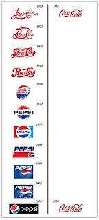
I am curious to hear which design principle you feel is the most important, if you had to choose just one. Personally, I think the principle of "Timeless" is the most important. A logo that is constantly changing tends to lose its effectiveness in my opinion. The image below is a timeline of Coke vs. Pepsi logos. It shows that Coca-Cola did a great job of designing a timeless logo, even back in 1885.
What do you think about the logo design principles? Are they sound? Which one is the most important? Are there any that you would add to the list? And finally, CocaCola is a great example of a logo. What are some other effective logos?
These are some awesome examples, Allison! I recognized Eggo, Pez, York, Reeses and Oreo right away. It is also amazing how Coke hasn't changed their logo in all these years, but Pepsi has gone through so many iterations. I’m not even sure why Pepsi has changed so many times. I thought some of their logos would have been great to keep around…like my personal favorite that was introduced in the early 70’s (fifth from the bottom).
ReplyDeleteI like that one because it doesn’t remind me of the Coke logo like so many of the other early Pepsi logos. That one introduced the simple red and blue swooshes. The whole image is simple, in text and shape, and the balance between the name of the brand and the surrounding graphics is great. To me, it says “Pepsi”, unlike any other image I have seen from the brand, which brings me to my next point.
I personally think that the most important principle out of the ones you mentioned would have to be "memorable". I can’t say for sure, but I think the logo I referred to before may be the earliest Pepsi image I ever saw, and since it is from the 70’s and 80’s, that would make sense. Remember the Cindy Crawford commercials in the 90’s? The logo still had swooshes, but the name wasn’t sandwiched in-between.
I think that associating an image with a product or service is crucial. I associate that logo with the idea of Pepsi, probably more because of advertising campaigns than anything else. I might never be able to think that any other version of the graphic is as legitimate as that one, thanks to the early development of my Pepsi paradigm.
I agree that a successful log must be recognized immediately and I will even go so far as to say a logo must stand alone from any further information. Not to undermine this post but this blog give a more accurate comparison of the Coke and Pepsi logo Coke vs. Pepsi To me it would seem that Pepsi is the more consistent of the two brands as the wave in their logo has lasted through all iterations. That tells me that the essence of the logo, in this case the wave is the more dominant factor in a logo. An example might be Apple's logo original a rainbow log and now solid it still carries with it the essence of the apple.
ReplyDeleteThis was soooo cool Allison! The most important component to a logo seems to be that it's simple. I noticed that in order to be appropriate, it should be simple; in order to be versatile, it should be simple; in order to be timeless, it should be simple; and, in order to be memorable, it should be simple. It seems as though everything is tied back to simple. Making the logo standout, yet simple is important because you want people to understand what they see representing something.
ReplyDeleteTimeless is an important feature because with the logo never changing, this allows people to always know what it is they are looking at. When I notice a logo changing overtime, I automatically thing that something has happened to the product or someone new is in "charge"
I agree with Jessica that the most important component to a logo is that it's simple. Moreover, The other important thing should be considered in designing a logo is font style. It plays a very important role in a logo. Though while designing a logo, several elements have to be considered, among them, font style is probably one of the most vital ones. For instance, many incredibly successful products are almost synonymous with a certain kind of font. Think about Dell's, Fedex's, Coca Cola's,IBM's. Those fonts have become visually ingrained in peoples conception of the brand. However, Choosing the right font type for logo is not just about recognizability, it is also about choosing a font that communicates the right message to the general public.
ReplyDeleteThe skill of designing a visually striking mark for a business or corporation is known as logo design. A logo is a sign, a brandmark, or an image that represents or symbolises a corporation. A logo should be distinctive and easily recognisable.
ReplyDelete