1. All text, scant pictures. A bad brochure has lots of text and almost no pictures.
2. All paragraphs, no lists or subsections. One sign of a bad brochure is text content that are made of all paragraphs with no lists, no subheadings and no sub sections.
3. Wild font style, Lots of font styles. A bad brochure has a wild font style or it has lots of different font styles.
4. No pictures of people. A bad brochure has no pictures of people.
5. Too many colors. Another big sign of a bad brochure are layouts with too many colors.
6. No call to action. A call action such as “call now”, “buy now” or “join now” is important in brochures.
I think the article is still debatable, for Instance picture of people. I don’t think that all brochures must contain pictures of people. It really depends on what is the point or purpose of a brochure. If we create a brochure for informing audiences about detail product descriptions, I don’t think it is necessary to put pictures of people on the brochure.
What do you think about the signs of a bad brochure? Do you agree with those signs?
The following is an example of a brochure.
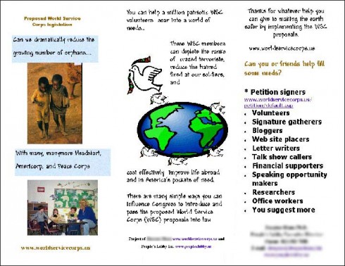
What do you think about the brochure? What wrong with it?
Hopefully by knowing signs of a bad brochure, we can avoid them in order to create a good brochure.
Wow! Nice idea, you made me start thinking about my brochure. The article does a good job on identifying the basic elements for what to avoid in order to create a successful brochure. As you can see most of the provided instruction mirrors what we learn in our class about the principles of creating visuals. Starting from the need to keep things simple and the art of organizing information in a hierarchy to guide the viewers throughout the brochure, and ending with the use of different selection tools such as color and type. I found a similar article ehttp://advertising.about.com/od/brochures/a/createbrochure.htm
ReplyDeleteThis article shares most of the points covered in your article; however, it also answers your question about people pictures. It says that people pictures are usually more effective and thus recommended. They suggest that in case of advertising for a certain product, you can always have people demonstrate how the product is used. The article also offers links to other topics such as types of brochures, planning the brochure, and graphic design.
To answer your question about the example brochure, i will start with the heavy text and the lack of headings. The brochure also has a bad font style and size which make it difficult to read. The colors are not welcoming (at least for me) and my eyes start to jump all over the place because I don’t know where to start (no hierarchy). Also, the boxes with the text above pictures make them look bad instead of inviting. Lastly, I can’t understand the purpose behind the picture in the middle.
ReplyDeleteNice post Mailizar, especially since this is our next assignment. I agree with Sue that your article does a great job of including the visual principles we are learning in class. However, when thinking about "people pictures," I am also not sure they are always necessary. I think it depends on the content you are trying to get across. An example that comes to mind are safety brochures. On an airplane the pictures in that brochure are not of real people conducting the safety procedures. Instead, they are cartoons or of elements within the aircraft.
ReplyDeleteWith the brochure you presented, I am not sure I can understand the overall idea. The text on the right hand side seems to be the most important due to the font. But with the lack of headings, it is hard to tell the purpose of each visual element. I also agree with Sue that the font is hard to read and the middle picture does not seem to fit. The "people pictures" also do not seem to help the cause. In defense of the brochure, it could be that it is a little hard to see, but I do think that improvements are necessary.
I agree with all of the sign of a bad brochure, especially a brochure with too much text and not enough pictures. In this class, we should know by now that visual literacy is a method of dual coding. A brochure is another form of visual literacy where context is needed however, too much may decrease the desire of the viewer to read the brochure. Random pictures with no meaning have the same effect. Brochures require just the "right" mix of pictures and words to make the message effective.
ReplyDeleteI am totally against brochures having paragraphs! As I mentioned before, too much text can make the reader not interested. Cognitive overload is a mistake many designers of brochures make. It is necessary to have contact information so that whatever the reader does not understand from the brochure, he or she can call for more information.
The brochure in the blog is not too clear, however I do see the mistakes that the brochure makes, such as too many different font sizes and styles and pictures that do not make sense. It does do a great job simplifying the information into bullets.
The idea of having too many paragraphs is understandable, but not having any is not. One obvious case is of a company or organization’s mission statement. That is something, I would think, that should be on the informative brochure.
ReplyDeleteI can also say that seeing a face to associate with an organization (picture of a person) is a great way to see that the company is not some big machine rolling along without care for the consumer. The Mazda “Zoom, Zoom” commercials come to mind. They are just another scene of a shiny car driving along like crazy on a closed course until they show a person to make it more personable.
For the brochure shown, the logo in the middle looks haphazard. I can understand it, but it does not look professional. It looks like an organizational that wants to spread peace around the world. The pictures are “off” as well as they are different formats. It seems the landscape one should go on the last page. The other picture should probably go on the inside and the logo shrunk and put on the front with the organization’s name and info. I do like the bullet point of needed volunteers and the org.'s info at the end at the bottom.
Great points Jason! I went through a number of the brochures that I have and targeted the two points you mentioned (mission statement and a personalized presentation of that organization). I found that the brochures that had their mission statements stated were more informative and had their role expressed more effectively than the ones that didn't. Moreover, I found myself tying your point of personalized brochures to that of Mailizar's advice for a successful brochure which states that good pictures should have people in them. I guess that whoever wrote that advice was aiming for the same idea of personalized picture where the readers can associate themselves to the presented context and create some form of a hidden bond.
ReplyDeleteNice stuff!Its sound looks so interesting and informative.Many thanks for your educational document..PSD to WordPress
ReplyDelete