Extraneous Load and Choosing the Right Colors
Can you think about a time when you saw a sign and thought that the colors they chose took away from the signs effectiveness? This is what is called Extraneous Load.

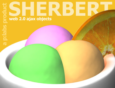

image taken from: https://blogger.googleusercontent.com/img/b/R29vZ2xl/AVvXsEgYwlxWGQmAg1BBV4PKWN9Z6hD9Canm0jW1EqzZtjkE4jppKNPSwrYfdRJVdTvWITM87k3rXuBEzCbJgd6TGF2GzPFc7NZax_1Lcvq43iRc1gzlxsgBuuzQHYa5H0lPDhjKM4lW_rh0JUc/s320/sing_it_loud_album_art.jpg

image taken from: http://fc02.deviantart.net/fs26/f/2009/238/a/3/Nike___Crazy_Color_by_mtmac.jpg
Above are four examples of advertisements and/or logos that can be accompanied with an instructional training session. I have chosen these images because they are great examples of enhancing or limiting Extraneous Load, when instructional designers choose colors.
Extraneous Load is defined as "The type of cognitive load that is based on content irrelevant to the important message"(Linda 2007 p. 46). This definition refers to images or colors (in this case) that take away from the important content. Now, this does not mean images have to lack color, like example 3, because that would create extraneous load. Nor do the colors we choose for our images have to contain vibrant colors, like examples 1 and 2, because that would create extraneous load. However, limiting extraneous load means that instructional designers need to be more cautious of color choice.
The Bad and The Ugly
When we examine the four above choices, which ones do you think is the best example of LIMITING extraneous load?
Example 1--I have no idea of what is going on in this picture. I think that the loud and vibrant color choices in this image take away from the main focus of this image (which is the woman...I think). When we look at the colors chosen in this image, it causes the viewer to focus more on the background than the woman in the picture. This picture is a great example of color choice enhancing extraneous load.
Example 3--This picture is an example of choosing dull colors, which distract the viewer from the logo's main content "Sing it Loud Come Around". If you focus on the "Come Around" text at the bottom of the logo, it is a very obscure grey color. This color, in my opinion, is two shades lighter than the white background. The color chosen for the "Come Around" creates more Extraneous Load, because the viewer is trying to understand what the text actually says. Thus, this image is another great example of color choice enhancing extraneous load.
Example 4--This last picture is a great example of color choice enhancing extraneous load. The colors in this picture are so loud and vibrant that it causes the viewer to focus on them and not the shoe that is being sold in the picture. Did you even see the shoe that is being marketed? Once again, this picture is a great example of color choice enhancing extraneous load.
The Good
Example 2--This image in my opinion is a great example of smart color choice that limits extraneous load. Anyone who has had ice cream sherbet knows that it is colorful and delicious. Well, this picture capitalizes on this known fact and the designer uses it well to market the sherbet. The colors are very vibrant, but in my opinion they fit very well into the picture. Once again, this is a great example of color choice limiting extraneous load.
Conclusion
As we move into the world of work, please be cautious of the colors you choose enhancing or limiting extraneous load. If you can think of any examples of color choice enhancing or limiting extraneous load please upload them and thank you for reading this blog! Have a great and enjoyable snowy weekend!
I think we all look for meaning in life. That does not differ when it comes to reading or looking at something imparticular. Whether it be a text book, a novel, a drawing, a picture, etc. We want to know the point, we want to know the meaning behind it. That is why extraneous load is a huge turn off for me.
ReplyDeleteWe are such busybodies now a day. That's one of the reasons we hear "is it Friday yet?" or "I cant believe its only Wednesday". Life is so busy, we may look to the weekends, a drink, exercise, pray, etc for peacefulness and serenity.
I am not suggesting that all visual imagery has to connotate an air of peacefulness, however, I think it should get its point across without so much "busyness". That gives us more to deipher through as we search for the overall message of the graphic, font, or what have you. As Lohr pretty much says on p.52 "extra content adds to the load when the viewer attempts to assign meaning to the various elements of the design".
One example I have is our PPT backgrounds during worship at church. We used to find "crazy" ones that went with our theme that Sunday. Some would be flashy, some would be all sorts of colors in motion, UNTIL... a couple of us went to a concert. Our worship leader saw the way the performers did their PPTs and adopted it for Aletheia. Now the PPTs are just black background, with white words. Sound lame? maybe, but researchers, Horton (1991) and Livingston (1991) found, color can be distracting. Shneiderman (1992) found, color can be confusing. We dont want the crazy backgrounds to deter from the lyrics of the songs we are using to glorify God.
Obviously, black and white will not always be the best choice. Sometimes I think though as designers we should just stick with the KISS (Keep It Simple Silly) model. I may have changed the silly part... =)
Over the course of my Master's education, I (along with others) have learned the importance of the K.I.S.S. principle that Sarah has previously spoke of. In designing e-learning this past summer at UNC - Chapel Hill, I was given the opportunity to truly realize the importance of keeping it simple when it came to colors and graphics. Our learners ability to receive and retain the messages we are trying to convey in our online trainings was more important that the "glitz and glamor" that we are at times strongly attracted to do just because we have the capabilities. However, while I feel extraneous load in an educational context can have very hindering effects to learners, in other realms I do not see this as necessarily a negative thing.
ReplyDeleteIn the examples Mr. Anderson provided we are able to see several different ways in which limiting or overuse of extraneous load can have both positive and negative effects. In examples 2 and 3, I think that the graphic designer did a wonderful job of limiting extraneous load to deliver the message by the use of minimal colors, while in example 4 the amount of colors and patterns take away from the message the image is trying to convey.
In example 1, though, I am torn. From an educational perspective the use of colors, patterns and objects would be very confusing for anyone who was trying to receive a message. On the other hand, looking at this image as a piece of art gives me a different opinion. The use of colors and objects are very much a part of the message this "artist" is trying to convey, so what we see as "extraneous load" in an education context, may not be received this way when looking at the image through another lens.
As we move on in this course, I am very eager to see the different images and pieces of work we create. While we should constantly be aware of how extraneous load affects one's ability to receive our message, it will be very interesting to see the ways in which different people limit it through their own creative freedom.
I find pictures which have too many bright colors very hard to understand and they just remind me of a headache! Extraneous load is something that graphic designers really need to keep in mind. As others have mentioned, PowerPoints often become victims of extraneous load. Too often color choices are chosen that are hard to read and become distracting. Extraneous load is common in the elementary school setting. Teachers sometimes think that using bright vibrant colors will gain the attention of the little ones, but instead they are to distracted to focus!
ReplyDeleteGreat post Marcel! I like your examples and wanted to note a couple of things I observed.
ReplyDeleteImage one gave me the headache that Lauren described in her post.
Image two was very appealing to me. I'm not sure if that was the colors or the fact that it was food. It did not seem to be difficult to distinguish as the rest.
I did not even see the words "Come Around" in the third image. I agree that it obviously was washed away by the similar shading to the background.
The fourth image was painful to look at and I had to go back and look for the brand of the shoe after reading your post.
I found some good examples of "bad website design" in which too much color was used. They can be found at the following:
http://www.jamesvandyke.com/wp-content/uploads/2008/01/picture-1.png
http://commandshift3.s3.amazonaws.com/ss/14c5ae9d82e5a6489d6656d5fbff6fc2.png
Great pictures Marcel. I love the colors. In reference to extraneous load, as effective instruction designers, we should definitely do our best to avoid it. Too much action, colors, or instruction can can confuse the viewer/learner and no instruction is accomplished.
ReplyDeleteExtraneous load may not be something that we want to avoid, however, it appears that extraneous load is becoming the new approach to grab peoples attention. Many fashion designers as well media are using extraneous load techniques to grasp the eye of many. For example, a clothing company by the name of Bape (a Japanese based company) has created it's clothing using numerous colorful patterns. Once Bape became very popular in the mid-2000s, many clothing companies began to mimic their style of pattern. Soon, many advertising companies became to clone the Bape style of design.
Sarah mentioned earlier the principle of K.I.S.S. (Keep it short and simple). With the attractive extraneous load design that Bape has introduced, it seems as if Bape's design is may become the new K.I.S.S.
When I first glanced at the posters, I immediately skipped #1, spent a moment at #2, and then moved past #3 and #4. I'm the kind of person that likes to jump to the magazine and work my way backwards! But, I noticed that even though I was "skimming" the pictures, #2 held my attention longer than the others - because it was appealing (food and design as Jackie noted), but also because the colors related to the words on the poster - to me the colors were sherbet colors!! Poster #1 made my eyes spin and I had to look away - although as George mentioned it can be appreciated from an artistic point of view, with my vision/vertigo issues, I still couldn't really observe the poster.
ReplyDeleteI found an interesting article that talks about Split Attention Principle which ties in with extraneous load, but to me, from a different perspective. Visually, poster #1 is hard to focus on one main aspect of the design, but also, our brain is "split" trying to connect the different images together. Whereas in Poster #2, the colors, the words and the images flow nicely and are complimentary of each other, so our brain does not have to scatter to "connect the dots". Here is a link to a short PPT that explains the split aptention principle a bit more.
http://www.slideshare.net/jmborda86/the-split-attention-principle-in-multimedia-learning
Article:
What contributes to the split-attention effect? The role of text segmentation, picture labelling, and spatial proximity.
*sorry the link is so messy - wasn't sure how else to do it!
http://www.sciencedirect.com/science?_ob=ArticleURL&_udi=B6VFW-4VW4V5V-2&_user=650596&_coverDate=06%2F30%2F2010&_rdoc=1&_fmt=high&_orig=search&_sort=d&_docanchor=&view=c&_searchStrId=1246380524&_rerunOrigin=google&_acct=C000035098&_version=1&_urlVersion=0&_userid=650596&md5=ccc30dca018de6571d965820f8d5201d