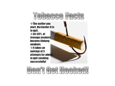
 After reading the chapter, I wanted to keep my visual as clean as possible so that the message is not lost. I chose the fishhook in the cigarette to illustrate the fact that smoking is addictive. The letters that I chose for the prominent words seemed to blend into the white background, so I outlined them in black. I'm wondering if the lines need to be a hair thicker to make them stand out even more. Although the image seems to speak for itself, I wanted to make sure the message isn't lost or missed by adding the "Don't get hooked!" line. The image had sharp edges, so I softened them hoping that the cigarette and hook would dominate. Any suggestions are welcomed!
 http://www.google.com/imgres?hl=en&biw=1123&bih=766&gbv=2&tbm=isch&tbnid=pqMZ-bKxmA-U5M:&imgrefurl=http://www.infobarrel.com/Media/Hooked_on_Smoking&docid=WsFbIbBPOQaJqM&imgurl=http://www.infobarrel.com/media/image/43852.jpg&w=267&h=189&ei=FjQ4T_SRD8nz0gGVoayoAw&zoom=1
Renee
Hi Rene,
ReplyDeleteI like this photo a lot. Nice pairing of photo and message. The one thing I might suggest is to find a way to make the photo look more integrated. I can see the slightly off white photo against the pure white poster background. This looks like a cut and paste job rather than an integrated image.
Maybe you could take a sample of the photo background color with the eyedropper and fill your poster background with that. I know that Ps lets you vary the sample size and will fill accordingly. If any edges stand out after that, you can use the blur tool to obscure them.
For a more radical approach, you could try making the photo the full size of the poster and fit your text around and on top of it. The 'tobacco facts' would look great inside the hook.
Hope this helps, Matt
Renee - very clever! I like the play on words and how it relates to your image. The font is a little difficult to read and some of the words run over on to the image. I would make it consistent and either have all words run over into the image or have none at all. I would also suggest making the grey darker or choosing a different color. I think your message is a strong one and I don't know if the shade of grey does it justice! Loved the creativity!
ReplyDeleteRenee, I think this image would work fine if you worked on the alignment of your text. The entire image really looks like it wants to be spread out, especially the black bullet points since they overlap your image.
ReplyDelete