Friday, May 27, 2011

First Draft Logo - REVISED


***I made some changes for some of the letters on the second page so if you could look at all of them and let me know what you think that would be great = ) ***

So my brother has gotten into making his own music digitally, DJ-ing (although he hasn't done too much yet), and has a website for his music and whatnot. He wants a logo for himself and said I could work one up for him. The logos I came up with are a cross between what he suggested and what I thought is cool. The name is a cross between our last name, "Ream," and "remix." I made some of my letters in PowerPoint and others in Paint. Consequently some of my letters don't look as clean as others. Does anyone have any suggestions of how to fix this? The three images are in the order of how I changed them - the first one is my original attempt. I've consulted with my brother and he seems to like them. Please let me know if you have any suggestions or comments.





Attached are several logos I created...with different colors, fonts, designs, etc.

I appreciate any feedback as to which logo you like the most, and ways to improve my logo. I'm the HR Onboard Specialist at JMU, so my logo, poster, and brochure will be tied to my position, as I hope these projects are something I can use for my job as well. Also attached is a PPT Slide that has the link to the HR logo I used.

Thanks!
Kellie

Thursday, May 26, 2011

Visual Draft Resume - Helen Revised

I've separated out the transition pages so you could better see what the final product should look like. The idea of this is that they would click through and certain things would appear on the slide as they clicked (hopefully keeping them more engaged). Jessica - thank you for the suggestion on the text - I just ran out of time to make the change.


Web Activity One

This image gives visual instructions on how to create an origami box. Although there are many steps, this is definitely one of the better visual step by step instructions that I have located on origami. This visual can easily be used by people of all language backgrounds, and with a little time dissecting each picture, anyone should be able to complete this project with little error.

Reference http://www.jenniferlanes.com/origami.html
Here is my final draft.  It looks MUCH different than my 1st draft.  This is the first class I have ever had where I'm manipulating and creating digital images, so I'm betting that as we progress, my skills will as well.

I liked the way this turned out, even though it looks remedial to my eye. 

Visual Resume

The end product isn't exactly what I wanted. The layout doesn't allow me to input as much information as I wanted. I was going with "less is better" with the idea that it would spark more conversation in an interview, i.e. having the employer having to ask more questions so you can elaborate as much/little as you like. However, I don't think this layout allowed me to put as much as I anticipated when I started making it.

Web Activity 1

This is an image of the geocentric cosmology the sun was to travel along as it circled the world. Although I like the picture I would prefer each zodiac sign to be labeled since most people aren't familiar with others except their own. Also the flat sheer oval in the middle is not labeled and viewers would have no idea that it is the celestial equator without reading the accompanying article.

The website I got this from is:
http://www.well.com/user/davidu/mithras.html

The picture is :
http://www.well.com/user/davidu/diagram3.jpeg

Web activity 2

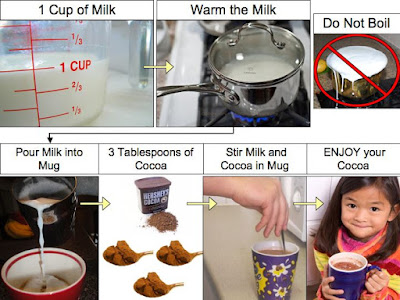
Here is my hot chocolate tutorial! I wanted to test out a new graphics tablet for work, and I think the handwritten text is cute and quirky with the typed text. What do you think?

Wednesday, May 25, 2011

Web Activity 2


*For anyone who is wondering, the "me gusta" image is a popular internet meme, just to add some humor.


Web Activity 1

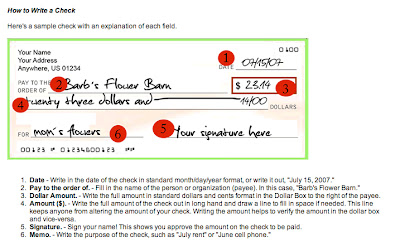
https://www.higheroneaccount.com/info/marketing/guidetochecking.jsp


This is a visual guide on how to write a check. Something I rarely ever do, so it comes in handy! I like how it is labeled in sequential steps. That way it clearly identifies each of the 6 different areas on the check. One thing I would change would be to label the address area in the top left, sometimes you have to fill that area out on a check.

Tuesday, May 24, 2011

Web Activity 2


Web Activity One

Updated resume


Thank you everyone for your input! Here is the current version of my resume. Do you have any more suggestions?

Monday, May 23, 2011

Web Activity 1

This graphic would be better by linking the "overhand knots" to exactly what an overhand knot is. Perhaps some red directional arrows will better illustrate the procedure as well. I would even break this down into more than four steps and expand it to maybe six.

Web Activity 2

Web Activity 1 - universal instructional image

Even though there are also text instructions in this image, I think the visual would work very well without the words; the directional arrows provide good instruction and the actual photo gives the viewer an excellent vision of what the finished product should look like.


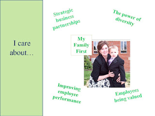
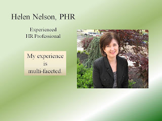
Helen Nelson Draft

This draft is in a Powerpoint slide show format; many of the slides have transitions, so some slides will appear jumbled. I may try and email to the class if I can make the file smaller. Sorry for the delay -- I like the slide show visual resumes, but it probably wasn't the best choice for the blog. Thanks for your feedback.


Updated Resume


I've added images as Austin suggested and I can't decide if I like them or not. I like the apples though as they give more information about what grades I was in.

Web Activity 2


Since it's quite cold here at home I've been making lots of hot chocolate so I figured I would just take pictures of how I make it.

Andrew's Visual Resume

Sunday, May 22, 2011

Web Activity 2


Images:
https://blogger.googleusercontent.com/img/b/R29vZ2xl/AVvXsEgHTGMsNmDoSgbZL54JhuKhe9ALPiunU85pUSM5C7ufYTl8xpud9EJXa_56G2ty0Zi2nYq-cg7pb8wl6osW-SwVFHMSJJwOuKts2k5QLoNHpFQiAjaRSnGLad3kHxICj3BMgUbG4ujVnKH8/s1600/1+cup+milk.jpg
http://kisi.smugmug.com/photos/470950062_8i9KT-595x595.jpg
http://lh4.ggpht.com/_d_yZ2mJrJM0/SjyyjozR_II/AAAAAAAACpo/ZhQRz7evMUo/DSC_0156.JPG
http://running4cupcakes.files.wordpress.com/2011/03/dsc01491.jpg
http://www.gourmetsleuth.com/images/unsweetened_cocoa.jpg
http://www.100cafestreet.com/wp-content/uploads/2010/06/cocoaonspoon1.jpg
http://www.istockphoto.com/file_thumbview_approve/10311072/2/istockphoto_10311072-girl-with-hot-chocolate.jpg
http://www.clickstart.org.uk/assets/img/sites/pages/6755/DSCF0829.jpg

Response to Jessica's Resume

Jessica,

I really liked the tree metaphor for your work experience and skills. However, there were places where it was difficult to read the text because light colored text was superimposed on a background with many colors, shapes, and textures. You may want to simplify your tree and strive for greater contrast. One way to do this is to color fill the leaves with a dark green. This would create a greater focus on the flowers and apples, then. If you are going to use text on the apples, I would avoid using images unless they are side by side, rather than text over image. I have reworked your image slightly to show you what I mean. In general, you want to try to cut down on the number of textures in your resume and try to use contrast to focus attention.