Friday, April 16, 2010

Does visual literacy help students achieve academic success?

You all know that I am not a native English speaker and that I am always using the resources around me to help me succeed at school. I absolutely hate standardized test, I think they are one of the hardest things that I've done in my life, and I think they are evil! Before I started the AHRD program, I didn't realize the importance of images and how critical it is to relate images to the content. I have to say that I don't consider myself creative at all, but this class forces me to make an effort and use all the tools that make an image better.

Burmark's article touches on a topic that really catches my attention and I'm really curious to see what you all think.

So my question to you is: do you think with today's technology availability to teachers, should it be mandatory to use visuals? do you think visuals help students achieve academic success? should art be mandatory and not an elective in high school?


Friday, April 9, 2010

Branding and Culture

This class has been a very interesting extension of my undgrad studies. Just to give you all a perspective of where I am coming from I majored in cultural communication and minored in studio art. Both topics have become a very passionate part of my life, and I truly enjoy learning more about anything remotely associated with either.

Cultural studies focuses on identity and how it is created, maintained and understood. Since we are working on creating logos, which is a visual representation of a groups identity, some of things that I have previously studied really seem to apply here.

Like we have talked about in class, and read about, most of the visuals we are surrounded by on a daily basis are purposely created in order to make us feel, think, or obtain something specific. Through these messages individuals and groups create and share identities for many reasons.
There is a man, Philippe Starck who is an all around designer. His work includes industrial design, interior, fashion, graphic and many more types of design.
check out his website www.starck.com

Starck is an interesting character, he is very outspoken about his design practices which involve all kinds of theories about democratizing design among other things. But, what is interesting here is to look how he has branded himself based on these theories.

He talks about designing not for the elite and really designing objects, rooms, clothing etc. with very specific purpose, and very specific thought about the consumer and market place.


Starck has not only branded his objects but he has branded himself based on these ideas. He names his designs things like my "juicy salif" which is a lemon squeezer, but by calling it my "juicy salif" it becomes something else it sends a different message.

After looking at some of Starck's work and his website what do you think about his branding? What design tools does he use, and are they effective? Do you think that his visual rhetoric is cohesive with this verbal messages about design? Does any of this change how you thought about branding?


Monday, April 5, 2010

International Wayfinding

First off, apologies for the late post. I was absolutely convinced that next week was my week! Comps is destroying my mind! :)

Over the course of this semester, I've been introduced to the concept of wayfinding. David Gibson, author of The Wayfinding Handbook: Information Design for Public Places, defines wayfinding roughly as the process that people undergo when they're navigating public places, basically to find their way...a system of using various implicit & explicit cues in the environment to help people find destinations. Wayfinding projects can be a simple, single landmark or feature sign, or complex systems of signage and maps for a hospital complex, university campus, or an entire municipality. According to Gibson, "an effective wayfinding program can easily balance the needs of the different constituencies, supporting and enabling a positive experience" (18). 1

Often, we don't notice an effective system, but we definitely notice an ineffective one! Ever tried to find the restroom in a foreign country? Fifteen years ago, I went on a class trip to Europe. After several weeks of cunfusion and bumbling, tourist-like behavior, I was thrilled to arrive on the United Kingdom leg of our trip. Finally! I could speak the language! Navigation was going to be a snap. But what on earth did all those "W.C." signs mean?...

it's gotten better. I was in the U.K. again over Christmas this year, and the trend seems to have moved to more iconic representations. Still not the same as here in the U.S., but at least recognizable.

I recently listened to a podcast with Gibson about his book, and the question came up about the effect of globalization on wayfinding. 2 Different cultures have different meanings for colors, symbols, and framework of information display. Whithin our own culture, there is a movement to eliminate displays of "sexism" in communication, so forget your pink vs. blue, or skirt vs. pants signage.

What methods can a designer use to create systmes for a culture that they are not familiar with, or for an international audience?

And just for fun, a few examples of interpretations of important signage:
http://sensemaya.org/files/toilet_signs_57_3.jpg

http://uummeaw.exteen.com/images/2007/final.jpg

http://forum.gaijinpot.com/attachment.php?attachmentid=3366&stc=1&d=1163418798

https://blogger.googleusercontent.com/img/b/R29vZ2xl/AVvXsEhhoLqSRBJuvVezdWvnj5Q8Cv8b6df1Vxr7eBtzc4jO31njURGaJ3eMldDrrT9Piop5nKzW38OwfnEu9nOQeBwYkn_JHMv39y1_FQ1Told9J5nBSwcZH3OnBdiZGPNTmr2MpwThfT-N6PM4/s1600-h/toilet_signs_43.jpg

https://blogger.googleusercontent.com/img/b/R29vZ2xl/AVvXsEiB3rxObNMSdqPxwdrgQkR5n6HG0CazzxLaT61I9kc4wEaRY6EGmsWcYYOuZdWkDgbyE1unYR3FmV3e94fWFsGl6P-qoxFCZ-9TYIsC-XgRpon1Qj4tz32FWnyjmSY8vJjoFC_chYBwpJ9u/s1600-h/toilet_signs_44.jpg

http://www.fortunefavours.net/index.php?act=viewProd&productId=12

Sunday, March 28, 2010

Free Creative Software

Earlier this month I read about the launch of "Google App Marketplace" and the possibilities it offers in the way of free (or cheap) services. Now the marketplace is specifically for developers, who pay a $100 a year fee, but we can still access the products contained within. Here is a list I found of the "Top 10 apps": http://www.lifehacker.com.au/2010/03/top-10-google-apps-marketplace-apps/ Pay special attention to "SlideRocket" and "Aviary", there is also "Picnik" which didn't make this list but is still great. I started using "Aviary" this week and it has been phenomenal. The services it offers are comparable to the "Adobe Creative Suite" but completely without cost. The "Aviary" software doesn't include some of the bells and whistles included with the Adobe products, but there is enough to get done most of what we are going to do. It really is a great way to work with an advanced editing program without tying yourself down to the cost of the Adobe software.
I really feel that Google is going to have a profound effect on how we educate in the future, and the "Marketplace" is just a small part of this. The bigger picture for me is the openness that it creates, and the possibilities that come with this openness. No longer will kids in rural communities be closed off from the "outside" world. The will be able to access "virtually" the great museums of the world and use software such as "Aviary" and "Picnik" to create their own images, without the school system spending any of their dwindling budget. I hope that Google sticks to it's mantra of "Don't be Evil" and continues to use its power for good, to help broaden all of our horizons. With products such as "Aviary" Google puts the creative power back in our hands, so that we are free to concentrate on the Visual Literacy skills we have been learning. If anyone is interested there is a great book on how Google is changing the way the world works: "What Would Google Do" by Jeff Jarvis. I am looking forward to reading what you all think about this software and if you have any questions let me know, I have been exploring these for about a week now and I will continue to in the future. If anyone knows of any other free software please post in the comments.

Thursday, March 18, 2010

Visual Dictionary

This image of the heart is taken directly from the Visual Dictionary Online (http://visual.merriam-webster.com/about-visual_overview.php) , a tool I found when I was doing some basic research about visual literacy. It's very competent learning tool that verbally and visually defines a word. It's really cool, especially for a learner who may respond to both the verbal and visual cues this provides.

I think this type of resources is essential to the next step in e-learning. If I were teaching an online sports injury course I would be able to pull these images and show the injury to the exact bone or muscle and the students would be able to look up these images as well.

In class on Monday we talked about the importance of visual support for learners and how to create some effective images. What do you all think about this tool? (Be sure to check out the "themes" on the link...all kinds of cool stuff!) Would you use something like this as a student or as a teacher? What other types of online visual aids have you found that support learning?

I look forward to reading your responses!

Friday, March 12, 2010

We Live in a Visual World...


...but does that mean I am a creative girl?! (anyone know that material girl song? that's what song I was imagining while writing that)

We are SO blessed to have sight. Sometimes I daydream, often while taking walks about how amazing our senses are. Once I lost my taste and smell from using zicam, dont buy that stuff. I prayed that if God gave me my senses back I would never use zicam again and I havent. While I really enjoy all five senses, we are going to think about one in particular for this post in light of creativity in visual design and learning.

Do you guys ever think about stuff like that?! We live in a beautiful world. Every day we wake up (if it is early enough haha) to splashes of pink, red, orange, yellow, and blue and see the world go to sleep in the same way. Grass turns green and soft, or brown and hard. The leaves on trees are either green or have eye catching warm colors on them, or they are absent. We can see different shapes and colors of clouds.

What do all those descriptions teach us? So much- about the weather, about the seasons, and about the temperature..

The majority of people were created to be highly visual individuals. We learn so much by our sight. Not all of us necessarily prefer to learn visually but as educators we need to be knowledgable about both how we learn, and how our audience learns.

What kind of learner are you?- Visual? Auditory? Kinesthetic?
We're going to focus on visual learners.

For one minute, reflect on how much you know from visual cues, images, pictures, etc. Ready, Set, Go!!!

What did you write down? We learn so much through our eyes.
- 80% of the brain is dedicated to visual processing.
- Visual processing is not new, its part of our history.
- Written language originated from drawing and sketching.

Now for a minute draw a couple things that you have learned visually? What did you draw?

In light of being an educator, designer, does one have to be a super creative person that knows exactly what colors and shapes will look good, for what purposes, etc?

I found this PPT and was definitely encouraged by it. Please go check it out.

We are a lot more creative and visual than we think out on a daily basis. Dont take your sight for granted. Be thankful for it!

Friday, February 26, 2010

Using Visual Literacy for social development

The other day while having a telephone conversation with my younger sister (who is a senior in high school), she expressed that she was having difficulties in her photography/graphic design class. Surprised by the fact that this course was offered at her school, I quizzed her a little more about the curriculum of her class. Again, she surprised me when she mentioned several topics (on a broader level) that we have discussed in class such as image organization, the rule of thirds, and how to use color. While my sister has no desire to go into a visual based field, she said that this course was an art elective that she was required to take in order to graduate.
While my high school career only ended around six years ago, I do not recall courses such as this being offered. However, through further research on the topic of teaching “visual literacy” at the high school level, I found that this has become much more common. In a 2008 article by Debby Zambo (which I have sent in an e-mail to all of you), she discusses how teaching the concepts of visual literacy to adolescents have been proven to help them greatly in their social development as well as enhances their critical thinking skills.
The article explains that our youth today live in a very visual world and as such this can affect how they look at themselves, the choices they make about their future as well as the friends they select. For this reason the author believes that knowing how to “interrogate and critique an image’s purpose and emotional effect” can help adolescent to let go of some surface level values they have acquired about image, culture and society.
In class last week, we talked about how creating visuals can be a science and an art. While I agree that both realms come into play, I believe this study makes a strong case for viewing it as a science. The idea that the images we create could potentially have an effect on how someone views themselves or judges other people is a scary-thought in itself. However, knowing that in high schools we are using the principles and concepts of visual literacy to help breakdown these social barriers is a powerful thing.
As a behavioral science major it interested me to see how analyzing different graphics and photographs made me challenge my own values. Below I have included images which have come under scrutiny for the psychological and contreversial messages they conveyed to those who viewed them.
I’m very interested to see the classes opinion on teaching visual literacy in high school, but also on these images, and the messages you believe were conveyed through the editing and composition of these graphics, and the techniques used to hone the points each image made.
Controversial Graphics:

Image #1: Killer Heels


Image 2: OJ Simpson Covers


Image 3: United Hearts


Friday, February 19, 2010

Expanding the concept of Literacy


Elizabeth Daley
EDUCAUSE review. March/April 2003. pp 33 - 40.

What is your definition of “literacy”? I, like a majority of people would say, the ability to read and write, for that is the definition I grew up with. But what about media literacy? Is that different from “literacy”?
Elizabeth Daley’s article, Expanding the Concept of Literacy, suggests four arguments for an expanded definition of literacy:
1 – The multimedia language of the screen has become the current vernacular.
2 – The multimedia language of the screen is capable of constructing complex meanings independent of text.
3 – The multimedia language of the screen enables modes of thought, ways of communicating and conducting research, and methods of publication and teaching that are essentially different from those of text.
4 – Lastly, following from the previous three arguments, those who are truly literate in the twenty-first century will be those who learn to both read and write the multimedia language of the screen.

http://net.educause.edu/ir/library/pdf/erm0322.pdf

I want to concentrate mostly on argument #4, but also want to highlight a few phrases from the first three; phrases I feel are the highlights of each section.
#1 - “Metaphors from the screen have become common in every aspect of daily conversations. Close-up is synonymous for “in-depth” and “penetrating.” We speak of flashing back to our earlier lives. We frame events to put them in context. We cut to the chase when we are in a hurry.”

#2 - “The author, a respected art historian, asserted that it was time for the academy to give up a deeply ingrained suspicion of images and realize that the visual could indeed contain intellectual content…”
“Like text, multimedia can enable us to develop concepts and abstractions, comparison and metaphors, while at the same time engaging our emotional and aesthetics sensibilities.”
“Think also for a moment of historic cinematic moments: the first moon landing; the planes slamming into the World Trade Center. What would it be like to try to fully share these and other momentous events without access to the language and power of the screen?”

#3 - “Accepting the language of multimedia as co-equal with text will require a major paradigm shift that challenges the domination of science and rationality, abstraction and theory.”
“Interactivity as a core factor in multimedia is in some ways closely related to performance and can enable the viewer/reader/user to participate directly in the construction of meaning.”

#4 – “Even with this history and ample evidence of the skill required to construct media, the attitude widely help by both faculty and administration is that complex media texts do not deserve classroom or research time, especially if such study might take emphasis away from traditional activities such as essays and research papers.”
“No doubt, young people today have less fear of the computer and more technical ability with software for rich media; multimedia is needed in their everyday language. However, they have no more critical ability with this language as do their elders – perhaps less. They need to be taught to write for the screen and analyze multimedia just as much as, if not more than, they need to be taught to write and analyze any specific genre in text”

My question to you:
Do you think a “beginners” multimedia class should be included in the freshman or sophomore required classes, no matter what the major might be? When you were an undergrad, did you wish you had known more about the multimedia world? Did you need it as an undergrad?
Would you have taken a multimedia crash course the summer before you started your Master’s program if it had been offered? If it was online? What if it was required?

Personally I would have loved a crash course in the basic multimedia software I have used during my two years in this program – both AHRD and Ed Tech. It is very frustrating for me to stumble my way through assignments and yet not have the real time to sit down and discover the functions on my own. When school is out, that is when I have my free time. And you can be assured I will be playing with all of the software I can to gain the confidence I need going into my last year of the Ed Tech program!

Tuesday, February 16, 2010

The Whole of Gestalt


Saturday, February 13, 2010

Gestalt: The Whole Part
In this picture we tend to see a triangle and a sqaure instead of unregular figures
http://www.uic.edu/classes/psych/psych352jw/c4.html
The fundamental principle of gestalt perception is the law of prägnanz.
"The law of Pragnanz says that we try to experience things in as good a gestalt way as possible. In this sense, "good" can mean several things, such as regular, orderly, simplistic, symmetrical, etc." [Grika,2005]. We see this everyday in particular with advertising in logo's and signs that may be incomplete yet can catch our eye as unusual. However, we quickly can see the whole picture because our mind wants to create order to the incomplete image.
An example in advertising of this phenonenom is the logo for Federal Express: At first we tend to see the words but then hidden between the letters E and x is the arrow indicating delivery. We see it but then tend to go back to what may seem simpler and more complete. It is somewhat perceived yet moves on to the name of the organization. Again, Gestalt is about the relationship of parts to the whole.
How do you see this law as important to instruction when designing materials that capture the whole concept in many parts? Why is it important for businesses when creating an image?


Posted by John at 1:52 PM 0 comments
Subscribe to: Posts (Atom)

Monday, February 15, 2010

Directing the Eye with Color, Shape, and Photos in Multimedia


Although you have been asked to post to our blog and respond to your peers postings, much of your instruction this semester will occur through postings I make to our blog. Please carefully read what I post and access all of the links as they will contain content and examples NOT covered in our books.

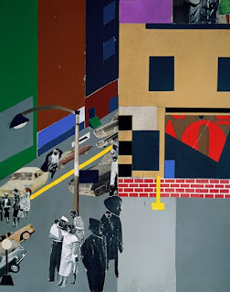
When individuals undergo training in the visual arts, they begin their education by looking at the elements of design - layout, shape, color, line, contrast - and how they affect the viewer's perception. Design students are trained to use the tools of their trade to communicate visually in much the same way that prospective authors are trained to use words to communicate in writing. Despite their training in the formal elements of art making, much of the artist's education happens in the real world by observing people, events, and places. This week, we are going to examine the work of Romare Bearden, an American artist who lived and worked in Harlem.

Bearden worked in a variety of media - printmaking, painting, and collage - and was considered a multimedia artist. The term "multimedia" as we know it today was borrowed from the art world and referred to any artist who used several media to create a single piece of art. Bearden created his collages by combining cut paper, paint, photographs, marker, pencil, and pen and ink. Although he created his layers manually by cutting, layering, and pasting different elements, you will able to emulate his methods in Adobe Photoshop by employing the software's different tools and working in layers.

Please look carefully at Bearden's work. Notice the way he used color, shape, photographs, and page layout to communicate his ideas and make statements about his world. The link below, Guided Tour, provides a short video description of his work, "The Block." Please watch the video and pay careful attention to the analysis of the work.

  1. What are your thoughts about the way Bearden combines photos, color, and shape in his multimedia pieces?
  2. How do you foresee using these ideas and practices in your own work?
  3. What do Bearden's images say about his world?
  4. How can an understanding of art inform the images you use in instructional design?
  5. Why do you think I am asking you to look at this artist's work?

Friday, February 12, 2010

Interest In Visual Literacy

A March 2009 article entitled “Visual Literacy and Message Design" by Rune Pettersson points out that Visual literacy may be applied in almost all areas such as advertising, anatomy, art, biology, business, presentations, communication, education, and engineering. In spite of this according to the article visual literacy has struggled to attract a strong level of interest from society and those responsible for school curricula. Pettersson believes that the concept of visual literacy has not been widely accepted because of a lack of focus. In the authors view combined visual and verbal messages need to be considered and not just text and not only visuals.

Do you agree or disagree with Pettersson? What thoughts do you have on the subject of why visual literacy has yet to attract interest in society and those responsible for school curricula?

Monday, February 8, 2010

Instructional Design for An Integrated Society


When creating instructional images, there are multiple factors that have to be kept into consideration. Some of those considerations include the finding out the purpose of the graphic, researching, and discovering the best way to showcase the final product. In addition to these considerations, one very important factor to consider is the audience that the design will appeal too. Essentially, the images has to appeal the vast majority of the population that will encounter it.

In a 2006 census, the Census Bureau discovered that 1 in 5 American residents spoke a language other than English at home. The census is revealing that if instructional images are directed specifically at an English speaking audience, then it is a possibility that many will be excluded comprehending the purpose of graphic and instructional design.

In a sense, graphic design has to be come universal. Universal design is the broad-spectrum solution for instruction that can be understood by everyone. In the case of our culture today, the audience that graphic designers are appealing to is very diverse. This is then causing graphic designers to evaluate what they produce to ensure that a majority of the audience that encounters their design is included in understanding what message is trying to be conveyed.

In the first 2 pictures above, the signs were created to appeal to 2 different audiences: Spanish and Englishing groups, but these signs are just one way to make instruction universal. In the 3rd picture the customer spits in the box, because the person who has dyslexia misinterpreted the sign. All audiences that have to be considered when creating design for instruction. Therefore, designing graphics for instruction has to strive to become more inclusive rather then exclusive so that all can understand the message that is intended.


Sunday, February 7, 2010

The Art in Instructional Images


I've been looking for examples of graphics to share with you, and am struck by paucity of decent instructional images for adults. For some reason, most educators and textbook publishers simply do not use pictures when teaching adults. Weird...

To get you thinking about the use of color, shape, movement, and line in images, I would like to share with you some pictures by my father's college art instructor. Charley Harper taught graphic design and illustration at the University of Cincinnati Art Academy for many years. During his very long career, he created posters, illustrations, books, and original artwork for a variety of clients. As a young child, I spent many hours pouring over a Biology book he illustrated.

Now for the interesting part of this story... In the summer of 1980, I went to the National Park Service's Visitor's Center at Harper's Ferry, West Virginia. I really liked the history of Harper's Ferry and had been there several times before to walk around the streets of the town. Much to my surprise and delight, there was a display of Charley Harper's work on the walls of the Visitor's Center!

As I walked around the room examining the different pictures, I was approached by an older gentleman. He asked me what I thought of the artist's work. I told him that I loved the artist's work and knew it well. Imagine my surprise when the man introduced himself as Charley Harper! Imagine his surprise when he learned I was the daughter of his former student,
Herb Beard!

After learning the identify of my father, Charley made me an offer. He said that when my father was my age, he had offered him the opportunity to come work with him in his studio for one year, but that my father had turned him down. (That was no surprise as my father had 3 young children at that time... He needed a real job.) When he asked me if I would be interested, I told him that as tempting as it sounded, I had just accepted a new job and that I felt obligated to stick with it. I just couldn't fathom interrupting my life to move to Cincinnati for a year. He said that it was ironic that he made the same offer to two people in the same family and received the same reply.


Imagine, if I had accepted Charley Harper's offer all those years ago... I probably wouldn't be here now at JMU teaching you about Visual Literacy! Here are some links to Charley Harper's work. Enjoy!


Charley Harper Website
Cardinal
Warbler
Raccoons
Ladybugs
Egret
Charley Harper Blog

Saturday, January 30, 2010

Extraneous Load and Choosing the Right Colors


Extraneous Load and Choosing the Right Colors


Can you think about a time when you saw a sign and thought that the colors they chose took away from the signs effectiveness? This is what is called Extraneous Load.

image taken from: http://th00.deviantart.net/fs32/300W/f/2008/233/c/d/cd8f655348d67a12dd9135a684b84c70.png 


image taken from: http://estrip.org/elmwood/users/paul/images/1005/sherbertFLyer5757.jpg


image taken from: https://blogger.googleusercontent.com/img/b/R29vZ2xl/AVvXsEgYwlxWGQmAg1BBV4PKWN9Z6hD9Canm0jW1EqzZtjkE4jppKNPSwrYfdRJVdTvWITM87k3rXuBEzCbJgd6TGF2GzPFc7NZax_1Lcvq43iRc1gzlxsgBuuzQHYa5H0lPDhjKM4lW_rh0JUc/s320/sing_it_loud_album_art.jpg

 
image taken from: http://fc02.deviantart.net/fs26/f/2009/238/a/3/Nike___Crazy_Color_by_mtmac.jpg

Above are four examples of advertisements and/or logos that can be accompanied with an instructional training session. I have chosen these images because they are great examples of enhancing or limiting Extraneous Load, when instructional designers choose colors.

Extraneous Load is defined as "The type of cognitive load that is based on content irrelevant to the important message"(Linda 2007 p. 46). This definition refers to images or colors (in this case) that take away from the important content. Now, this does not mean images have to lack color, like example 3, because that would create extraneous load. Nor do the colors we choose for our images have to contain vibrant colors, like examples 1 and 2, because that would create extraneous load. However, limiting extraneous load means that instructional designers need to be more cautious of color choice. 

The Bad and The Ugly

When we examine the four above choices, which ones do you think is the best example of LIMITING extraneous load? 

Example 1--I have no idea of what is going on in this picture. I think that the loud and vibrant color choices in this image take away from the main focus of this image (which is the woman...I think). When we look at the colors chosen in this image, it causes the viewer to focus more on the background than the woman in the picture. This picture is a great example of color choice enhancing extraneous load. 

Example 3--This picture is an example of choosing dull colors, which distract the viewer from the logo's main content "Sing it Loud Come Around". If you focus on the "Come Around" text at the bottom of the logo, it is a very obscure grey color. This color, in my opinion, is two shades lighter than the white background. The color chosen for the "Come Around" creates more Extraneous Load, because the viewer is trying to understand what the text actually says. Thus, this image is another great example of color choice enhancing extraneous load. 

Example 4--This last picture is a great example of color choice enhancing extraneous load. The colors in this picture are so loud and vibrant that it causes the viewer to focus on them and not the shoe that is being sold in the picture. Did you even see the shoe that is being marketed? Once again, this picture is a great example of color choice enhancing extraneous load. 

The Good 

Example 2--This image in my opinion is a great example of smart color choice that limits extraneous load. Anyone who has had ice cream sherbet knows that it is colorful and delicious. Well, this picture capitalizes on this known fact and the designer uses it well to market the sherbet. The colors are very vibrant, but in my opinion they fit very well into the picture. Once again, this is a great example of color choice limiting extraneous load. 

Conclusion 

As we move into the world of work, please be cautious of the colors you choose enhancing or limiting extraneous load. If you can think of any examples of color choice enhancing or limiting extraneous load please upload them and thank you for reading this blog! Have a great and enjoyable snowy weekend!

When a Word’s Look Counted as Much as Its Meaning


I came across a news article from the New York Times. The title, When a Word’s Look Counted as Much as Its Meaning jumped out at me and after reading this article I was very interested in this topic.

The article discusses typography, a field that is often left obscure. I was shocked to find out that typeface design is not protected by the United States Copyright Law. This means, people can replicate and create fonts on their personal computers without a problem! The article goes on to discuss a company called Émigré which is a magazine. This magazine wowed the Museum of Modern Art in New York because of its use of fonts. The museum put the magazines on display for a year. Author Chloe Veltman states, “the marriage between a font’s beauty of form and the context in which it is employed is what makes the written word jump off the page. In striving to demonstrate this truth, Émigré deserves our attention.” The main message of the article is that business and art can coexist, you will find this a wonderful read! Check out the article by clicking here.
After looking at a few examples of work from Émigré on the top of the page or from the Émigré website, why do you think it had such an effect on people? What makes these images stand out?